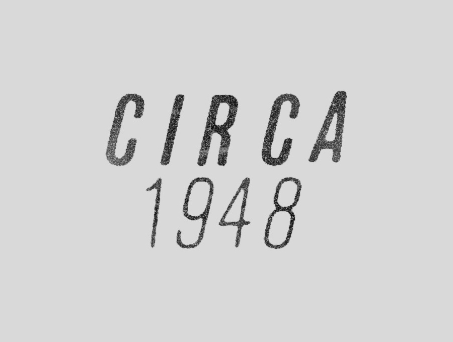
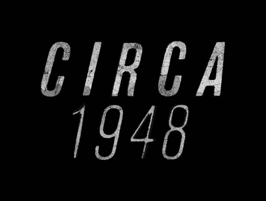
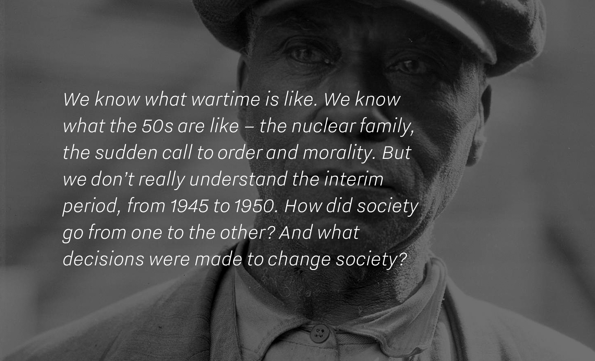
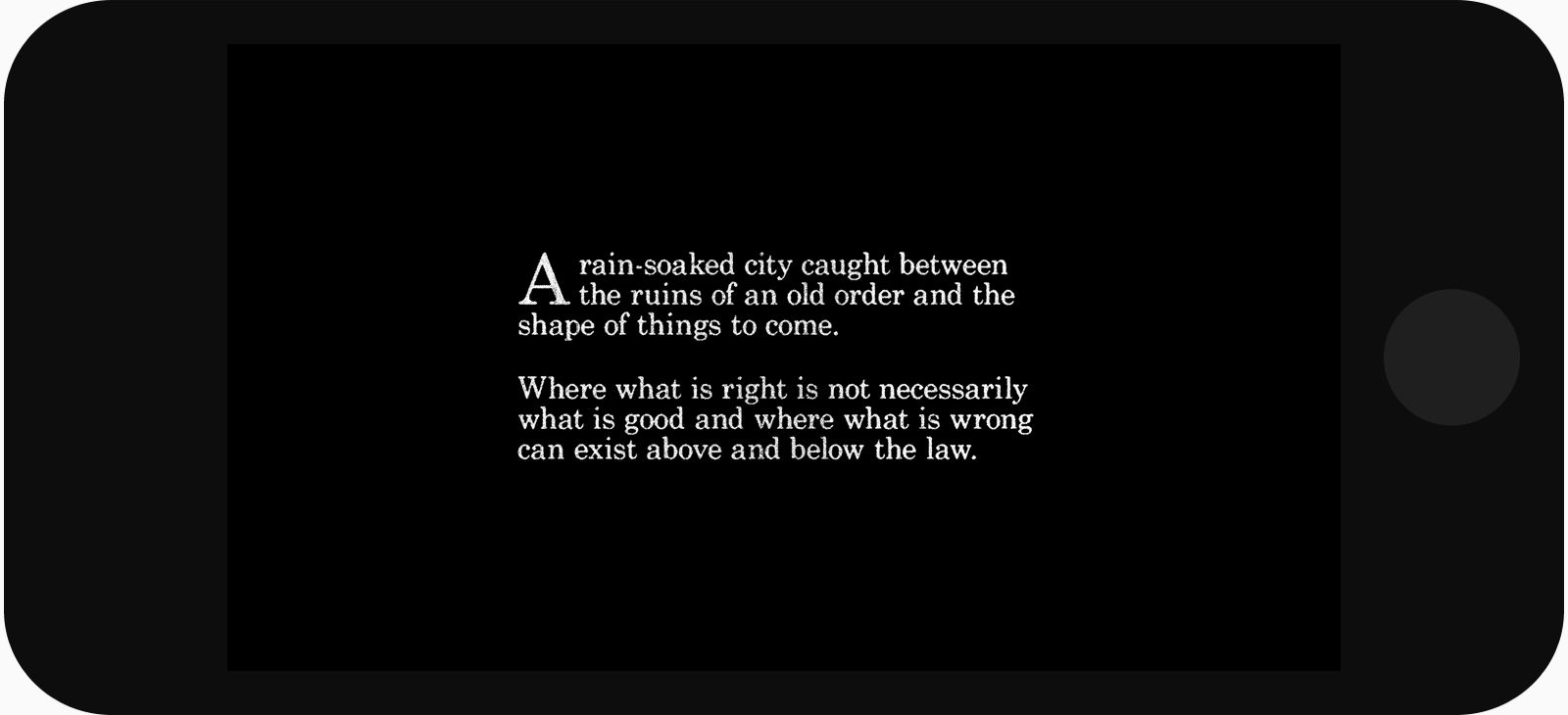
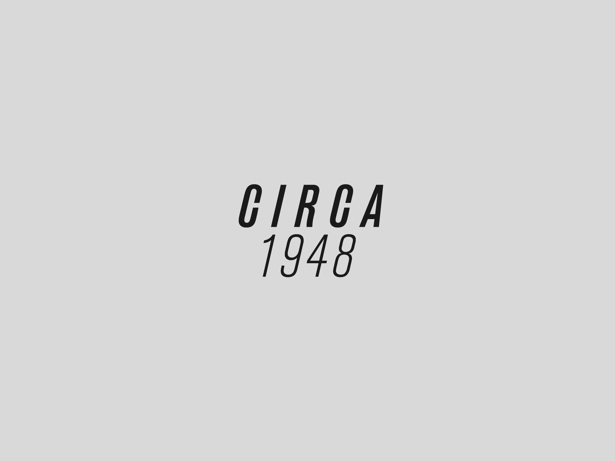
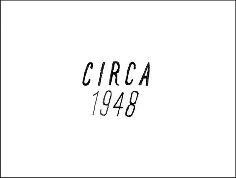
Circa 1948
The laws… had been suspended
Navigate two historical locations that no longer exist, and experience a film noir non-linear storyworld while eavesdropping on long-lost mysteries from a period of great social and economic change.

Type
App, interactive installation, microsite
View it
Download: Apple App Store
Microsite: circa1948.nfb.ca
Agency
NFB Interactive
Awards
FWA Mobile of the Day // Nominee: Interactive Fiction, 2015 Rockie Awards
Press
Time Magazine, The Guardian, The Toronto Star, Nuvo Magazine
App, interactive installation, microsite
View it
Download: Apple App Store
Microsite: circa1948.nfb.ca
Agency
NFB Interactive
Awards
FWA Mobile of the Day // Nominee: Interactive Fiction, 2015 Rockie Awards
Press
Time Magazine, The Guardian, The Toronto Star, Nuvo Magazine
Role
App: UI design (iconography, typography), introduction sequence, instructional + text screens // Microsite: UI design (visual concept, screen flow, layout, typography, iconography), image curation and manipulation, interaction motion samples
Collaborators
Creative direction by Stan Douglas // Production (NFB) by Loc Dao, Kelly Richard Fennig, Dana Dansereau, Laura Mitchell // Microsite art direction by Jeremy Mendes // 3D art by Johnny Ostrem, Trent Noble, Prajay Mehta // Software engineering by Kearwood Gilbert // Microsite development by deuxhuithuit // Copywriting by Michael Turner, Jennifer Moss
What happened in between?
The premise
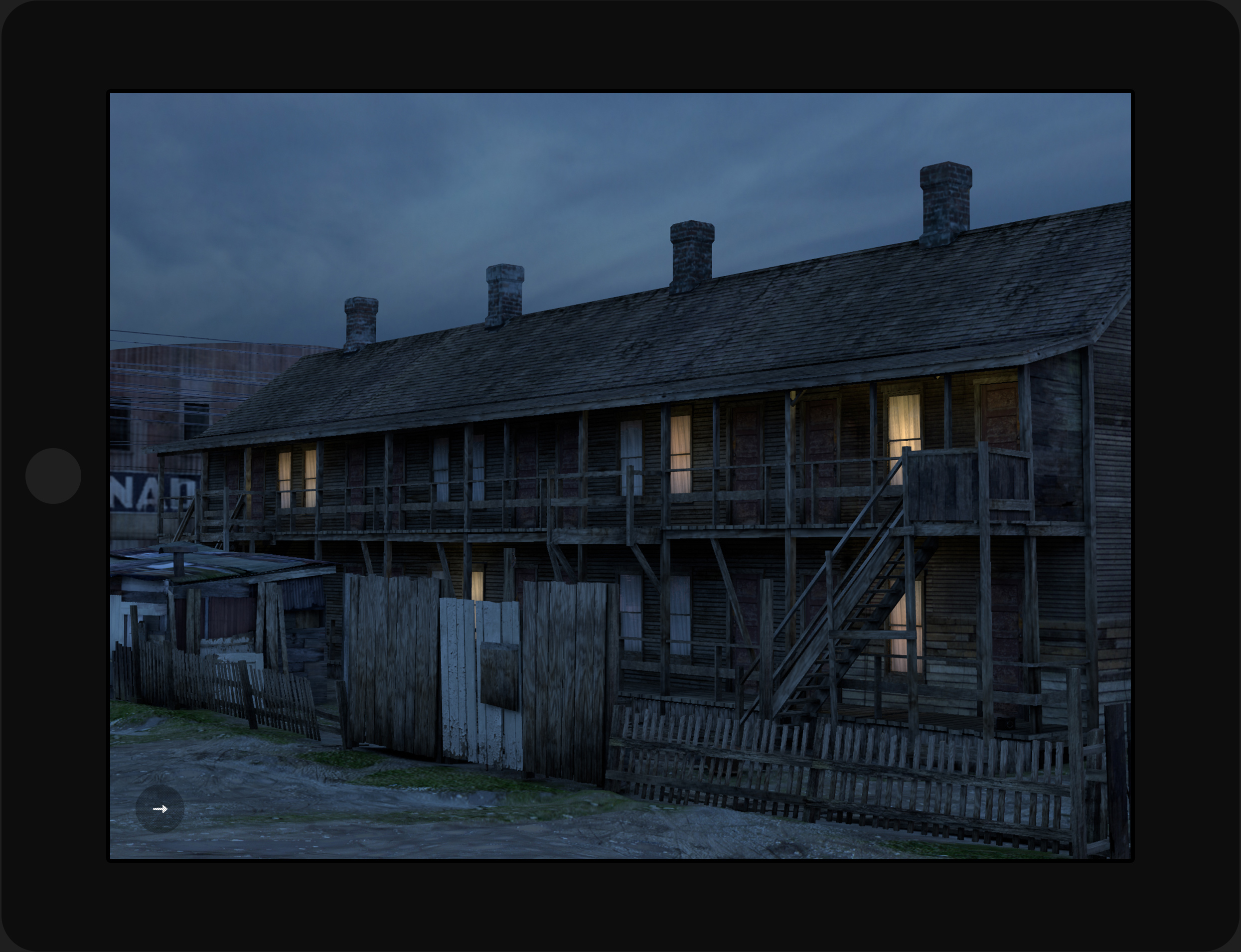
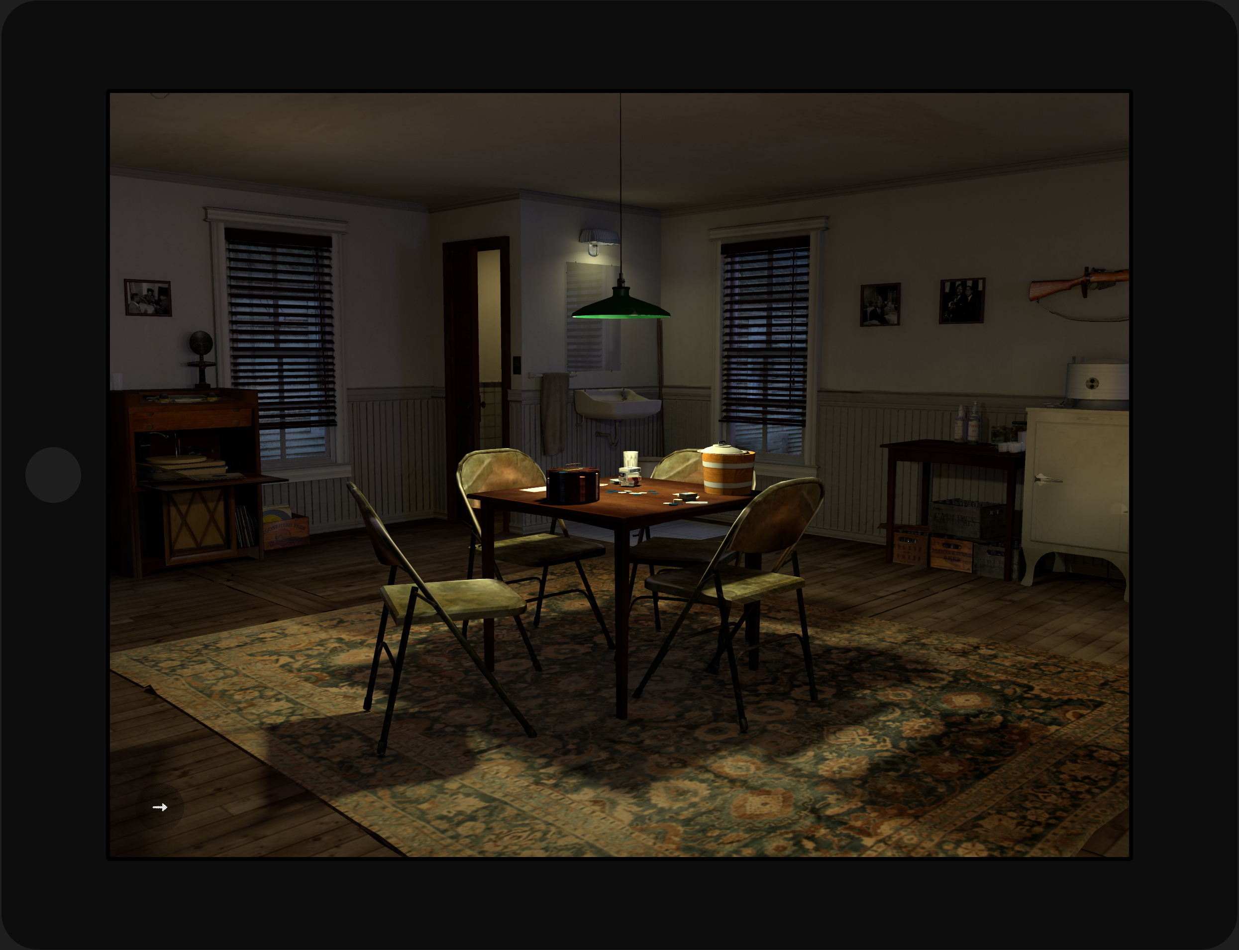
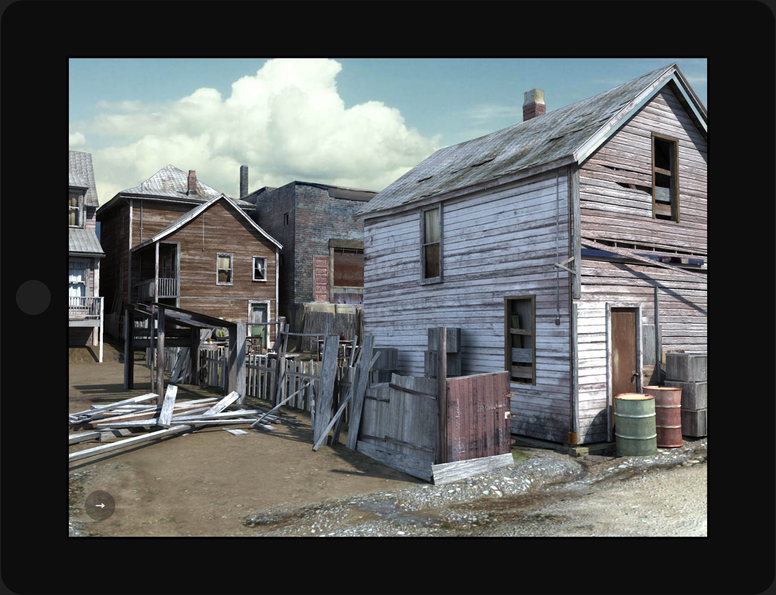
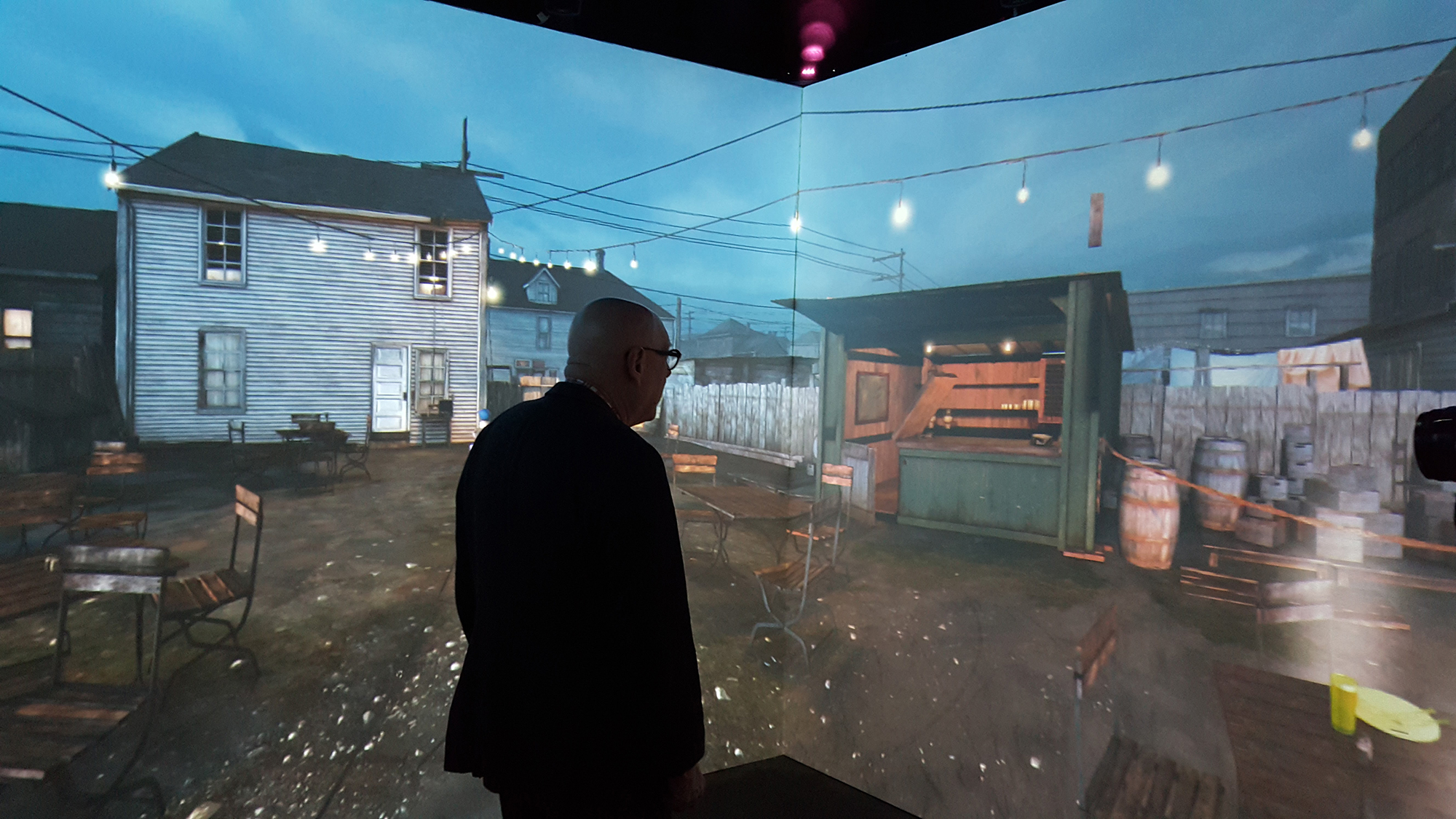
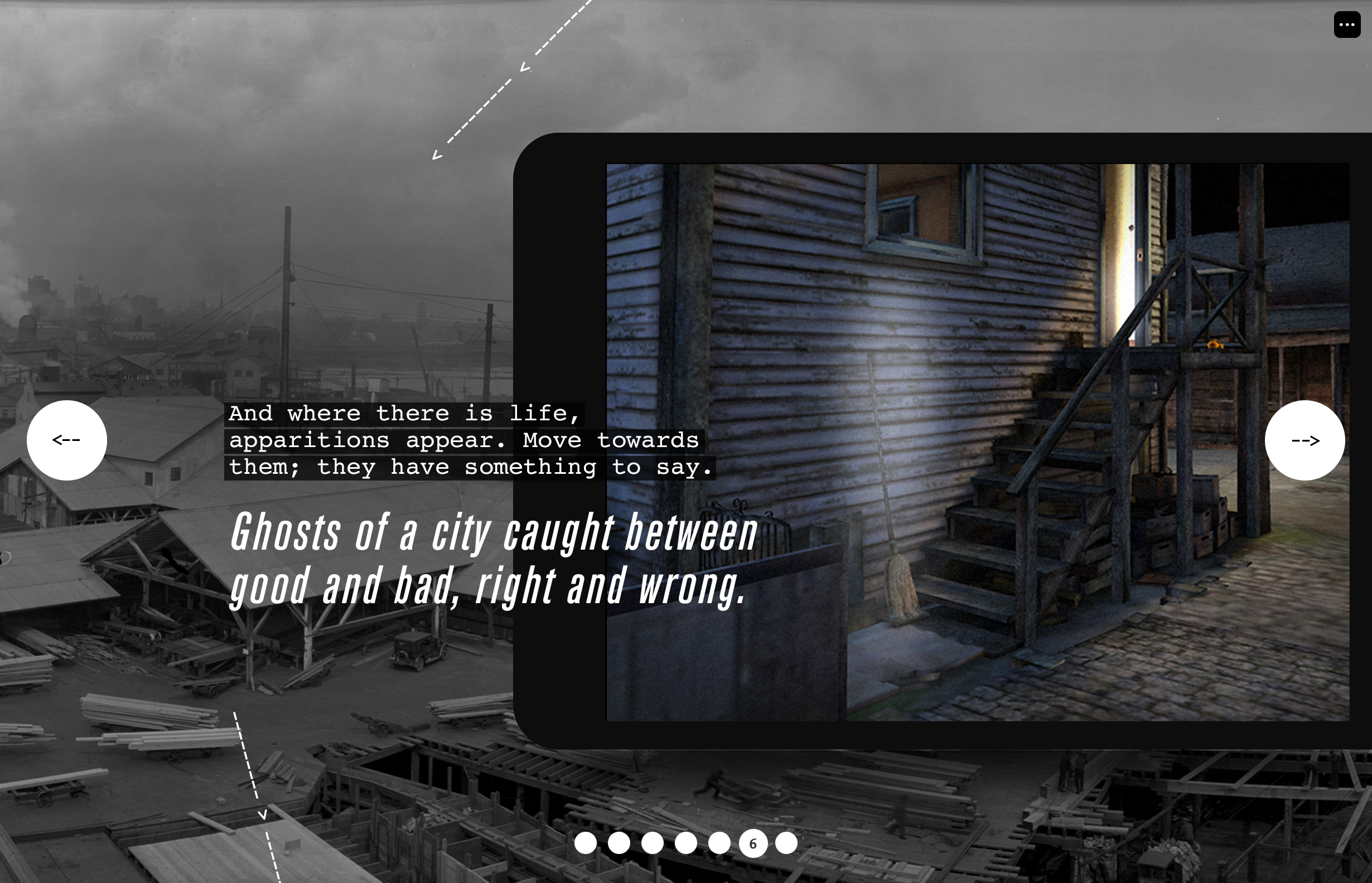
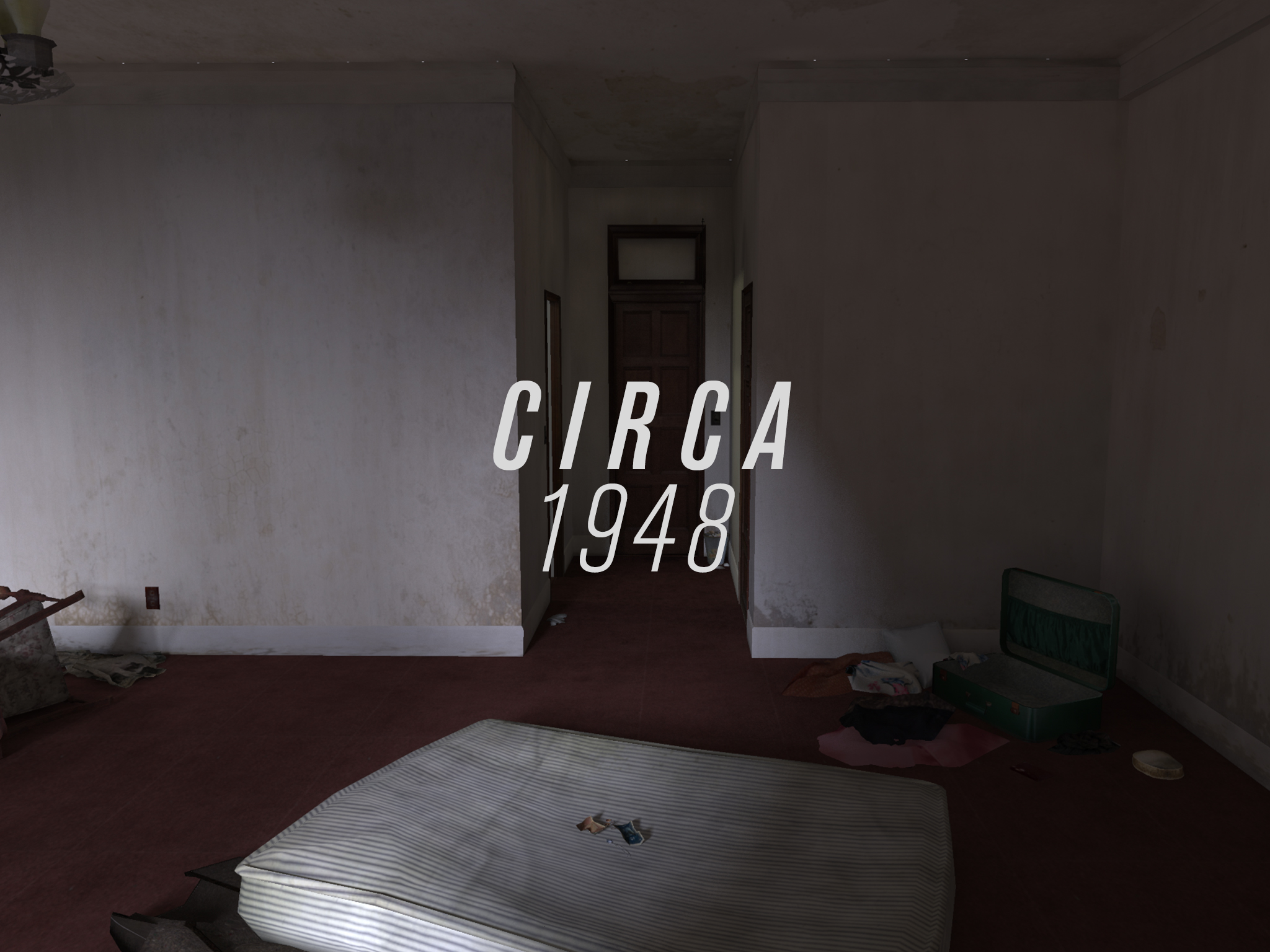
Circa 1948 is a 3D app and interactive installation by artist Stan Douglas, which made its world premier at the Tribeca Film Festival in 2014. Viewers are free to navigate wherever they like, through two communities in 1940s Vancouver that were eventually razed. The scenes are peopled by ghosts, and their conversations illuminate a period of rapid change, vice and corruption — a period that has historically escaped the spotlight.
Stan Douglas in The Guardian
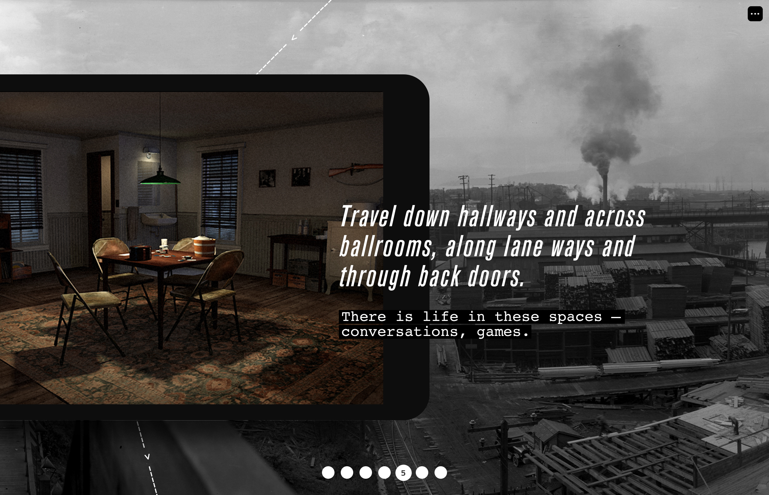
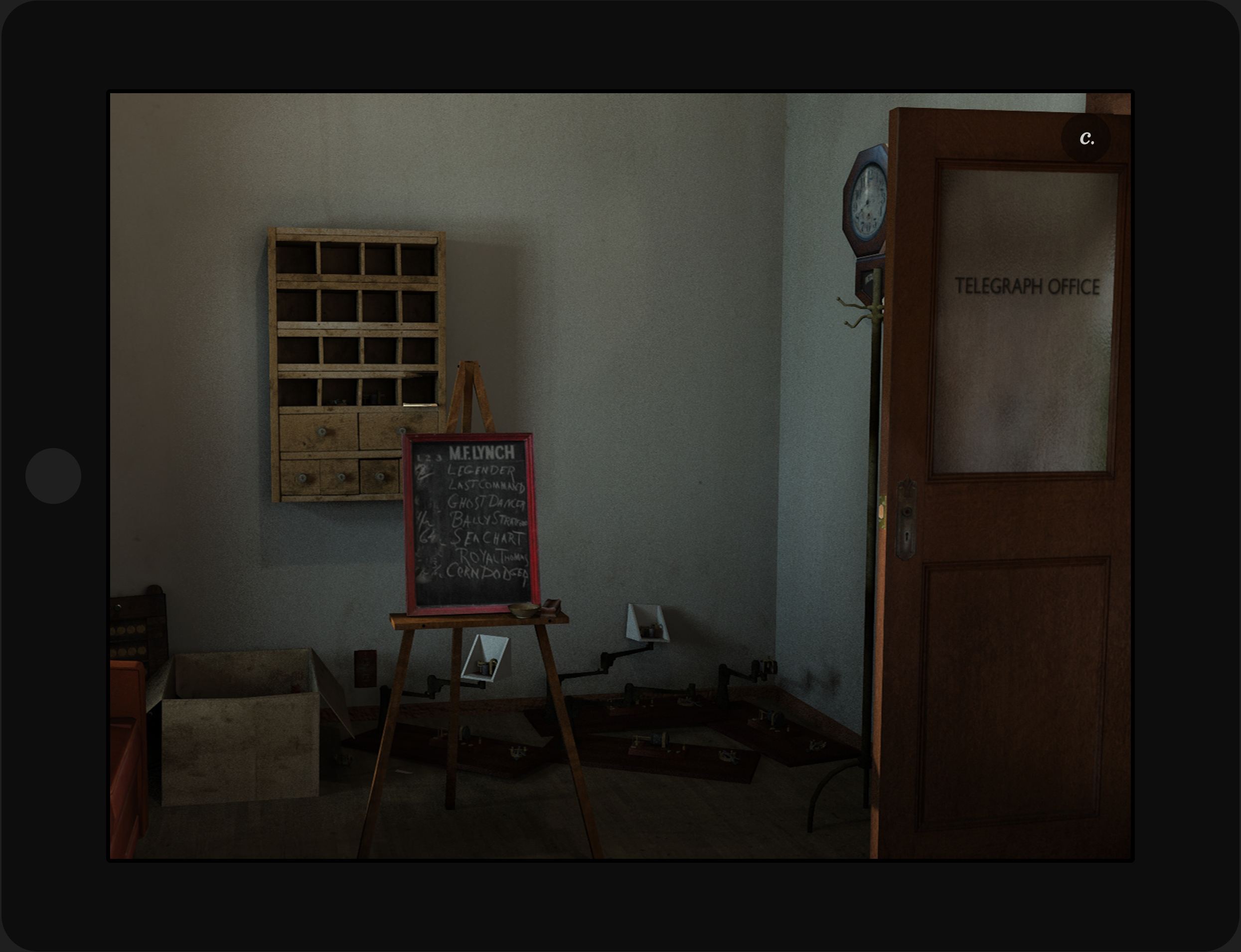
The storyworld is extensively detailed with historical props, architecture and landscapes, period music and ambience, and 44 conversations. The app uses touch and gyroscope-driven navigation modes, while the installation audience use their bodies to travel the grit of postwar Vancouver.
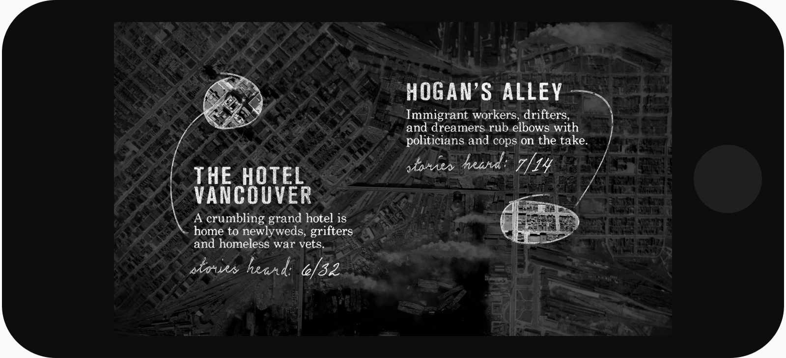
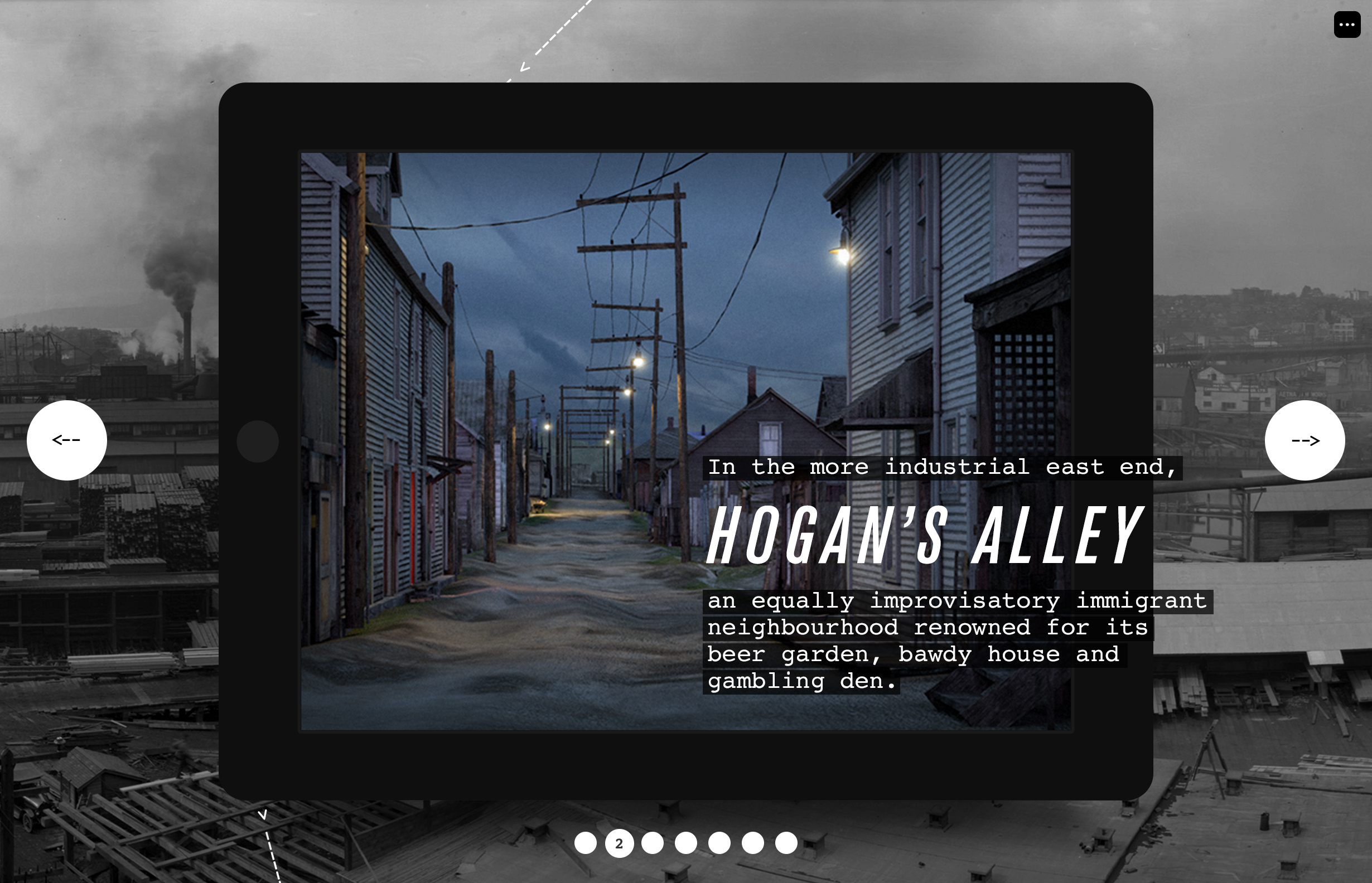
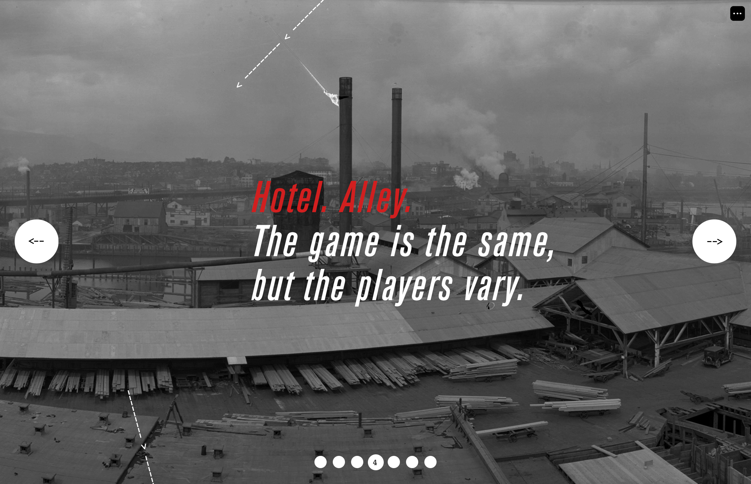
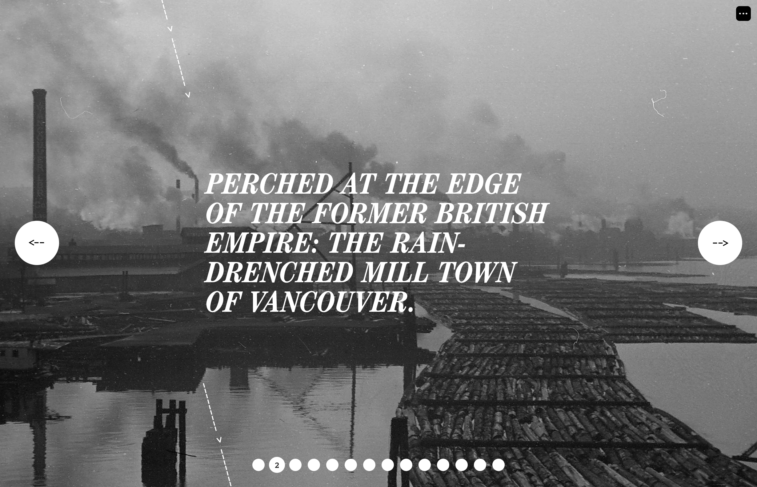
West versus East
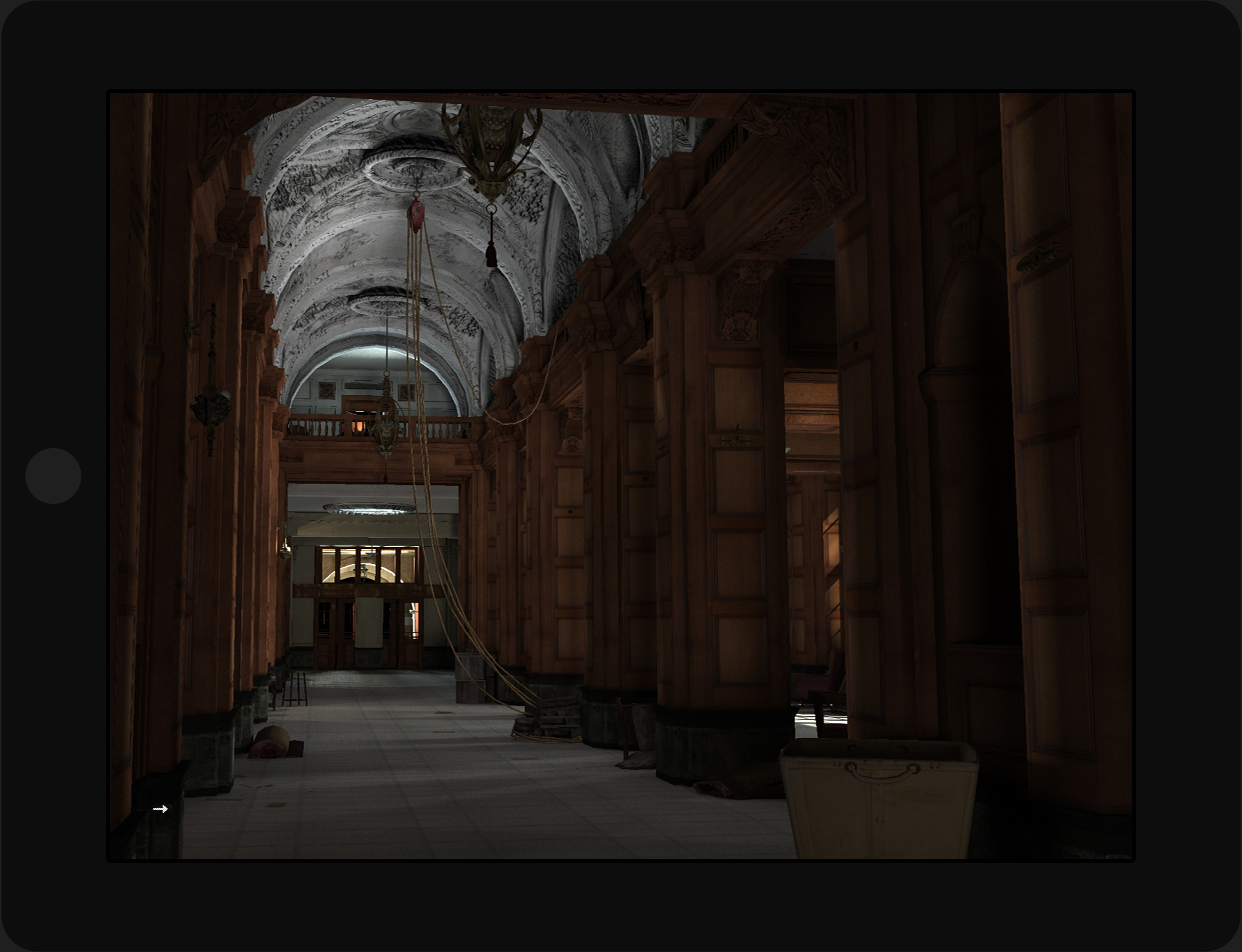
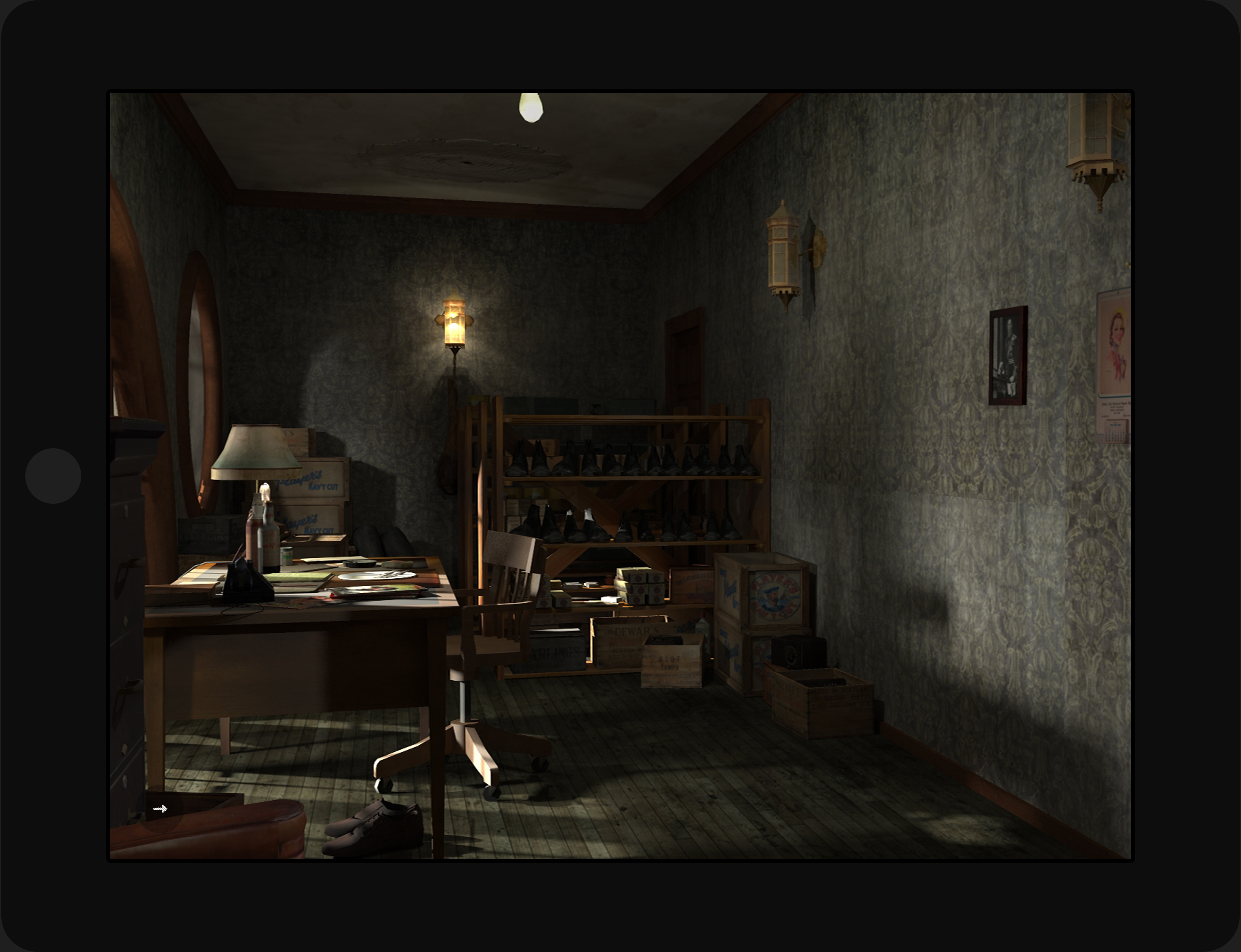
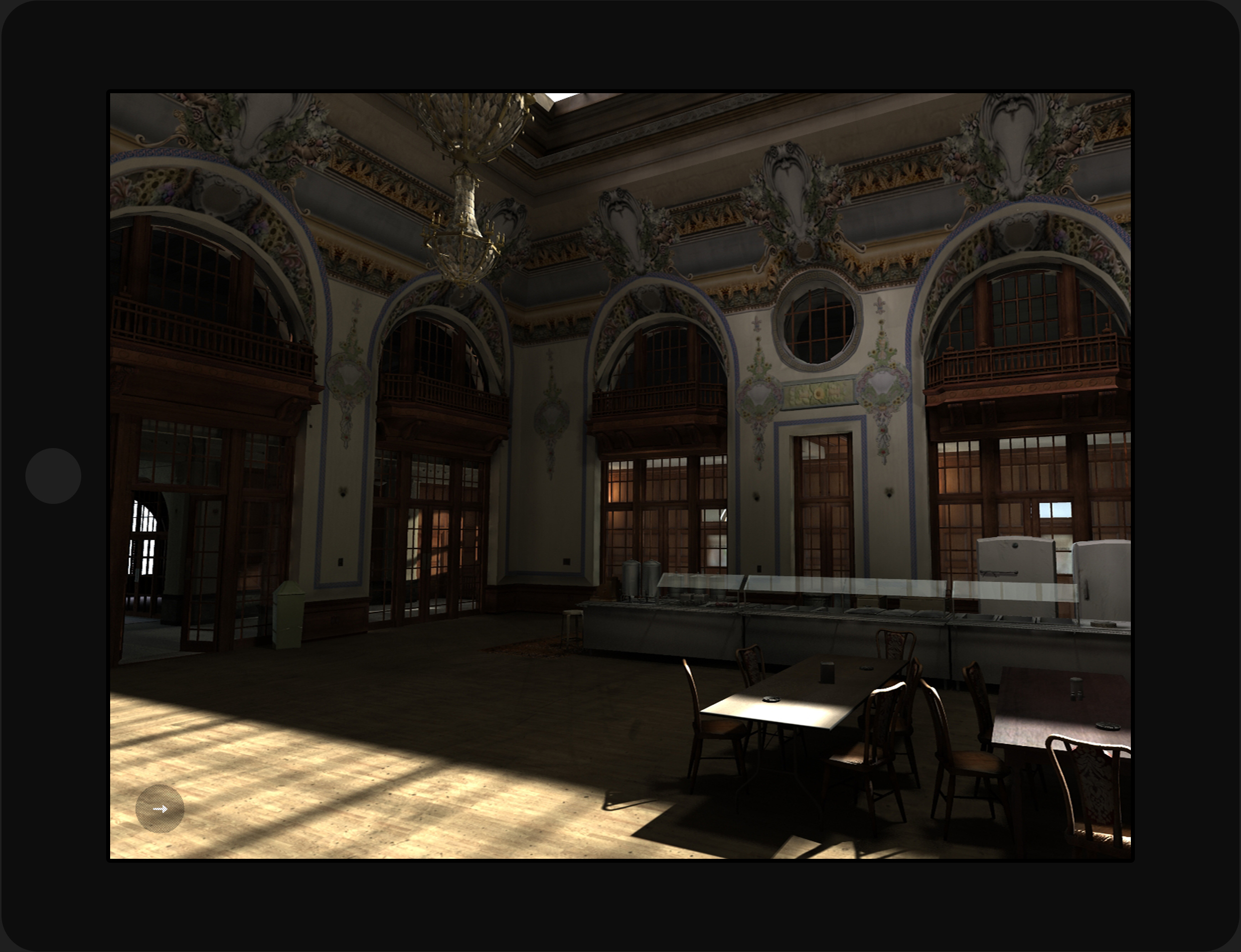
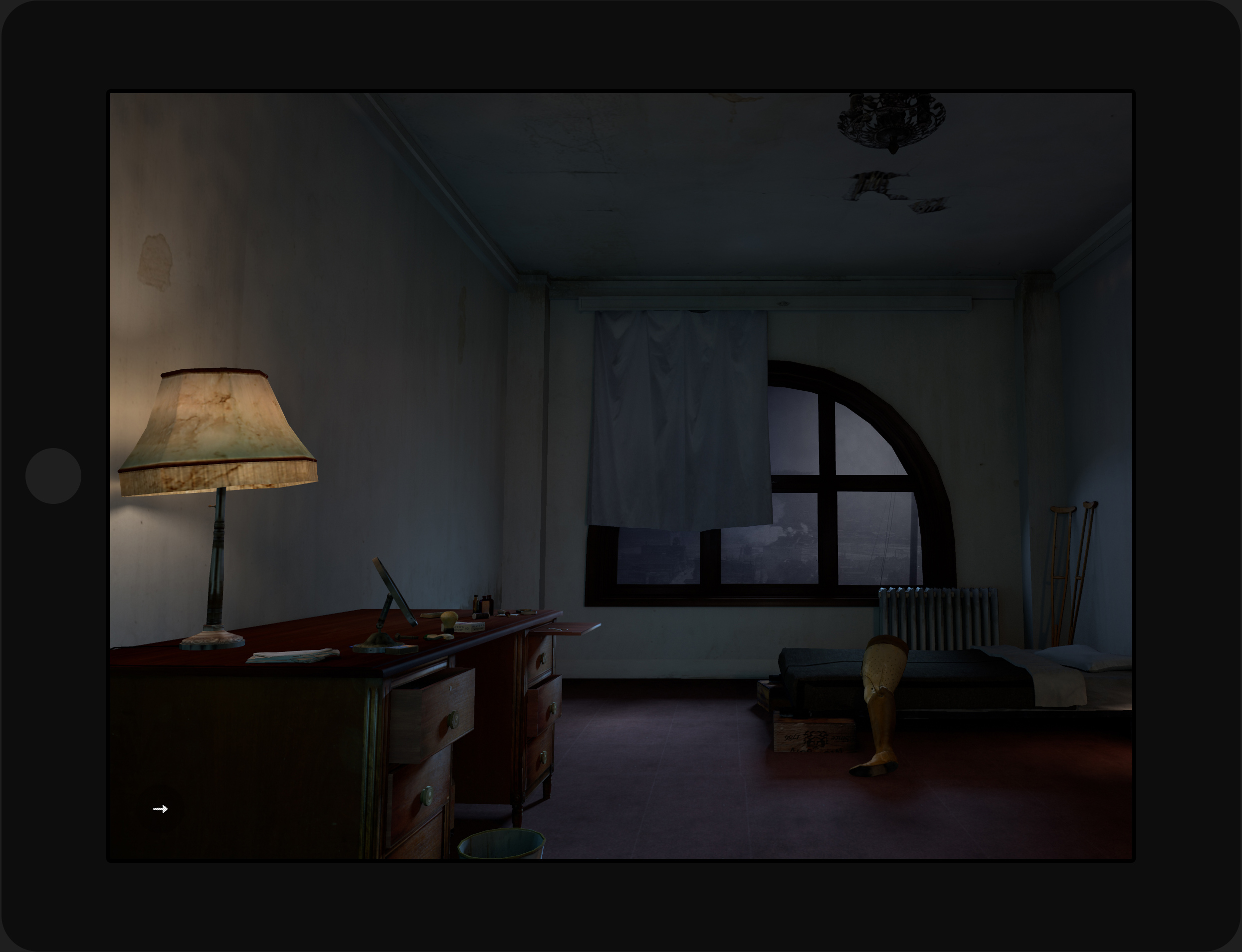
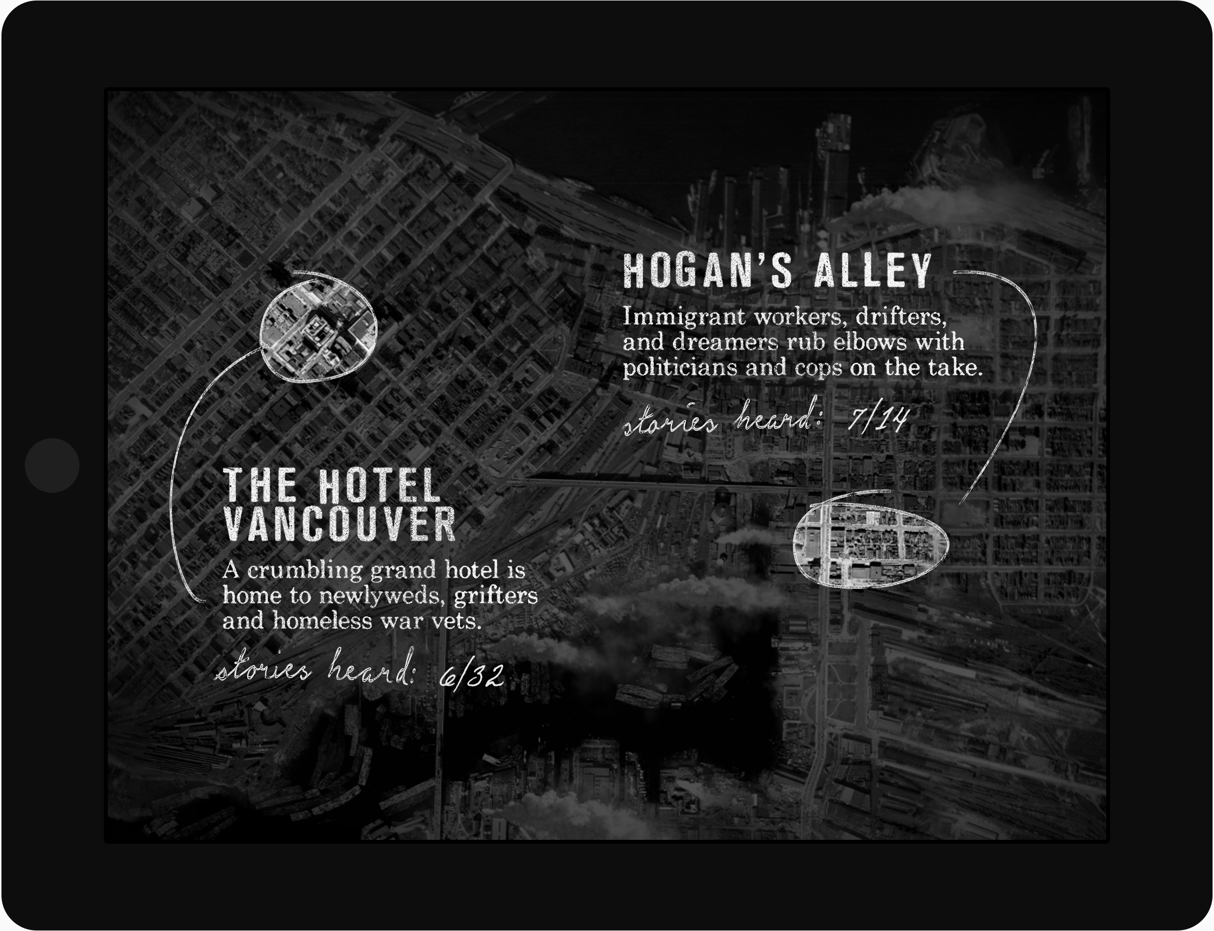
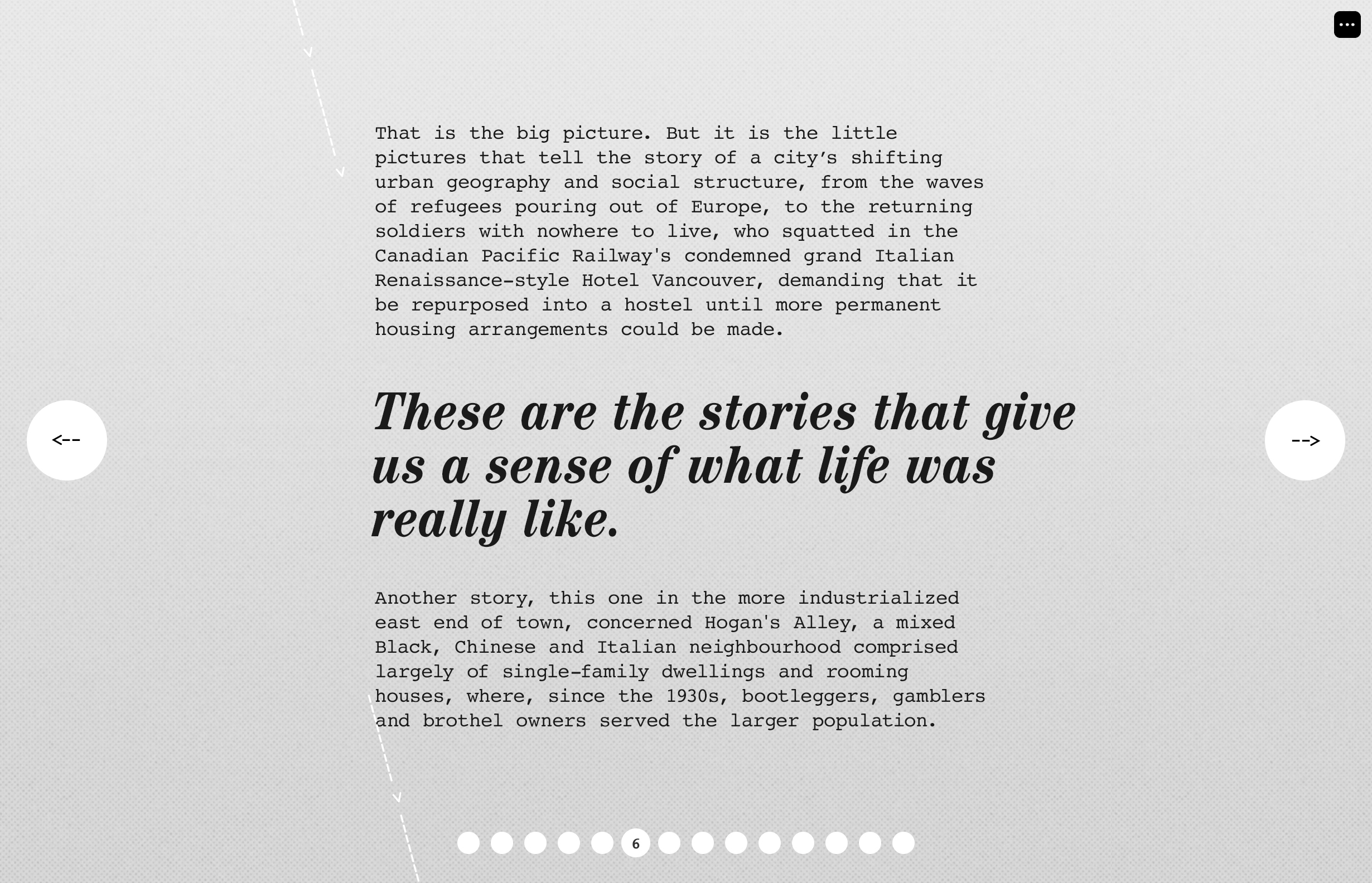
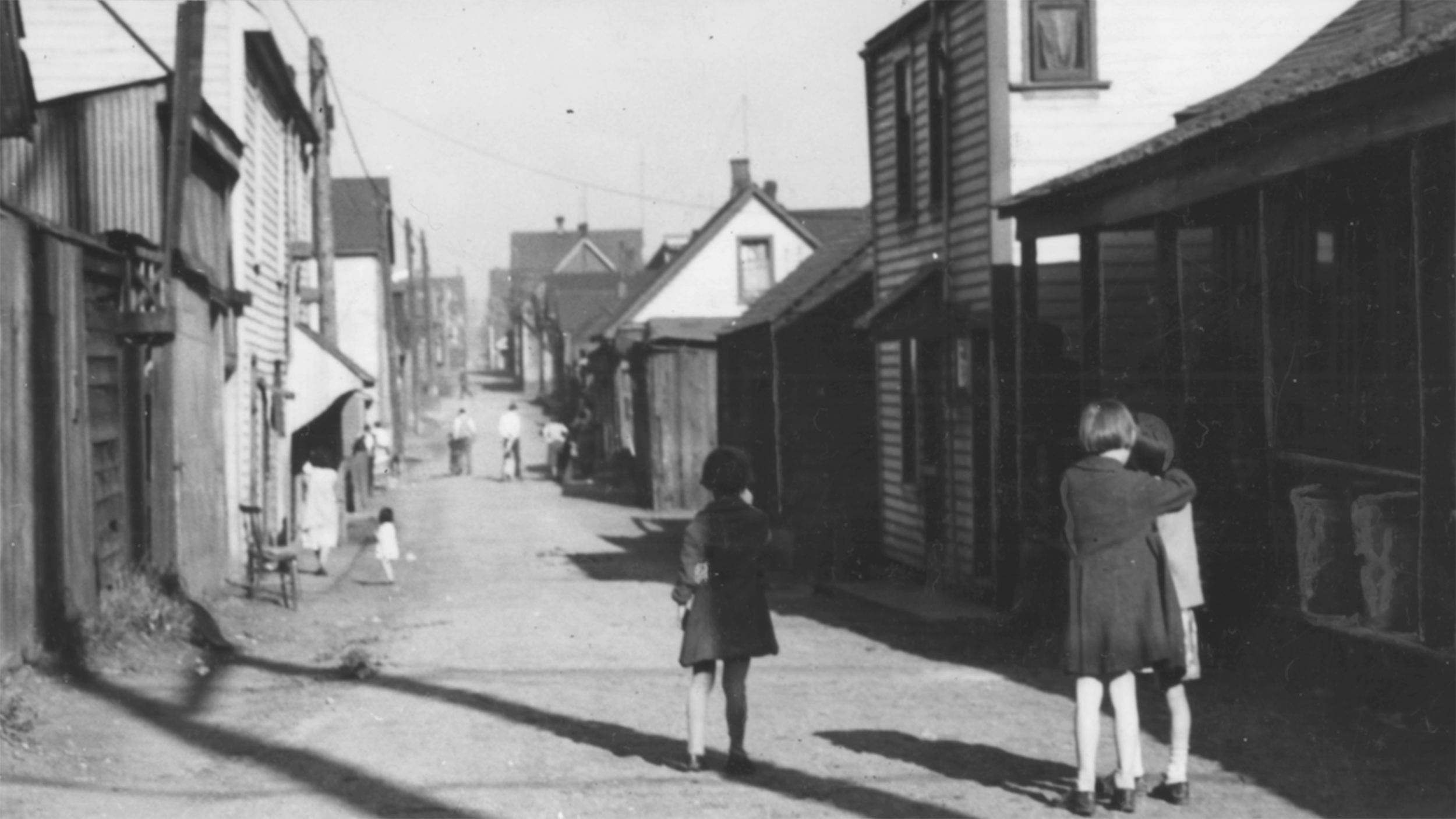
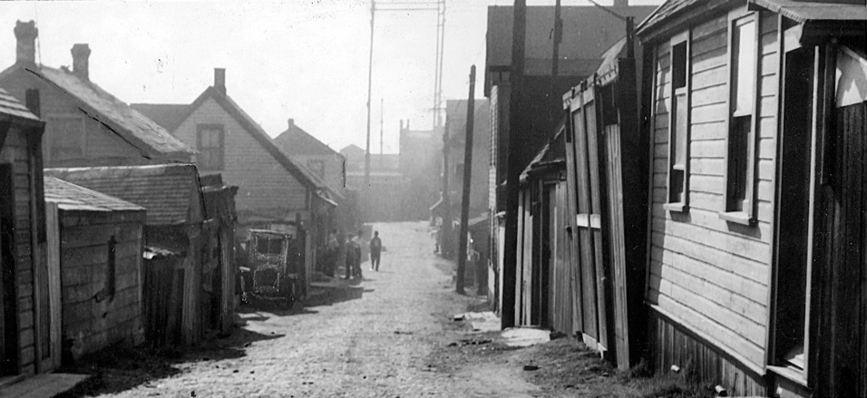
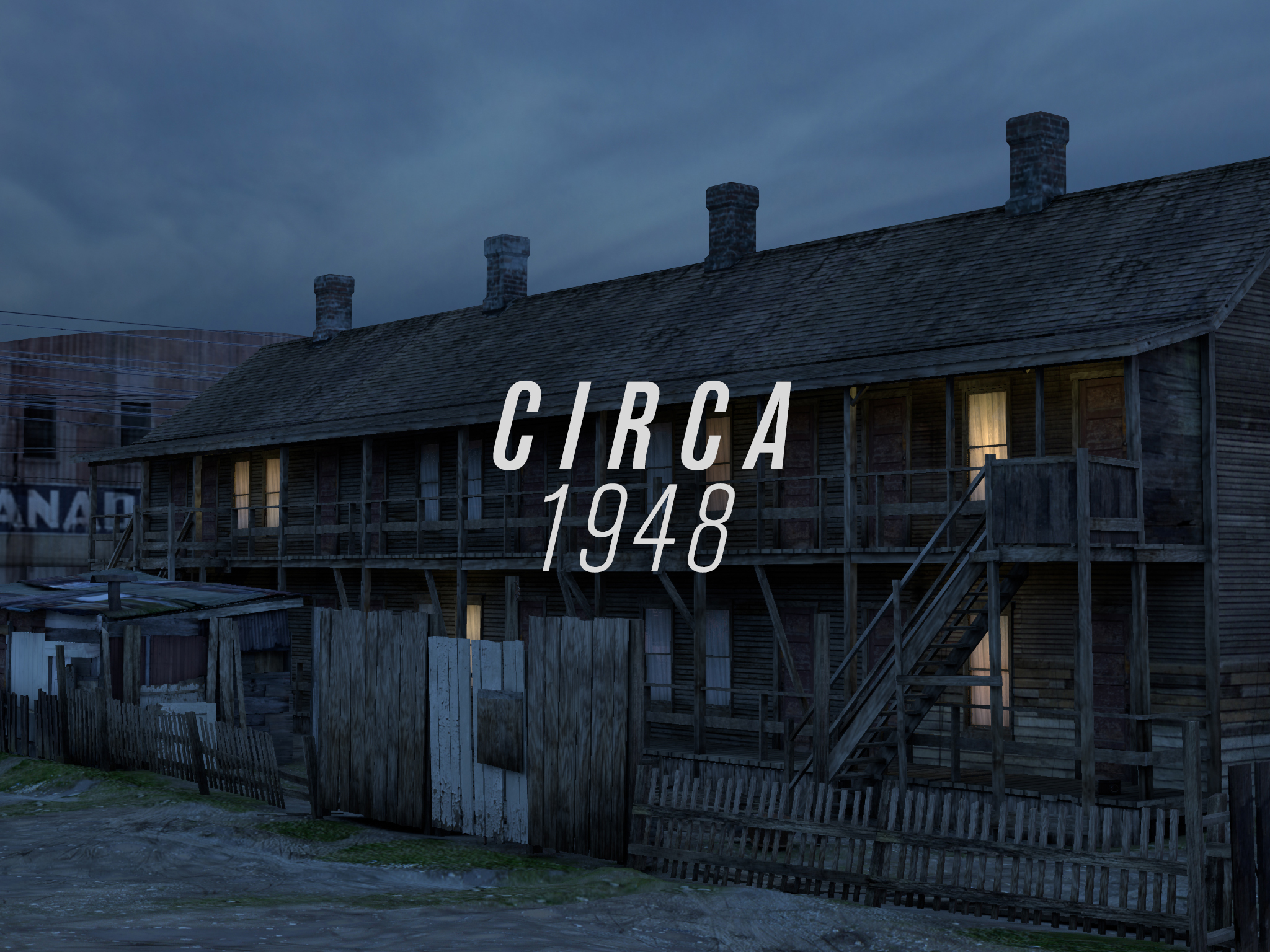
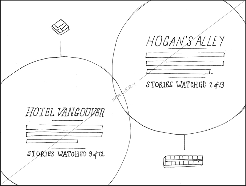
The narratives take place in two disparate locales. The first is the grand old Hotel Vancouver on the city’s posh West Side, its abandoned rooms occupied by squatting homeless war veterans. The second is Hogan’s Alley, a shady lane on the working-class East Side, textured by prostitution, gambling, bootlegging, corrupt cops and shady politicians.
The storyworld is extensively detailed with historical props, architecture and landscapes, period music and ambience, and 44 conversations. The app uses touch and gyroscope-driven navigation modes, while the installation audience use their bodies to travel the grit of postwar Vancouver.
West versus East
Two locations, circa 1948
The narratives take place in two disparate locales. The first is the grand old Hotel Vancouver on the city’s posh West Side, its abandoned rooms occupied by squatting homeless war veterans. The second is Hogan’s Alley, a shady lane on the working-class East Side, textured by prostitution, gambling, bootlegging, corrupt cops and shady politicians.
Slideshow — 3D renders by Trent Noble, Johnny Ostrem


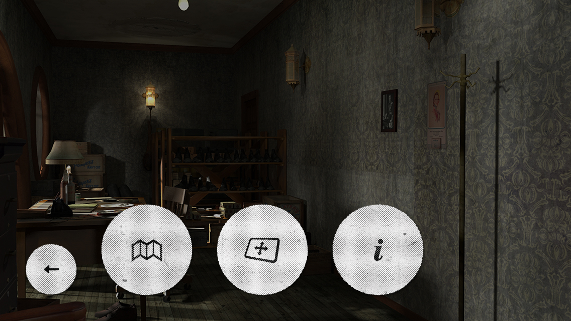
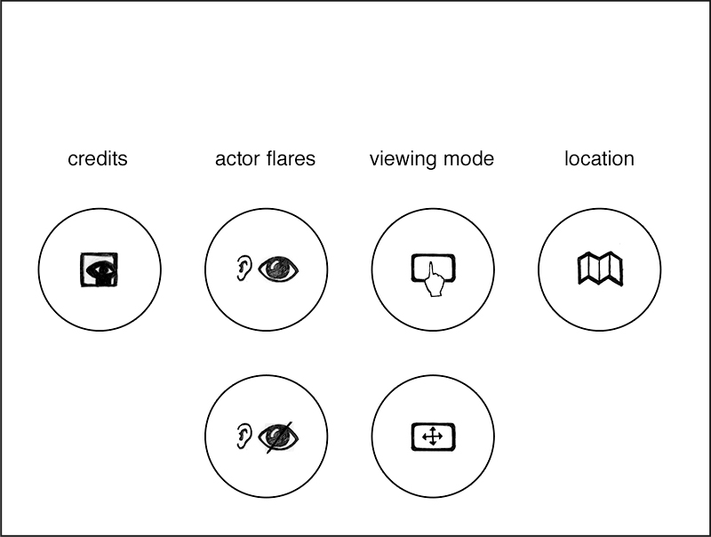
Controlling behaviour
My role
When I joined the project, the 3D world was more than half complete, but there was no UI, and many questions remained as to navigation, user control options, and UI complexity. Some screen wireframing had been done, though that would all be reworked later. My role was to style and design the app’s UI, the introduction, and various support screens, and to provide production graphics. In addition, I was also asked to design Circa’s promotional microsite.
History will not be silent
Results
The app quickly racked up over 36,000 unique users, and toured internationally as a projection-mapped installation at film festivals and as a stand-alone exhibit.
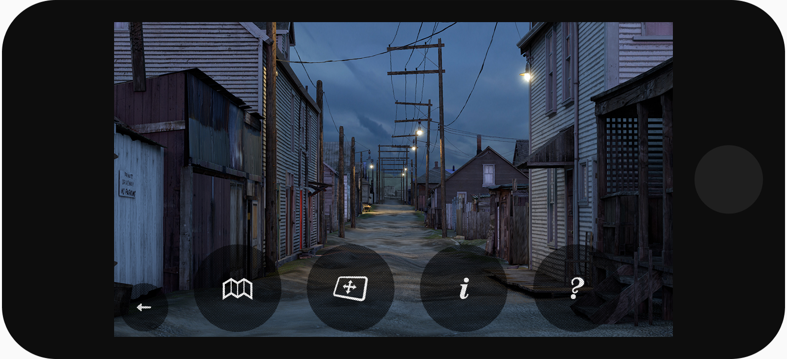
Shaded by noir
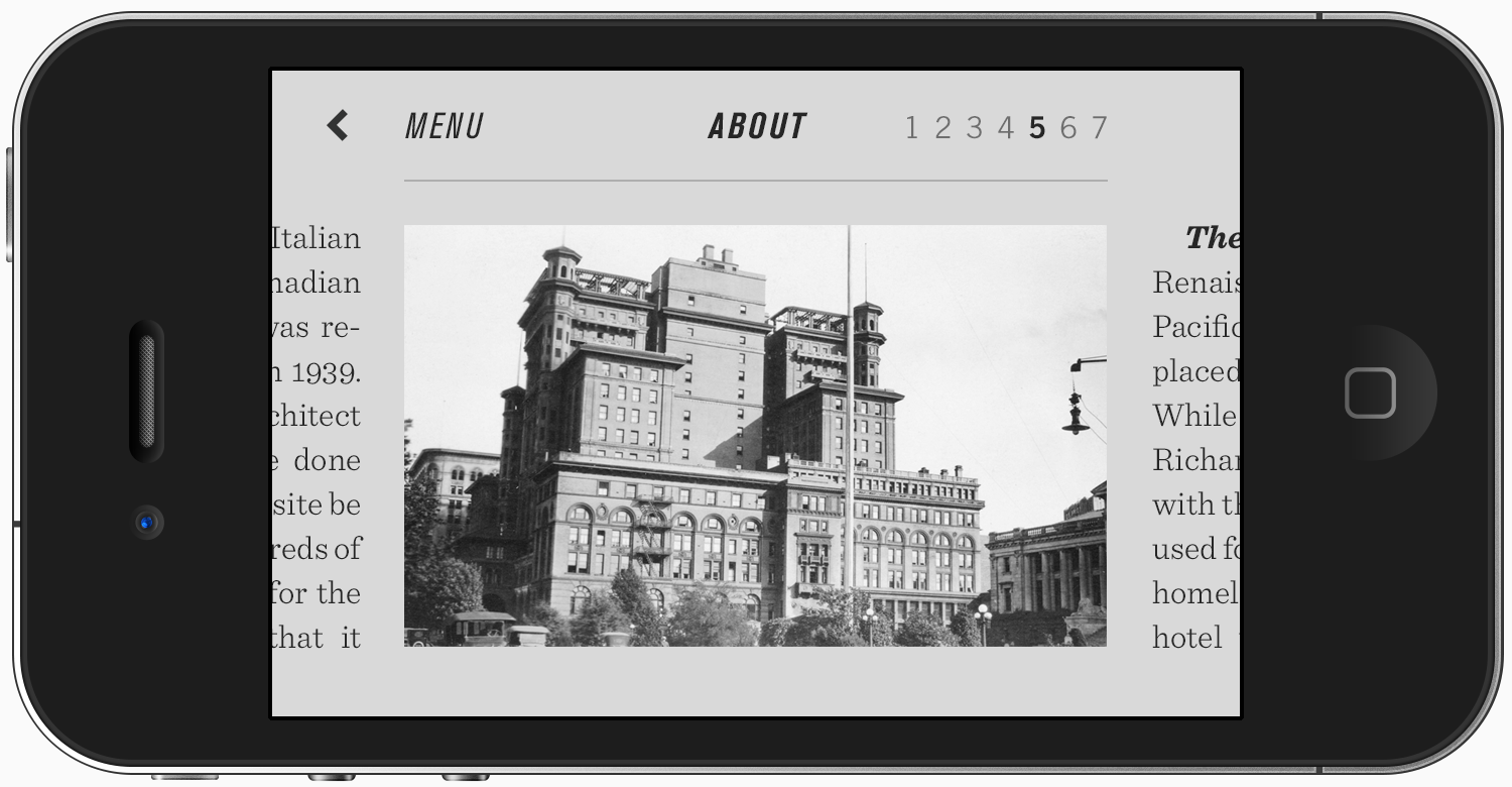
App final designs
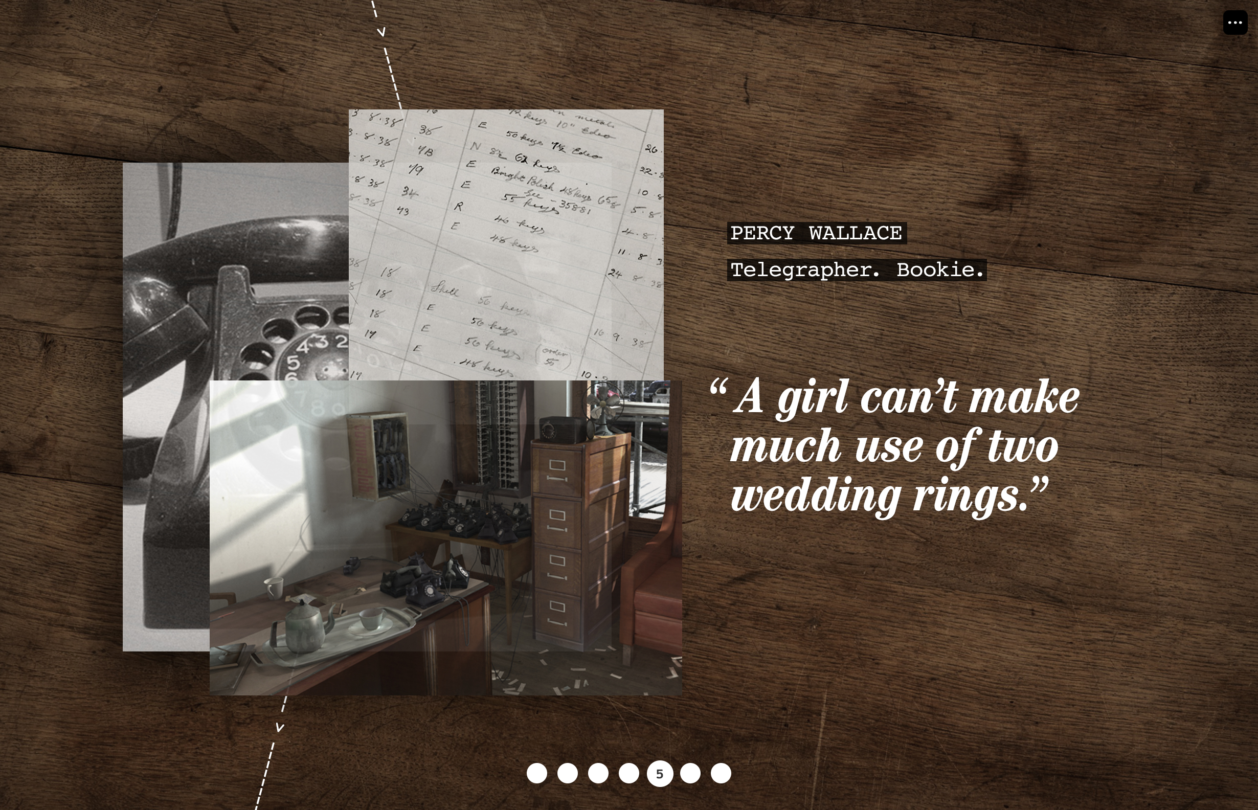
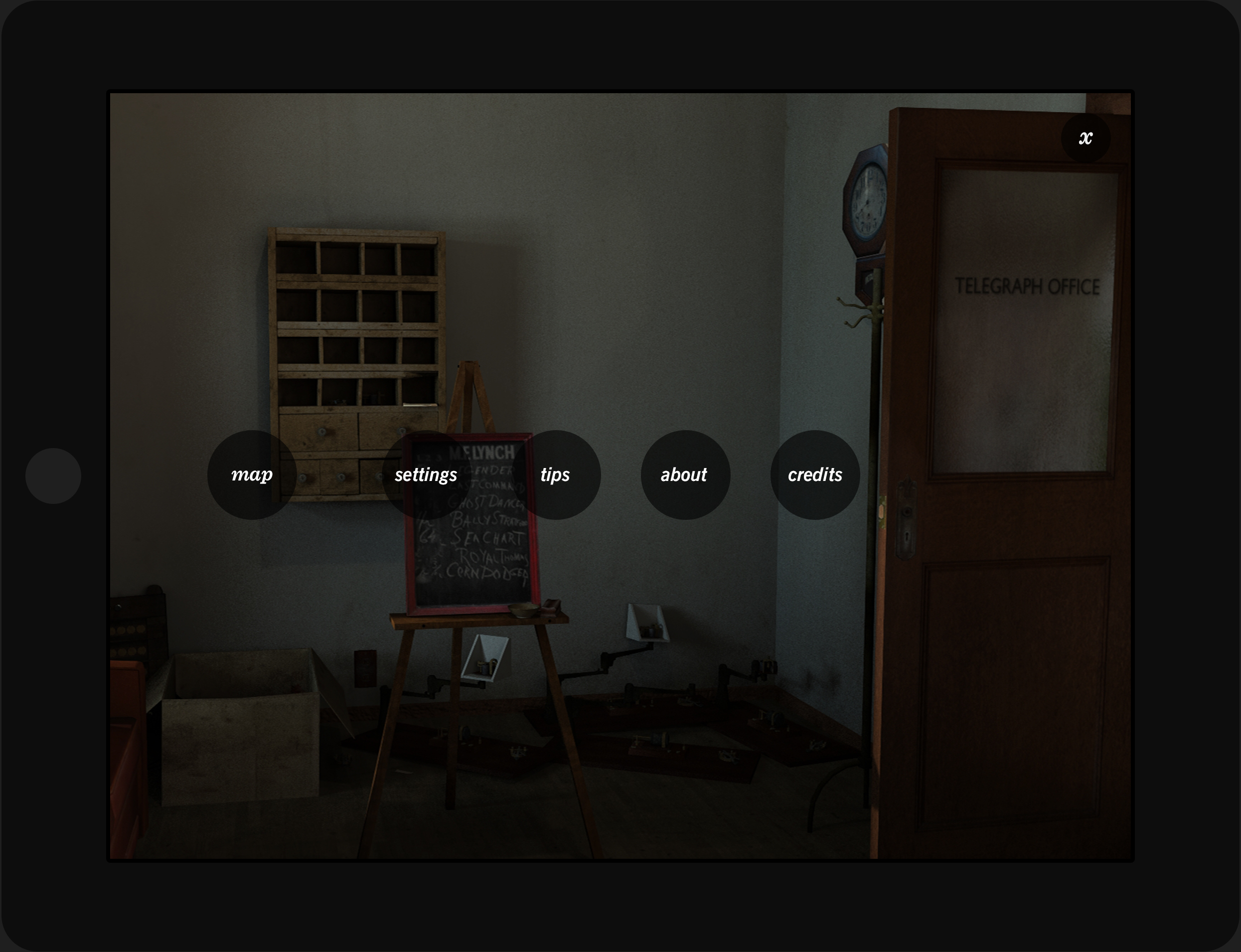
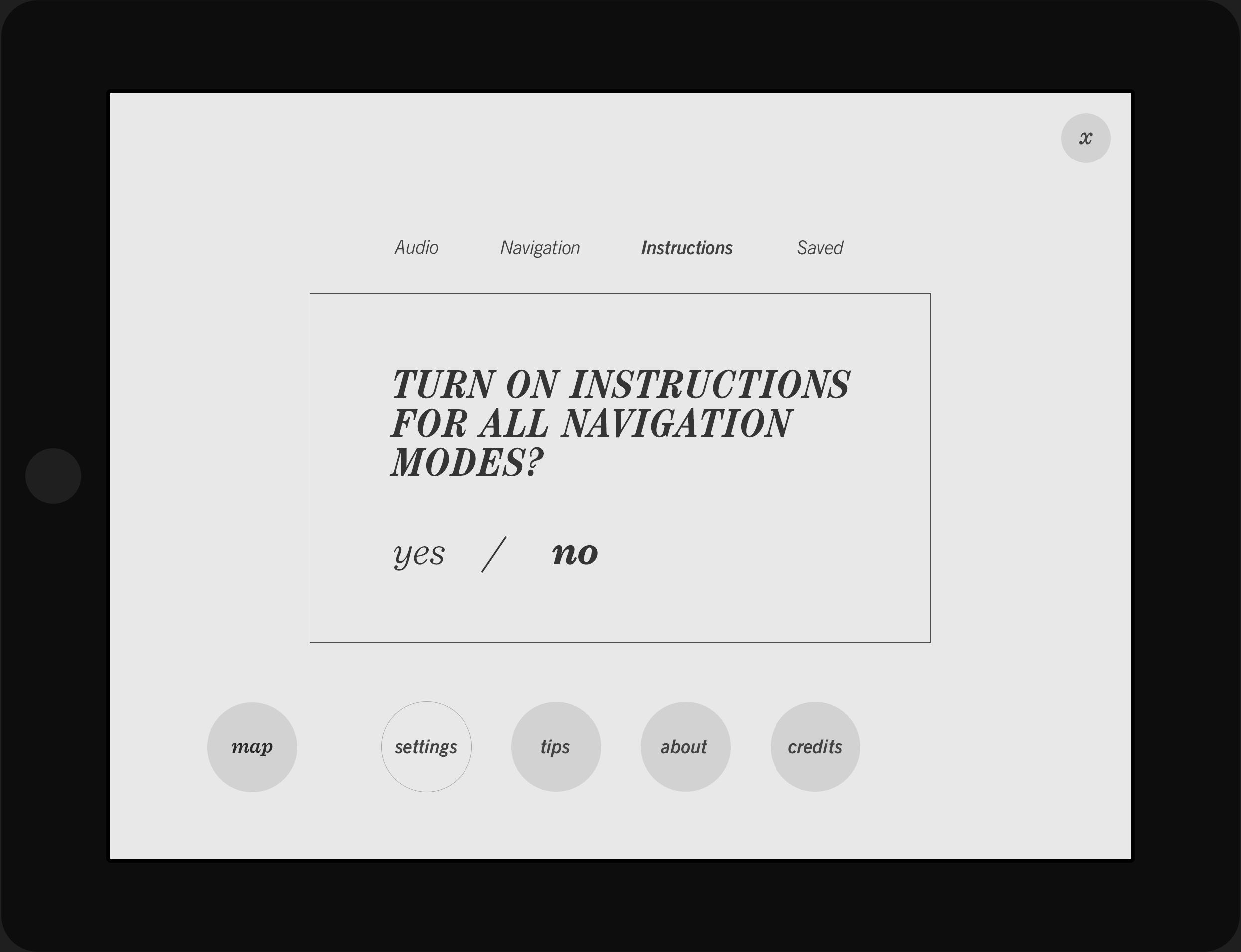
Circa’s UI is gritty and distressed, taking cues from archival microfiche and period newspaper layouts and typography.
Static design comp, location selection screen
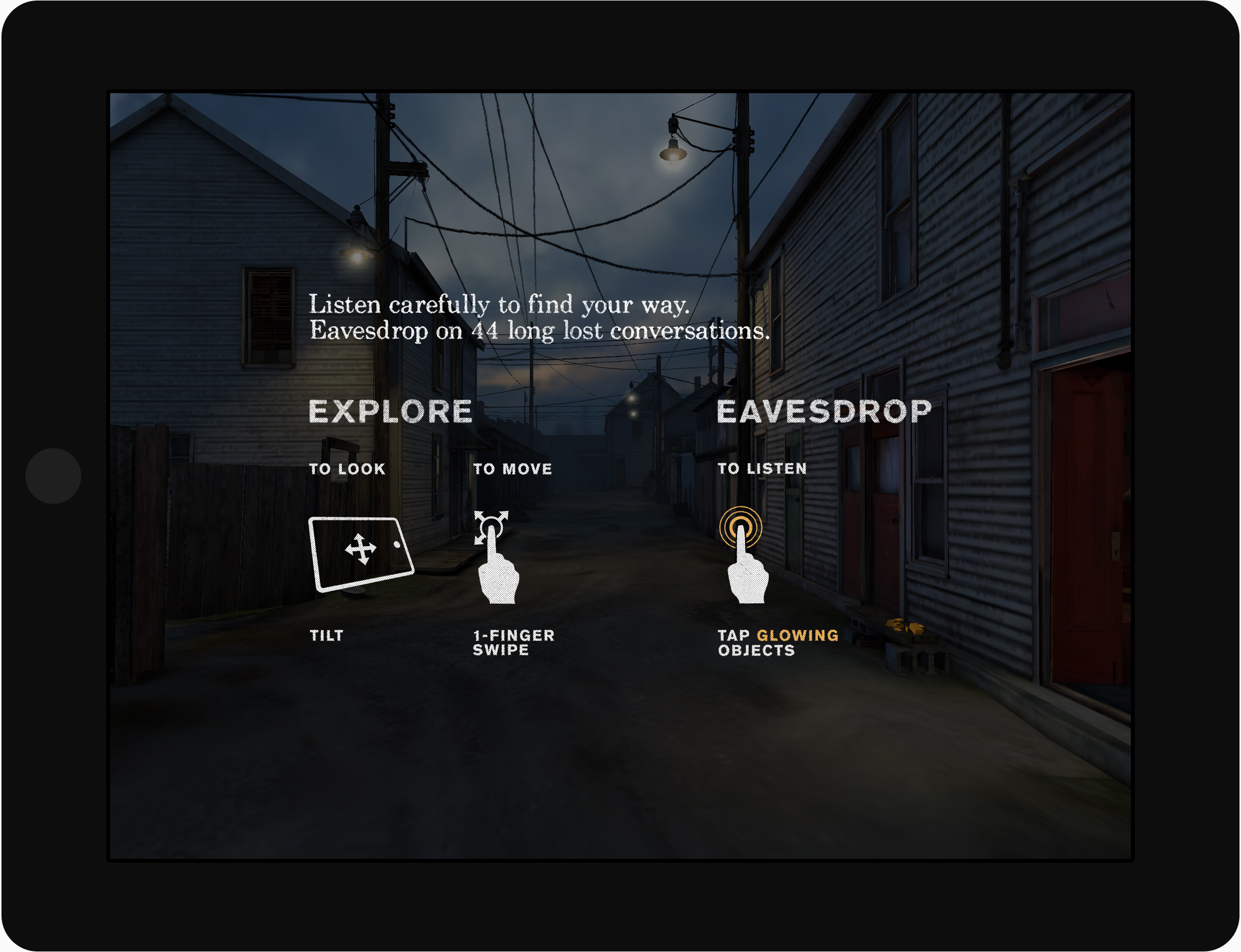
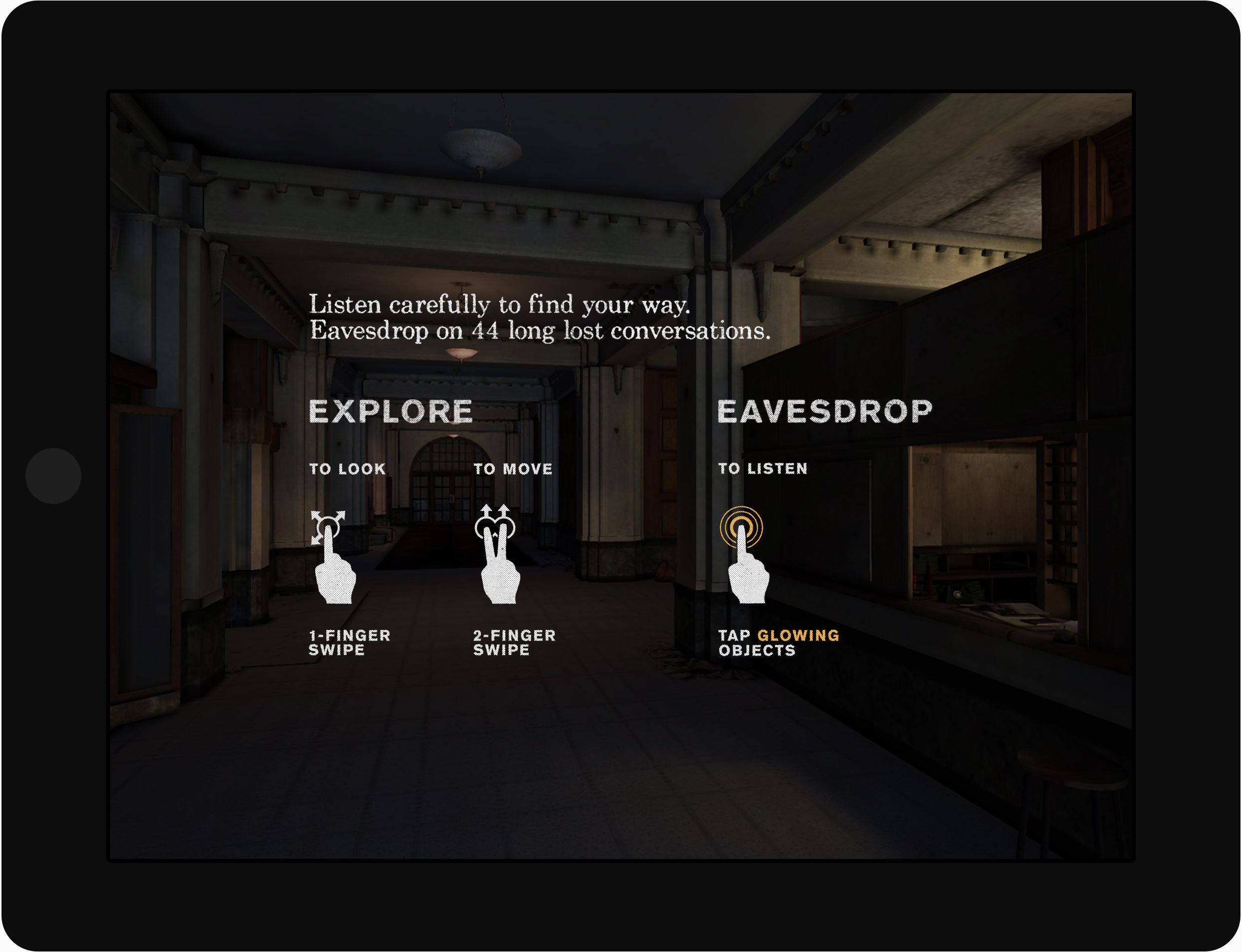
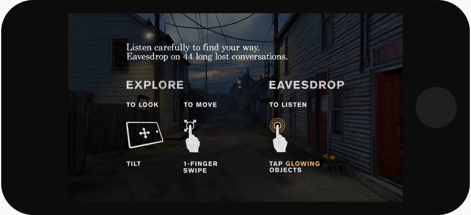
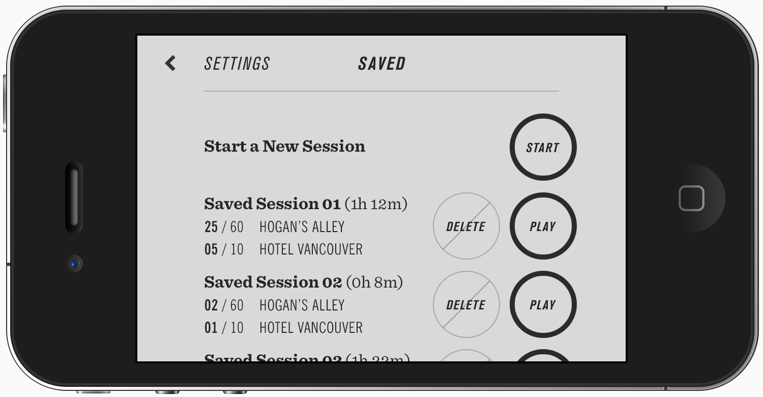
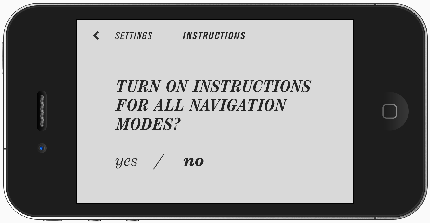
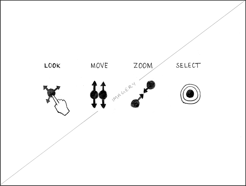
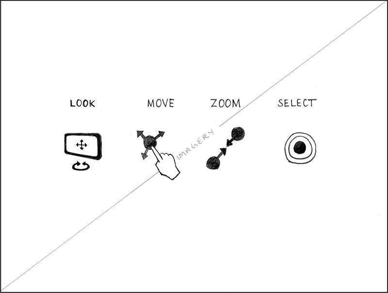
The audience is free to choose between two navigation modes: touch or gyroscope-driven.
Slideshow — instructional screens corresponding to navigation mode
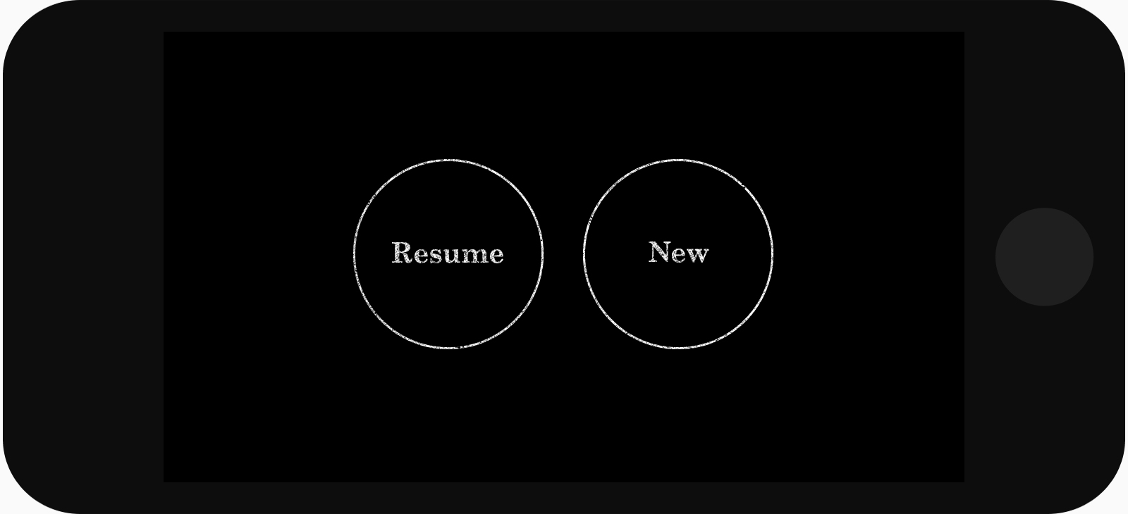
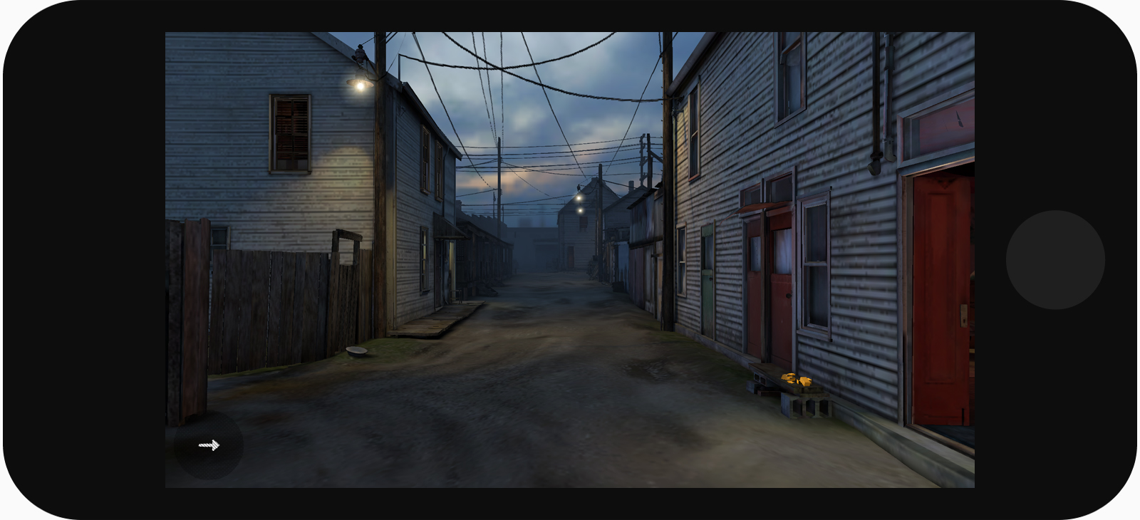
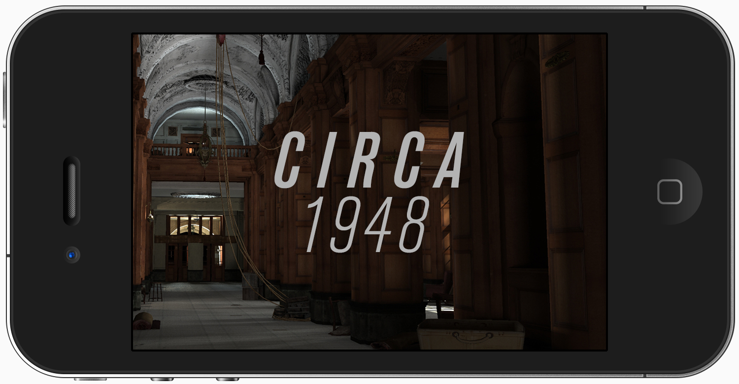
The first 30 seconds
The app’s opening moments quickly get the user immersed, situated and ready to explore.


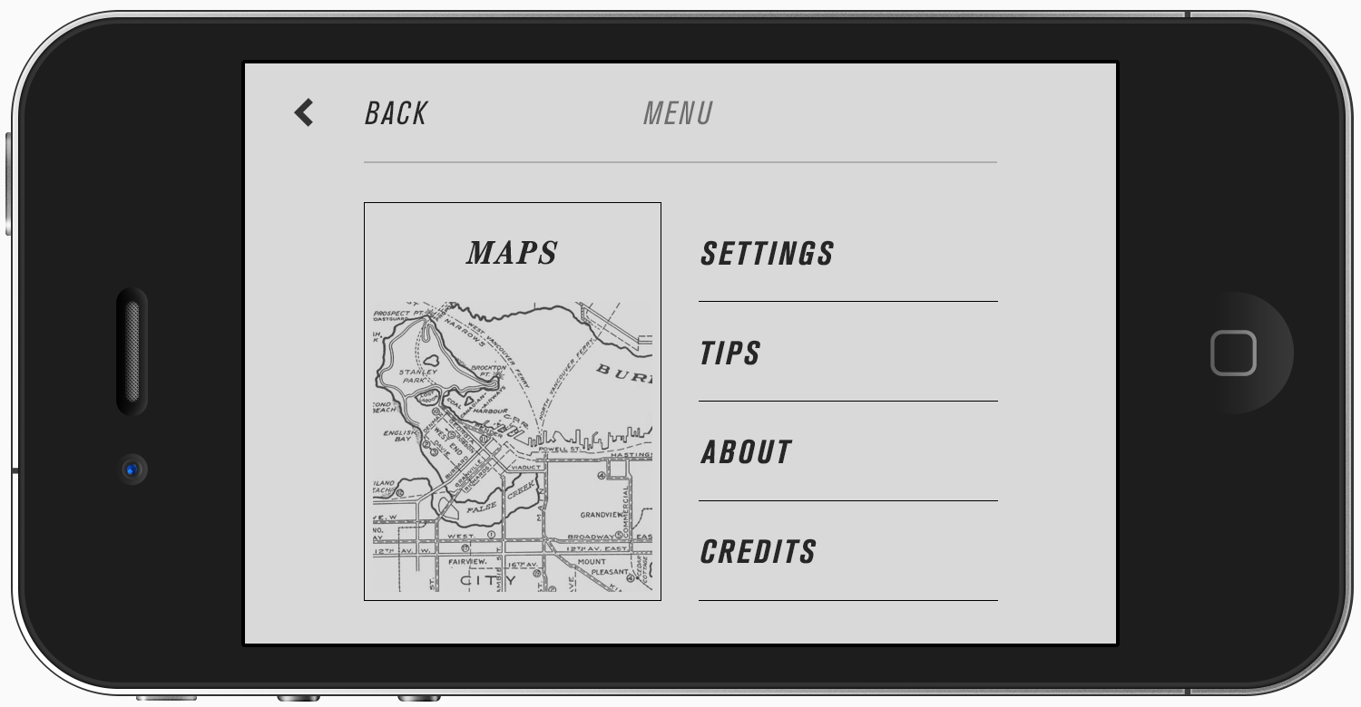
Simple ribbon menu
Settings, options, and information are hidden behind a lone interface button.
Slideshow — phone screen ribbon menu states

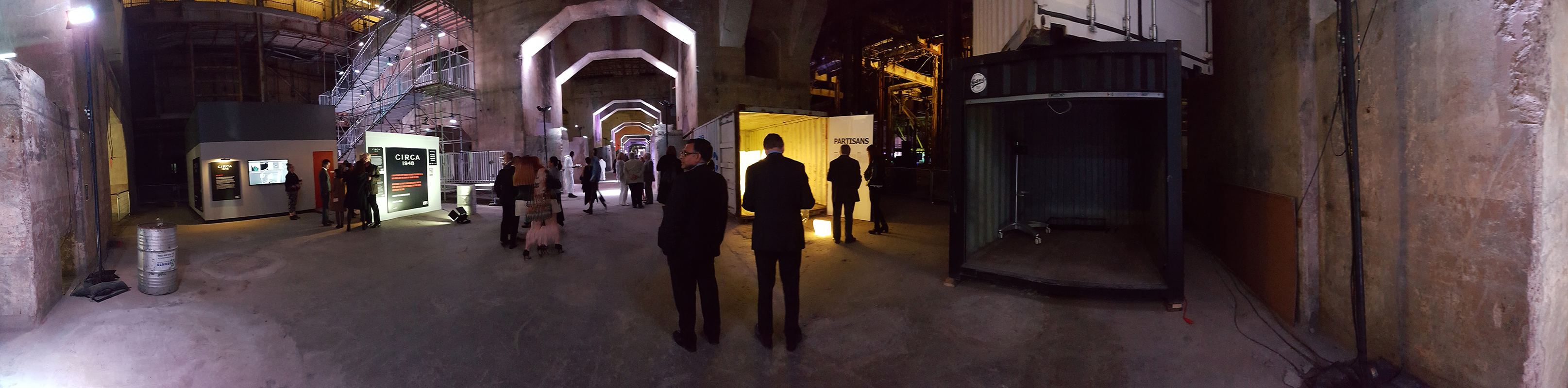
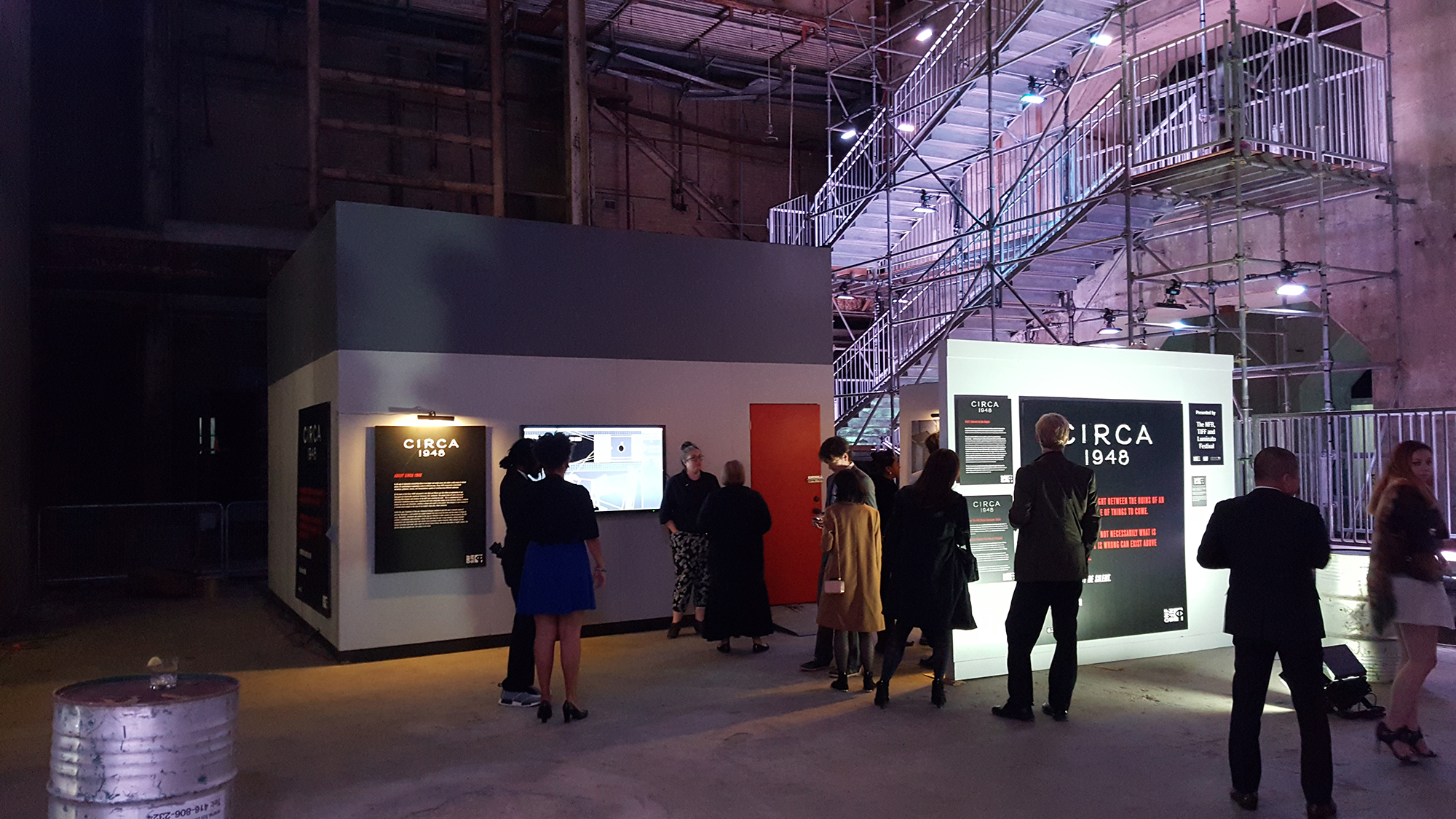
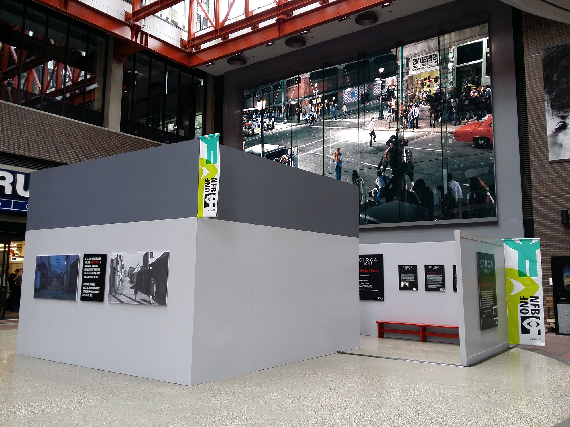
Your whole body
An immersive art installation
Circa 1948 also toured internationally as an interactive projection-mapped installation that debuted at the Tribeca Film Festival in 2014. While I didn’t design directly for the installation, the app’s UI and typography, as well as my design work on the Circa microsite, served as art direction for the installation design.
Aside from installing the app, these two videos are the next-best way to get a sense for what it’s like to experience the storyworld.
Circa 1948 trailer
At the Tribeca Film Festival
Installations at the 2016 Luminato Festival (Toronto) and the Woodwards building (Vancouver)


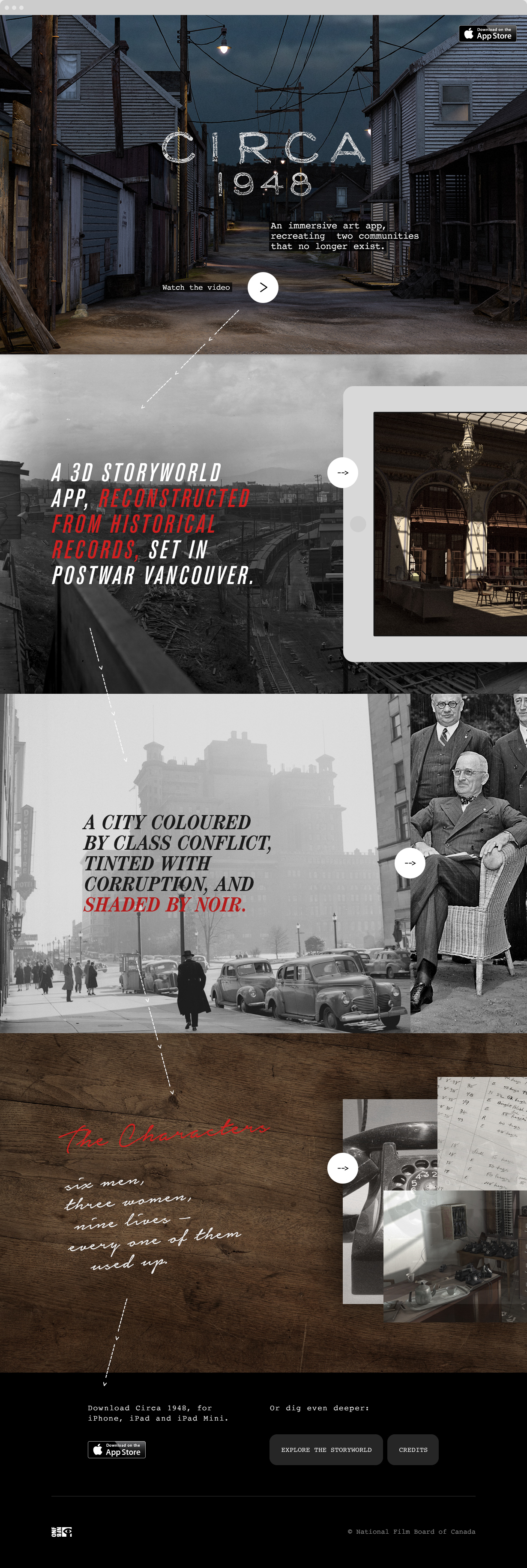
Paint a picture
The microsite
I was also asked to design the app’s promotional microsite; its goal was to drive downloads and educate the audience on the context and purpose of the project. The site’s Art Director, Jeremy Mendes, proposed a 3-part thematic structure with which to explain the app: form, time, people.

My role was to translate this thematic structure into a page layout and UI, infuse a period-specific typography language, and curate and manipulate photos and renders for the various sections.
In broad strokes
The main page
We settled on a simple layout: a vertical stack, comprised of four full-bleed sections. Except for section one (the landing screen), each section block served as a cover to introduce one of our three breakdown topics (form, time, people) and provide entry to a slideshow to dive deeper.
Unfortunately, the “time” and “people” sections (panels 3 and 4) were never developed.
View it live Circa 1948 microsite ↗
Final static design comp, microsite main page
![]()
But how does it feel?
Motion + interaction sample
This video — produced with an earlier iteration of the design comp — demonstrated how it would feel to scroll the promo site’s page and interact with the slideshows.
Video — a motion mock-up of the microsite’s flow and interactivity
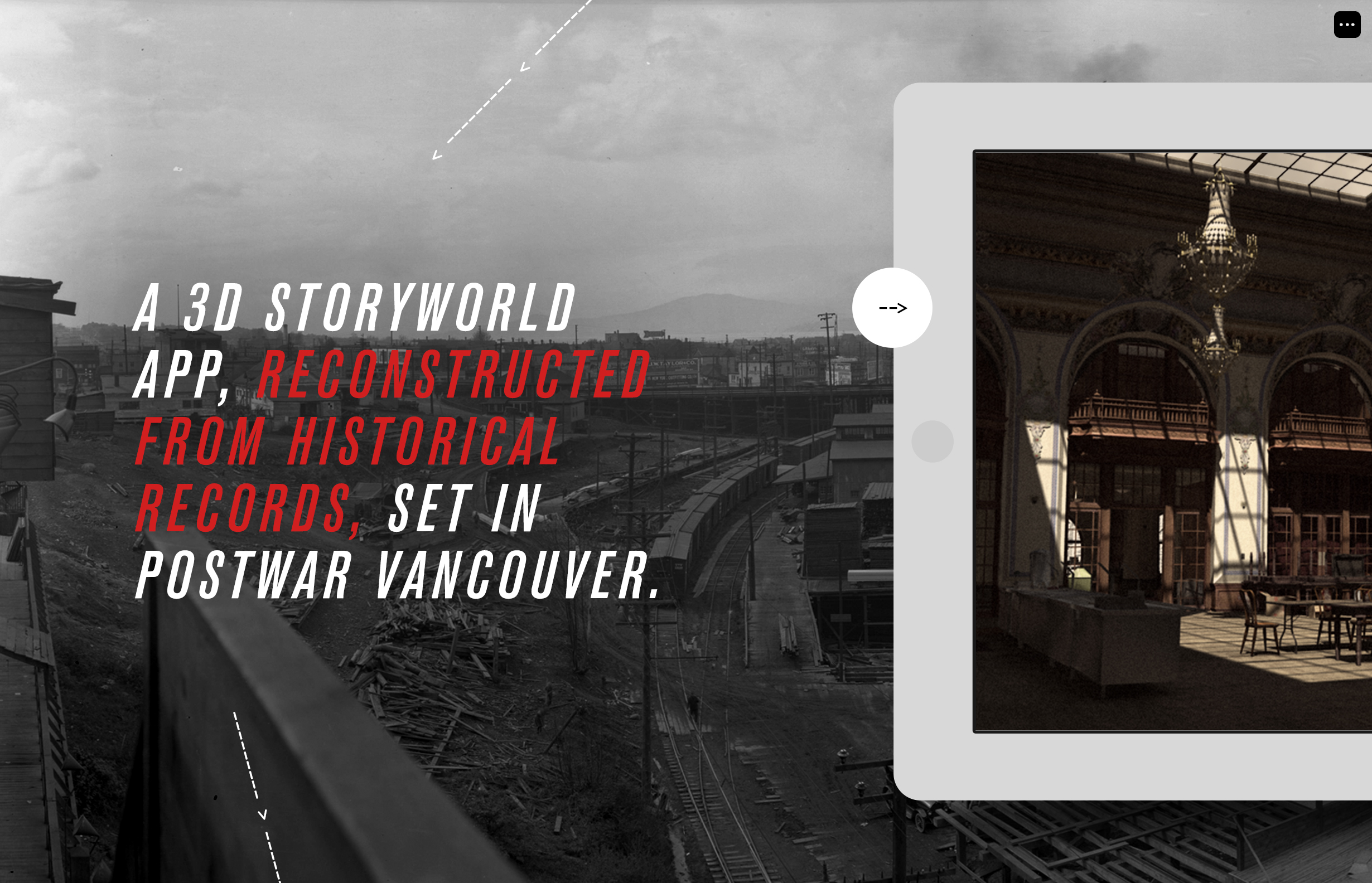
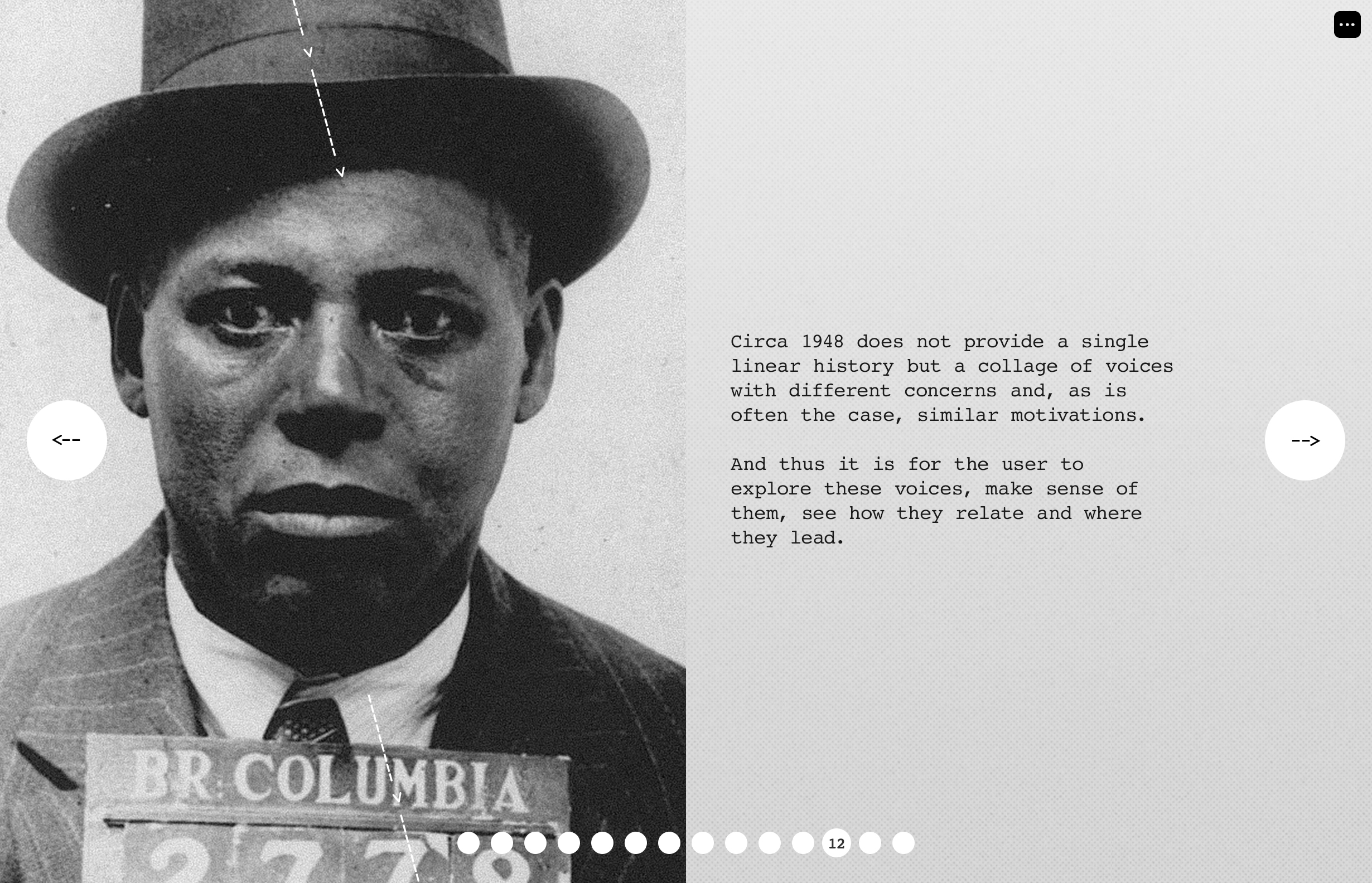
A collage of voices
Section one: form
With a period photo of False Creek’s grimy logging industry as a backdrop, the microsite’s first section introduces the app and its two settings: the Hotel Vancouver and Hogan’s Alley. Also mentioned are the rules of the storyworld, and the ghost conversations that can be uncovered.
Slideshow — final design comps for the microsite’s section one: form


Tinted with corruption
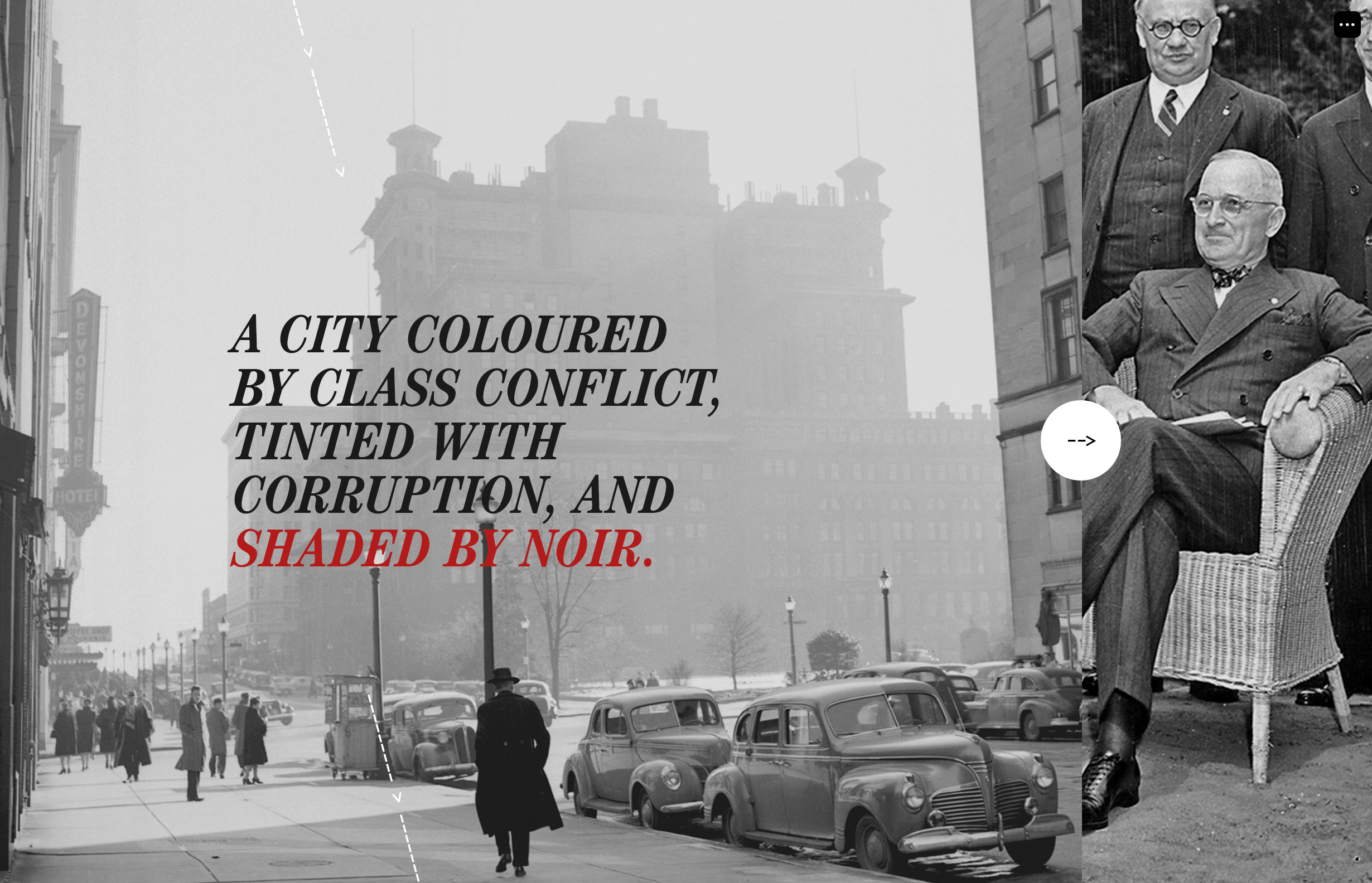
Section two: time
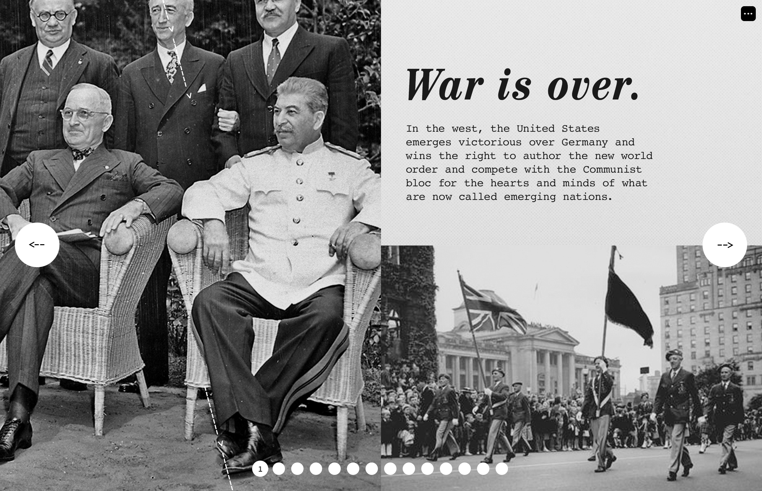
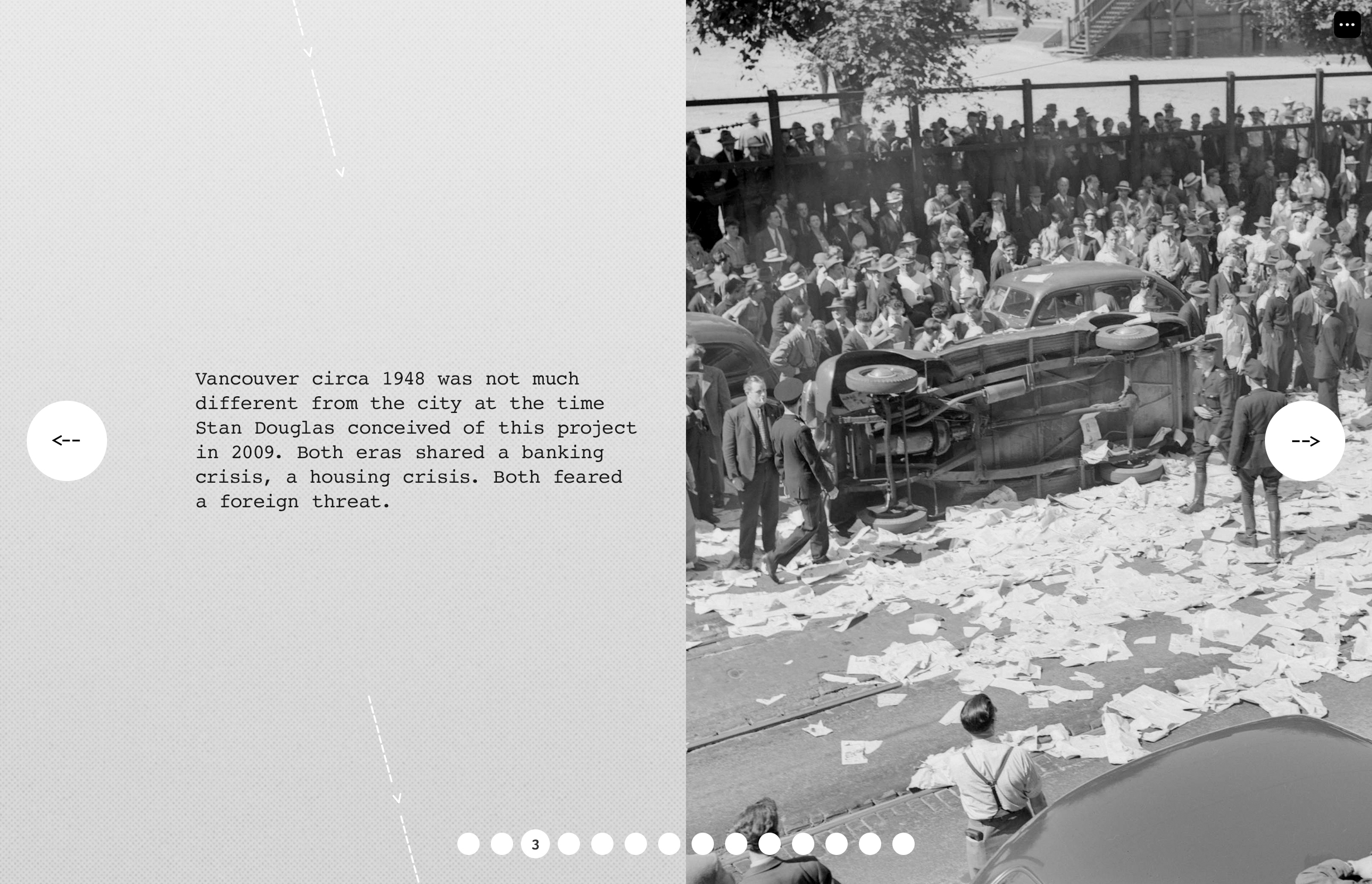
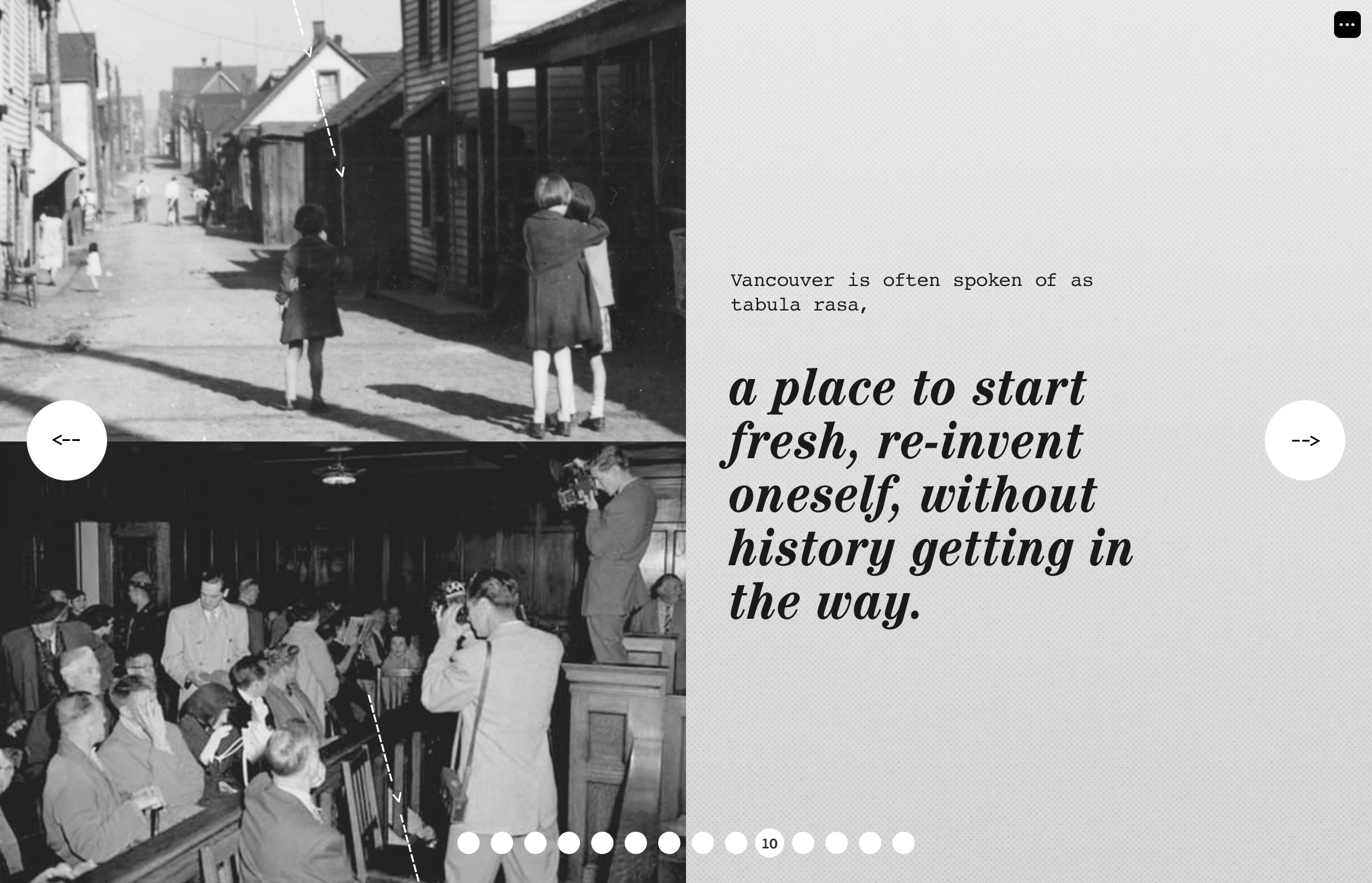
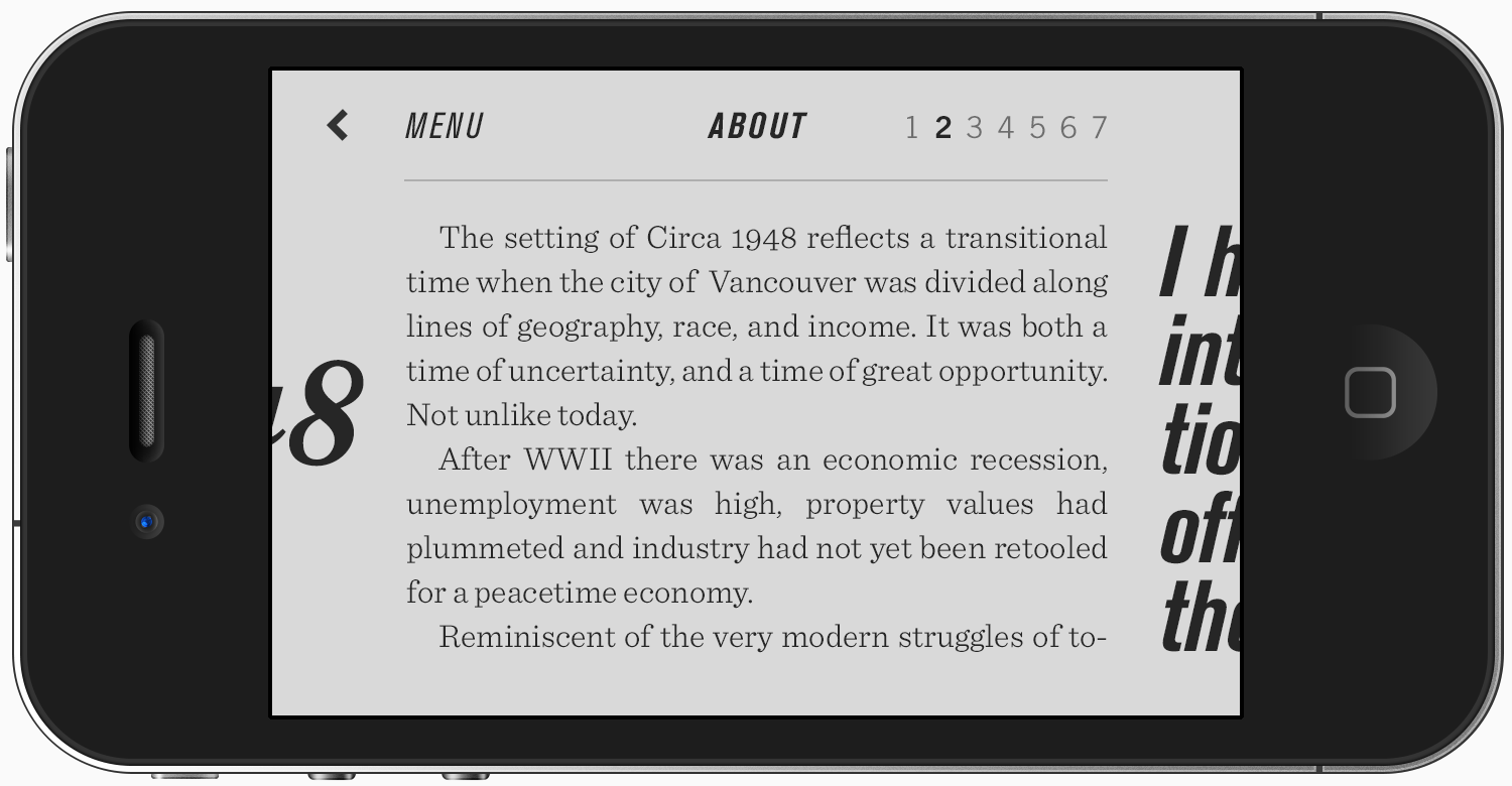
The second section outlines the historical background of late 1940s Vancouver, and the gritty post-war political, social and economic forces influencing the story. Bringing Circa 1948 into full scope, the text and imagery here also draw connections to the Vancouver of today, a city in rapid flux.
Slideshow — some final screens for section two: time

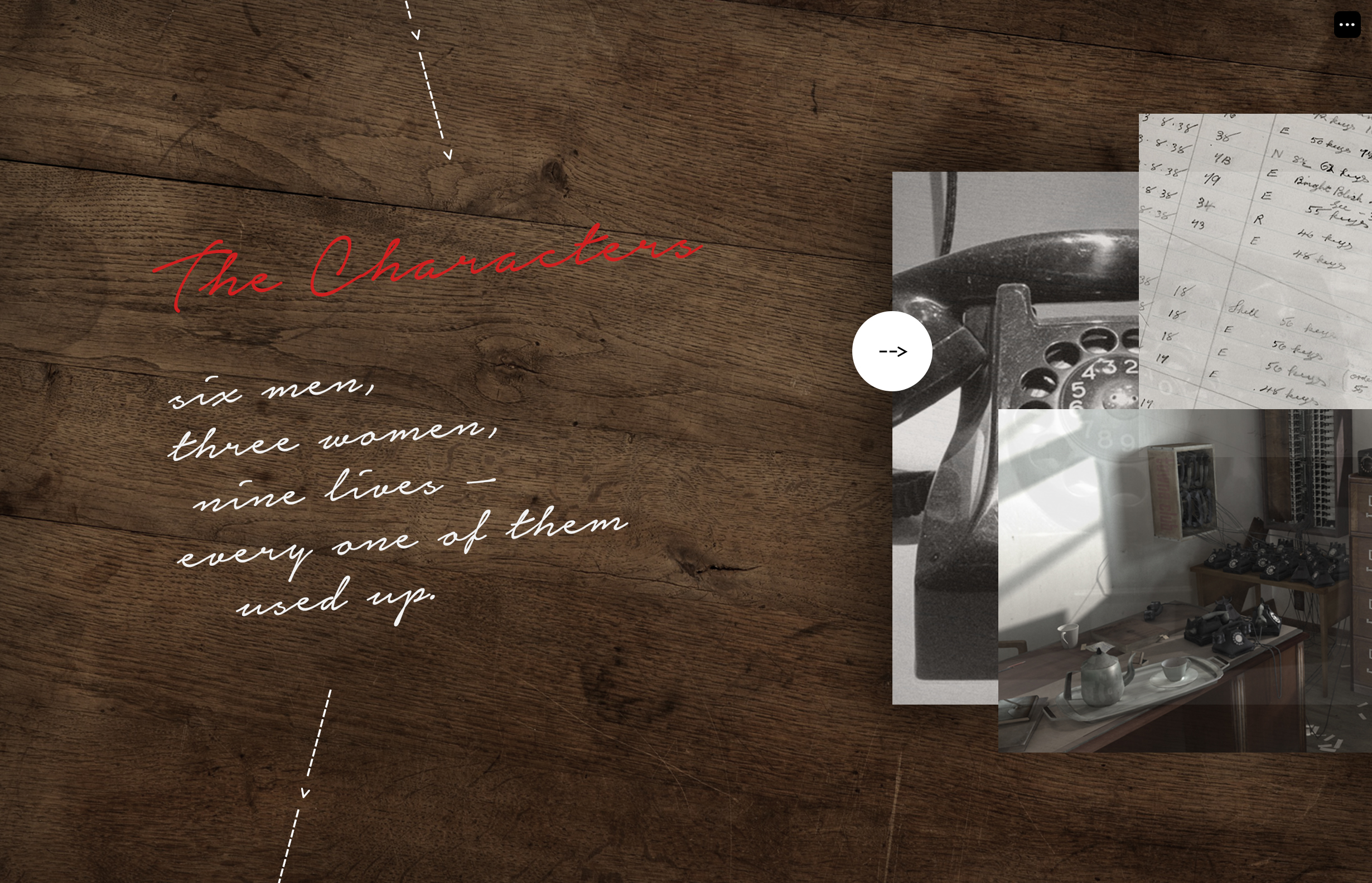
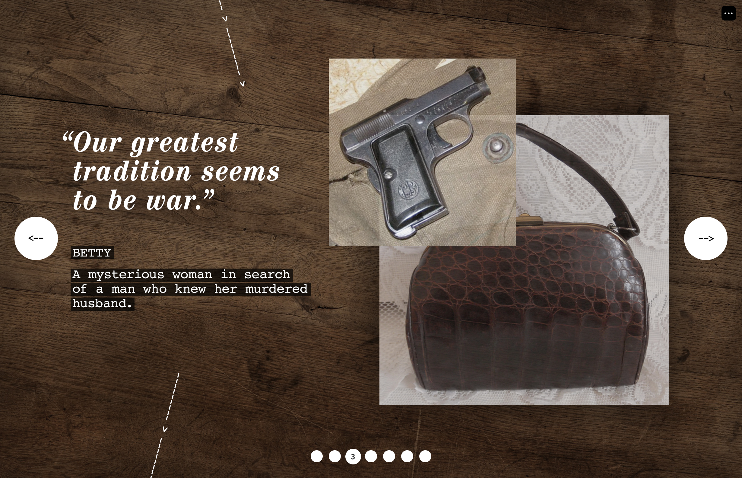
Lives — and every one used up
Section three: people
In the final section of the microsite, the viewer is introduced to key characters they will encounter in the storyworld: homeless veterans, grifters, newlyweds, immigrant workers, gamblers, corrupt politicians and cops. Since the app has no human forms — just voices and ghostly shapes — objects were used to represent each person.
Slideshow — some final design comps for the website’s section three: people

A temporary, teaser version of the microsite
![]()

Countdown ‘til launch
Teaser page
Several few months before the app dropped, I was also asked to design a simple teaser version of the microsite, announcing the project.
Digging through dust
Design Exploration
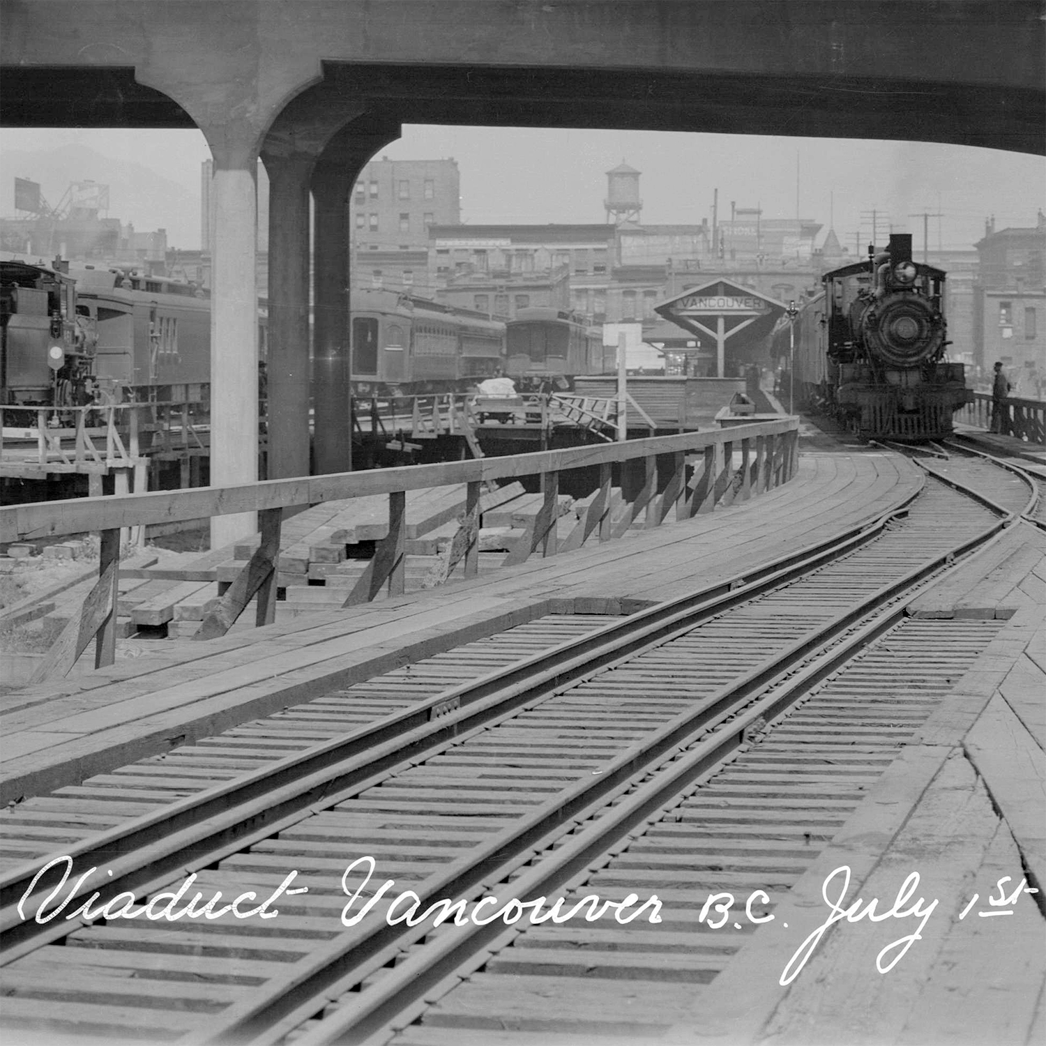
A project dripping in historical commentary required a discovery infused with some historical research. I had some fun hours getting dusty in the British Columbia Provincial Archives in Victoria.
Research + inspiration
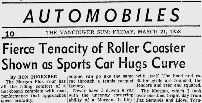
While the storyworld’s 3D scenes were carefully reproduced with period-accurate detail, the grit and tones of the archival photography also influenced my UI work for the app and promotional material.


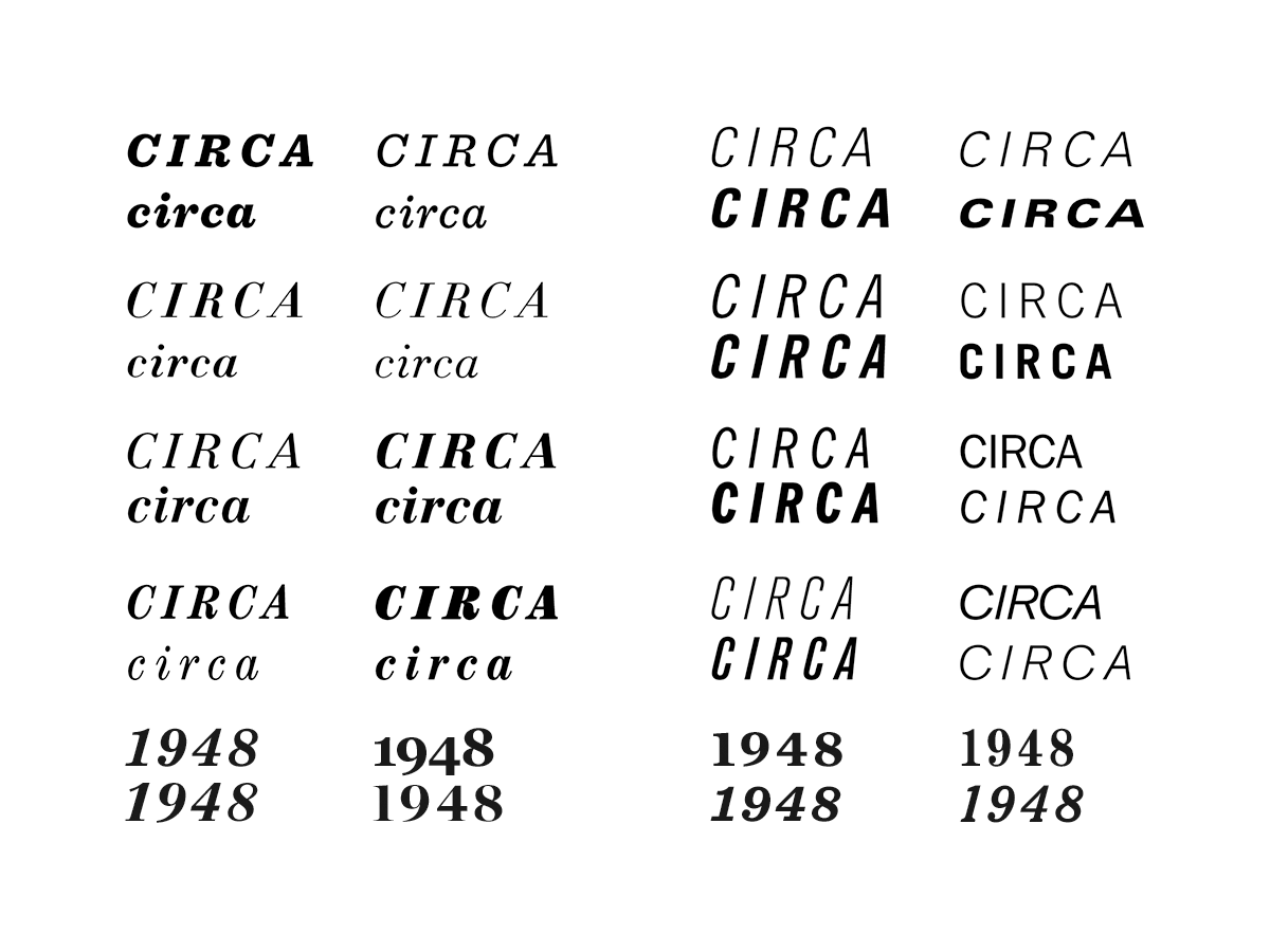
Design cues were taken from mid-century newspaper typography, particularly typeface pairing, text density, headline tracking and italics, and the mix of upper and lower case. The feel is very industrial, busy yet stark.


Also referenced was the handwriting on archival photographs, and the way it had cracked and degraded.
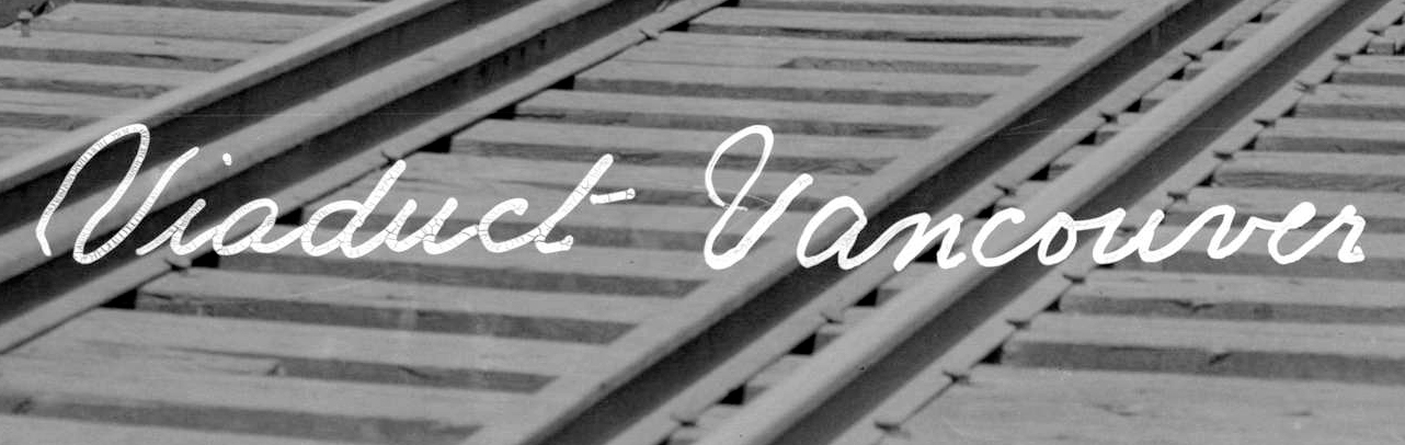
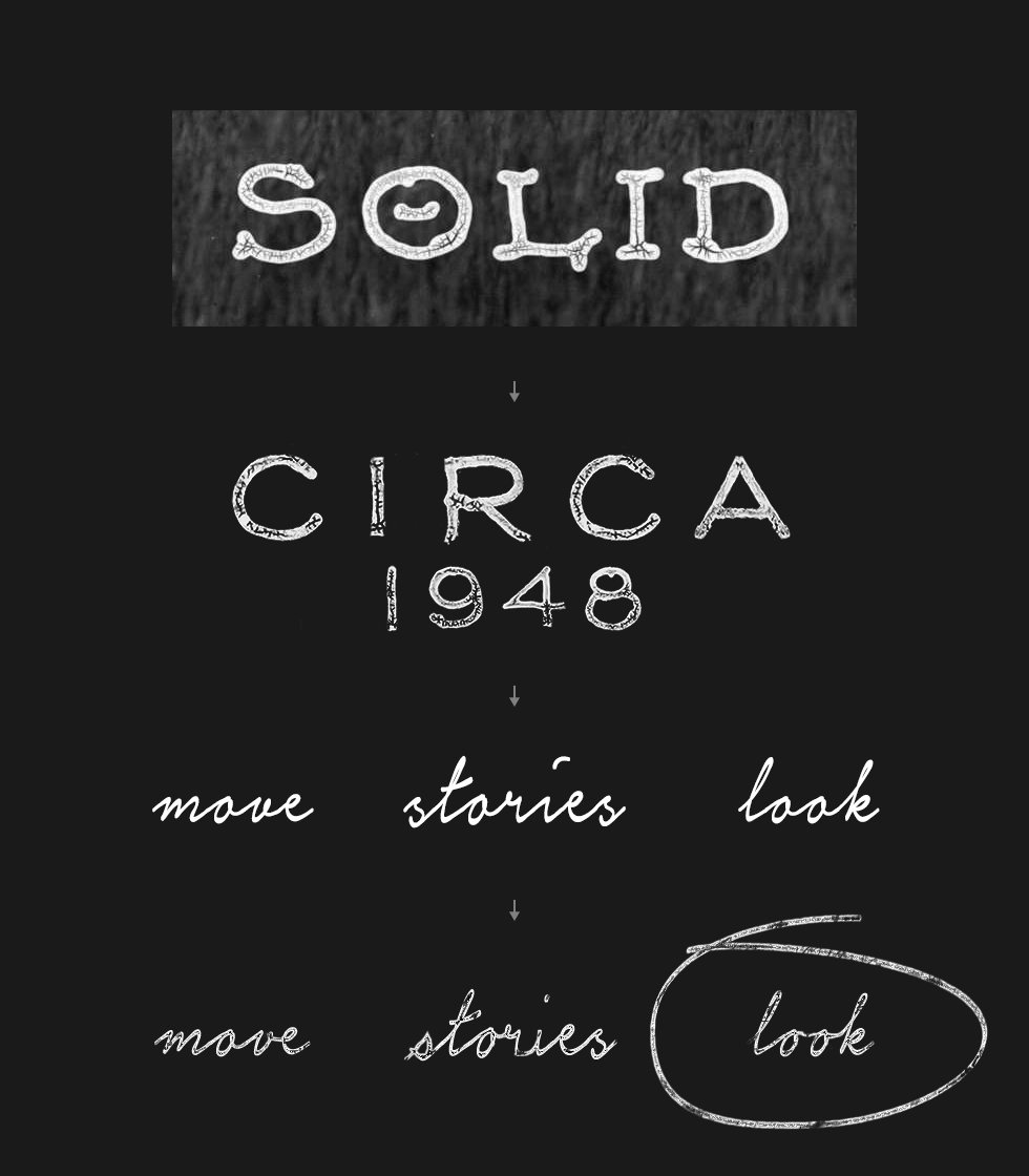
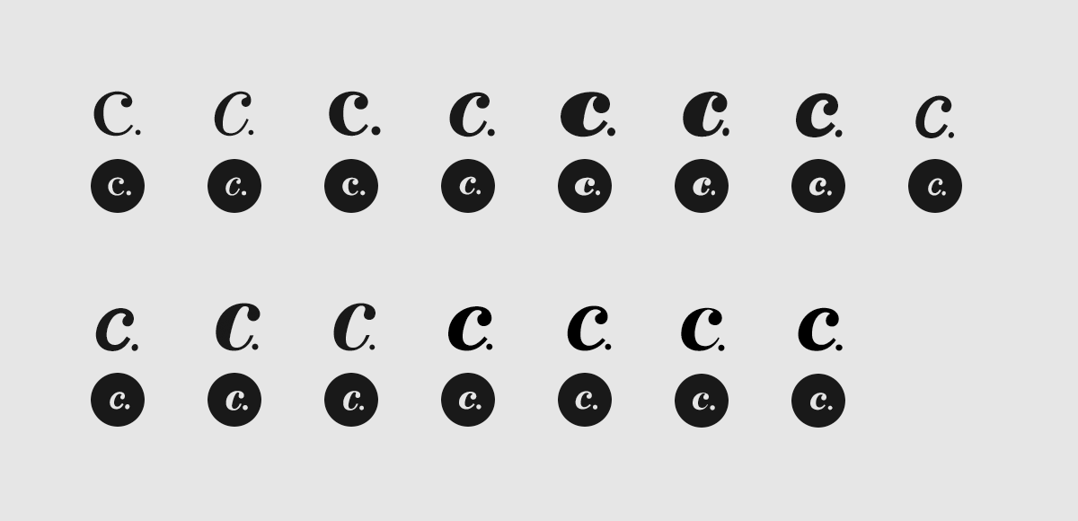
Canadian gothic
Type exploration
Many typefaces and letterforms were tested, looking for mid-century, newspaper-inspired combinations.


Type-first
Styleguide
Early Circa app styleguide screens show a UI, and layouts, that are almost exclusively made of period-specific type (in lieu of icons and illustrations) in a clean and vector-based style (no distressing). The feel is barebones, practical and timeless, and blurs the lines between mid-twentieth-century and present day.
Slideshow — wordmark samples for an early app styleguide
Slideshow — navigation sample for the styleguide
Slideshow — About + Settings screens for the styleguide

Across ballrooms + laneways
Early app design work
Initial design iterations continued with the type-centric UI and styling.


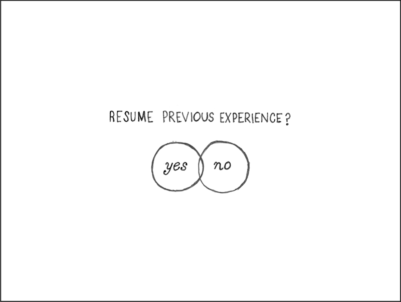
Interface sketches
As the app’s scope shifted, a more graphic style was requested, and we revisited the UI plan. These sketches reflect closely the final design of the interface.
Distressing
Eventually, a distressed style was committed to, and the textures of mid-century printing technology (i.e. ink bleed, halftone) from the design exploration came back into play.
The wordmark was ultimately constructed (by Johnny Ostrem) from handwriting found on archival photographs, and these cracked ink textures informed the titles digitally built for the app screens.