Hungry Month of March
Nothing but skin + grief
Meet 10 fishers, farmers, hunters and foragers who supply a burgeoning haute cuisine in Newfoundland, and at the same time are rediscovering a tradition of self-sufficiency-by-necessity in a remote northern landscape.

Type
Website (interactive video anthology)
View it
hungry.nfb.ca
Agency
NFB Interactive
Awards
Winner, Website/Microsite, 2018 Communication Arts Interactive Annual // FWA Site of the Day // Nominee: 2018 Canadian Screen Awards
Website (interactive video anthology)
View it
hungry.nfb.ca
Agency
NFB Interactive
Awards
Winner, Website/Microsite, 2018 Communication Arts Interactive Annual // FWA Site of the Day // Nominee: 2018 Canadian Screen Awards
Role
Art direction, design (visual concept, IA, screen flow, UI, layout, typography, iconography), seasonal header video production, motion samples.
Collaborators
Production, videos, writing by Rosemary House // Production (NFB) by Annette Clarke, Dana Dansereau, Nicholas Klassen, Laura Mitchell // Drawings by Bruce Alcock // Wordmark and season titles by Caleb Beyers // Development by Patrick Matte // Music by Joshua Stevenson
The rough cuts
Videos, metaphors + drawings
I was brought on board and introduced to Rosemary House, a resident Newfoundland filmmaker with a collection of rough video edits in which she interviewed locals who were reconnecting with, and reinventing, ways to work the land for food production.
Rosemary wanted to inject the anthology with the narrative of the Hungry Month of March, Newfoundland’s term for the not-so-long-ago scramble for food during winter, when your pantry would grow dangerously bare. It provided a historical context and merged nicely with the story of the restaurant suppliers who were using traditional, sustainable methods of food gathering and production.
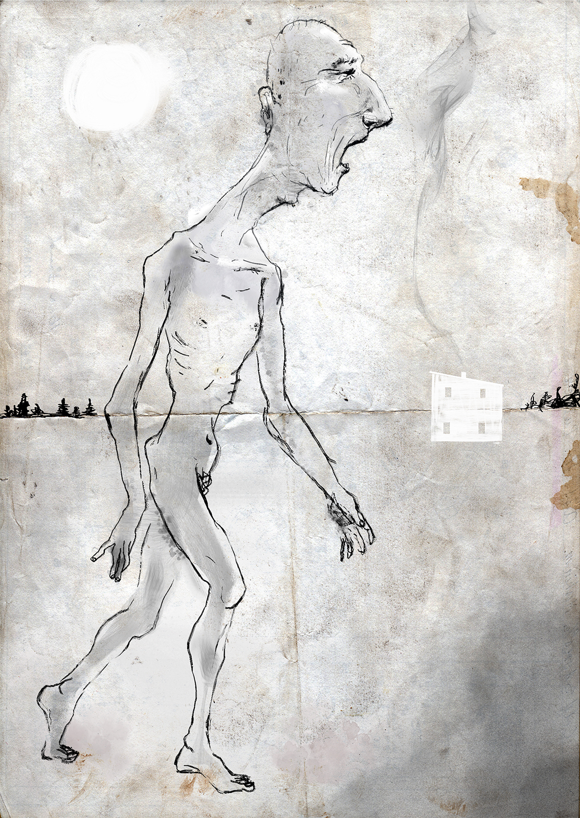
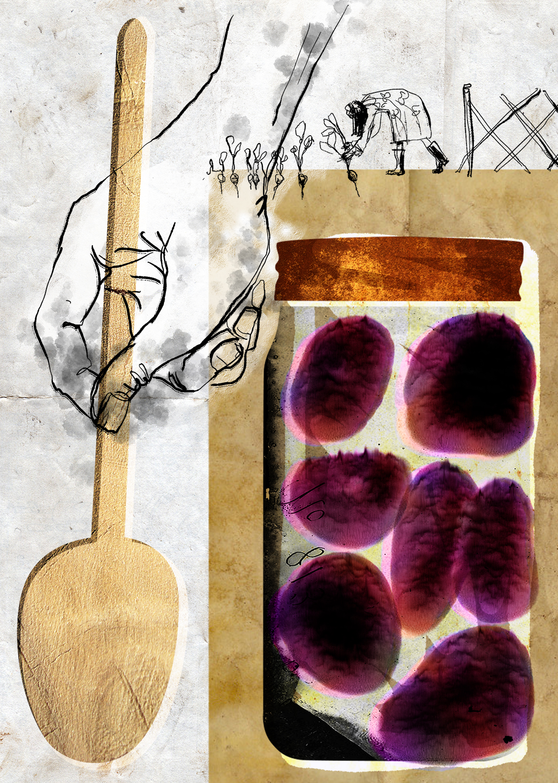
Rosemary and Annette Clarke of the NFB had already commissioned Bruce Alcock for a fantastic sample of test illustrations, and we had the opportunity to request more.
Rosemary and Annette Clarke of the NFB had already commissioned Bruce Alcock for a fantastic sample of test illustrations, and we had the opportunity to request more.
Some of Bruce Alcock’s initial drawings

Wrap it... in something
My role
My role on the Hungry Month of March site was two-fold:
- On an upper-level, determine a thematic structure for the video content, to provide some chapter flow and a path for the user to follow.
- Design a visual language for the site’s UI and layout that would complement the structure, enrich the video content, and incorporate Bruce’s illustrations.
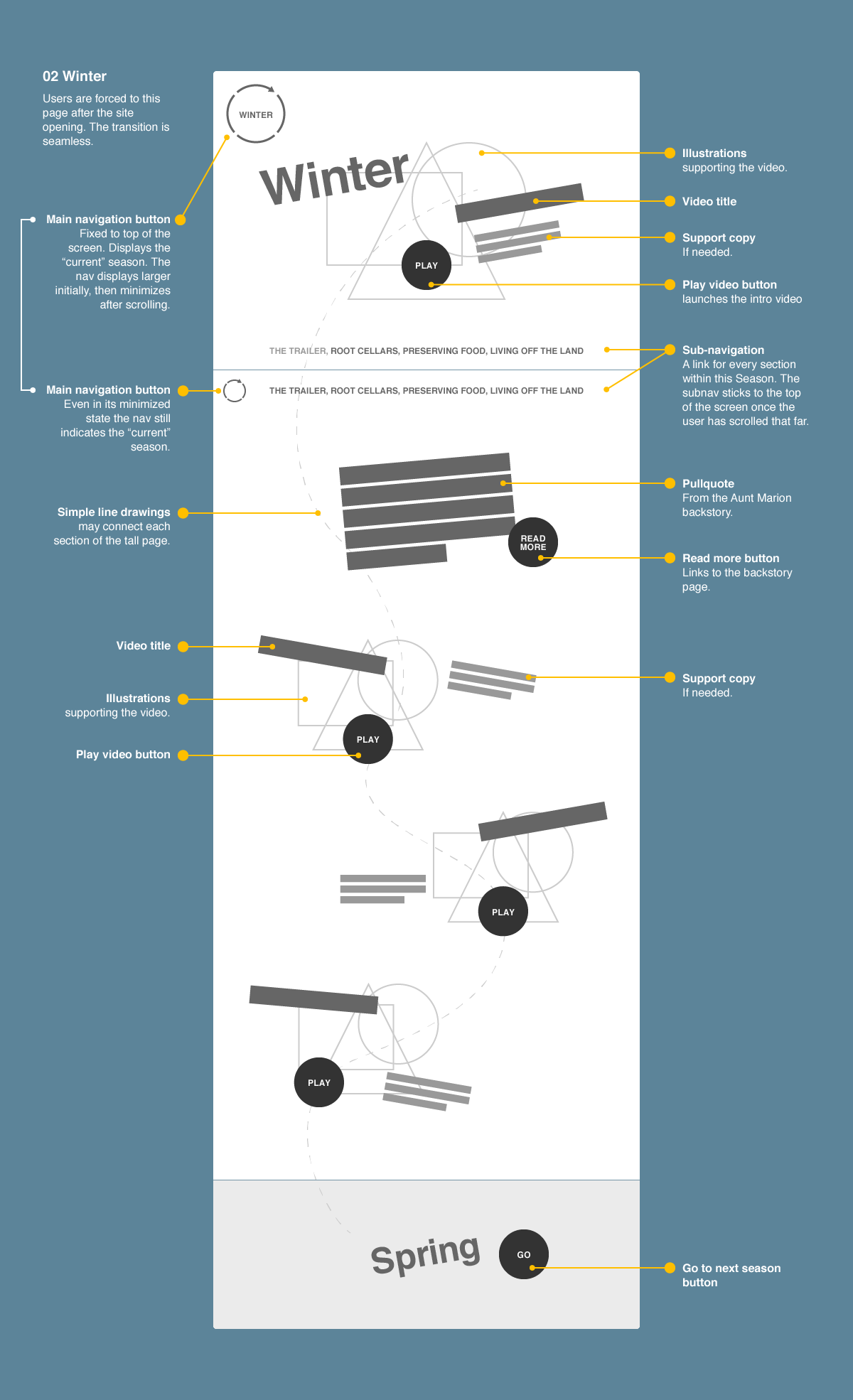
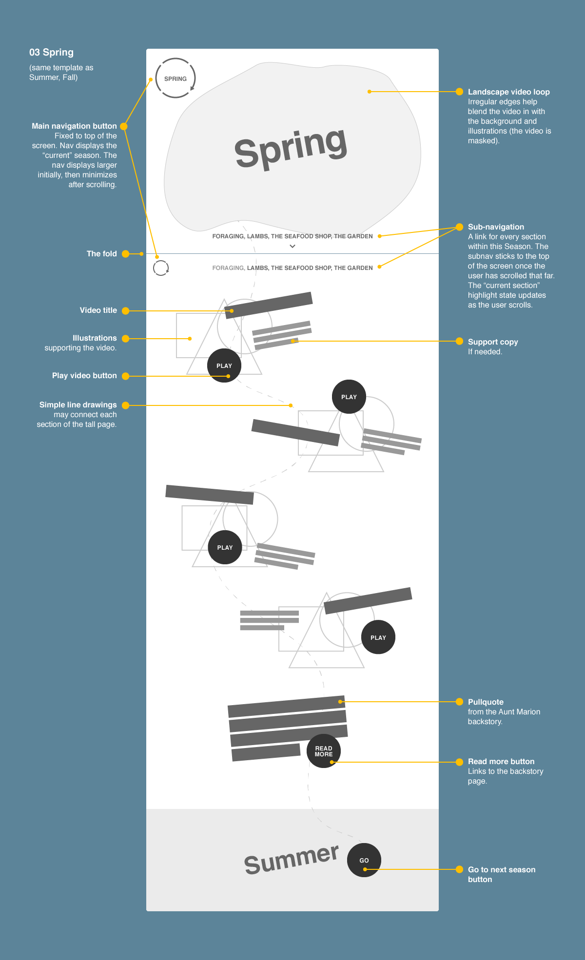
There is a season
Planning structure + style
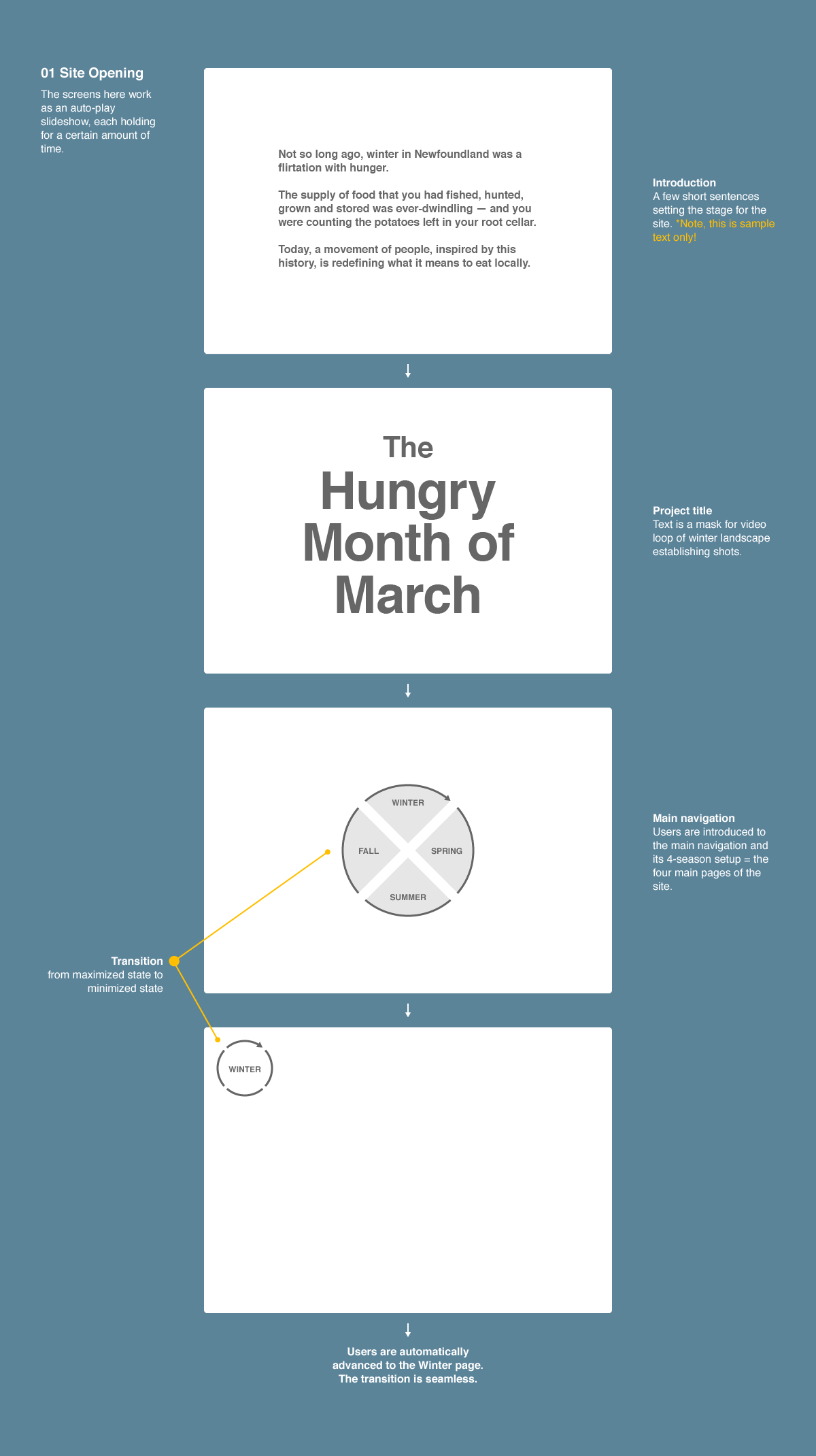
I set out to come up with several possible frameworks for the anthology, knowing that this concept would also inform the topics and final edits for each video.

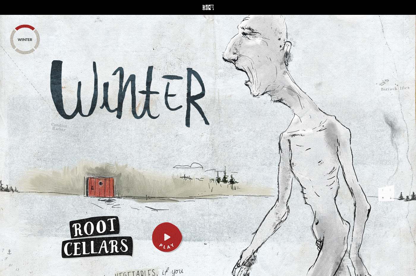
“The Seasons” provided for a promising structure, lent itself nicely to a passing-of-time, intimate, sketchbook / diary visual style, and solved the opening of the site: the Hungry Month theme, and our first chapter, winter, could be introduced right off the top as one and the same.
As this was a smaller-than-usual NFB project, it made sense to wireframe a UI, flow and layout that could behave almost identically regardless of the screen size.
IA
As this was a smaller-than-usual NFB project, it made sense to wireframe a UI, flow and layout that could behave almost identically regardless of the screen size.
A mid-progress wireframe package
Styleguide (with and without notes)
![]()
![]()
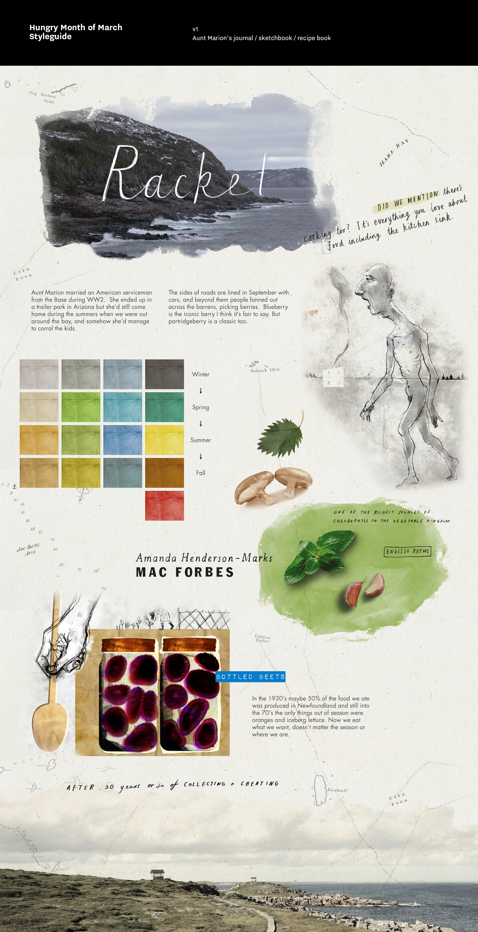
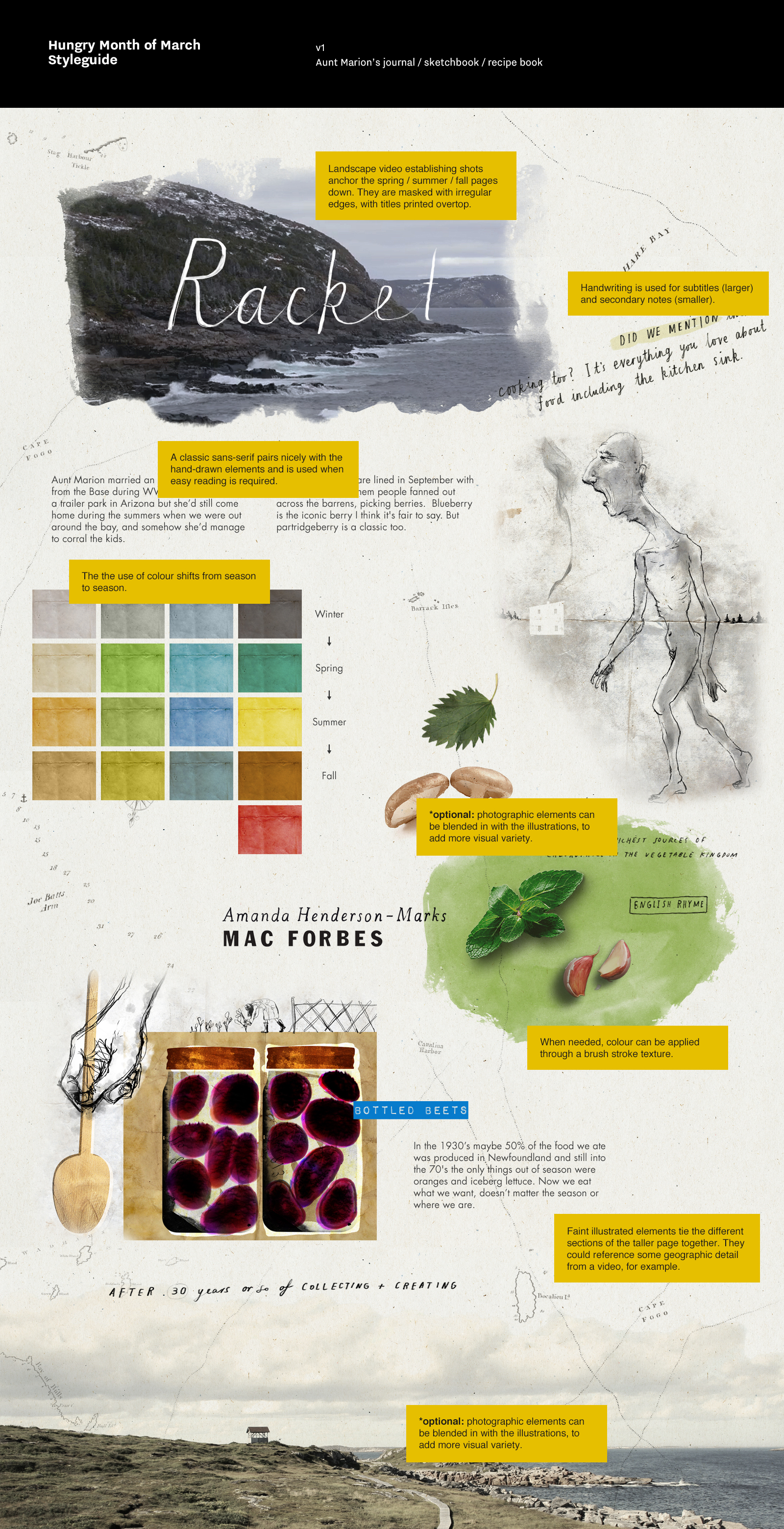
Styleguide
A hybrid journal / recipe book / sketchbook provided the metaphor for the visual form. The owner of the sketchbook was Aunt Marion, a Newfoundlander who can remember struggling through lean winters and the Hungry Month of March.
Later, as the design of the pages progressed, the challenge was to create modular layout patterns that would be easy to build while still maintaining some of the freeform layout of a sketchbook.
Where nothing grows
The launchscreen
Winter provides the kick-off for the season-structured content, and its videos are also an introduction to the tradition of the Hungry Month and Newfoundland’s particular history of self-sufficiency and sustainability.

Turn, turn, turn
The experience
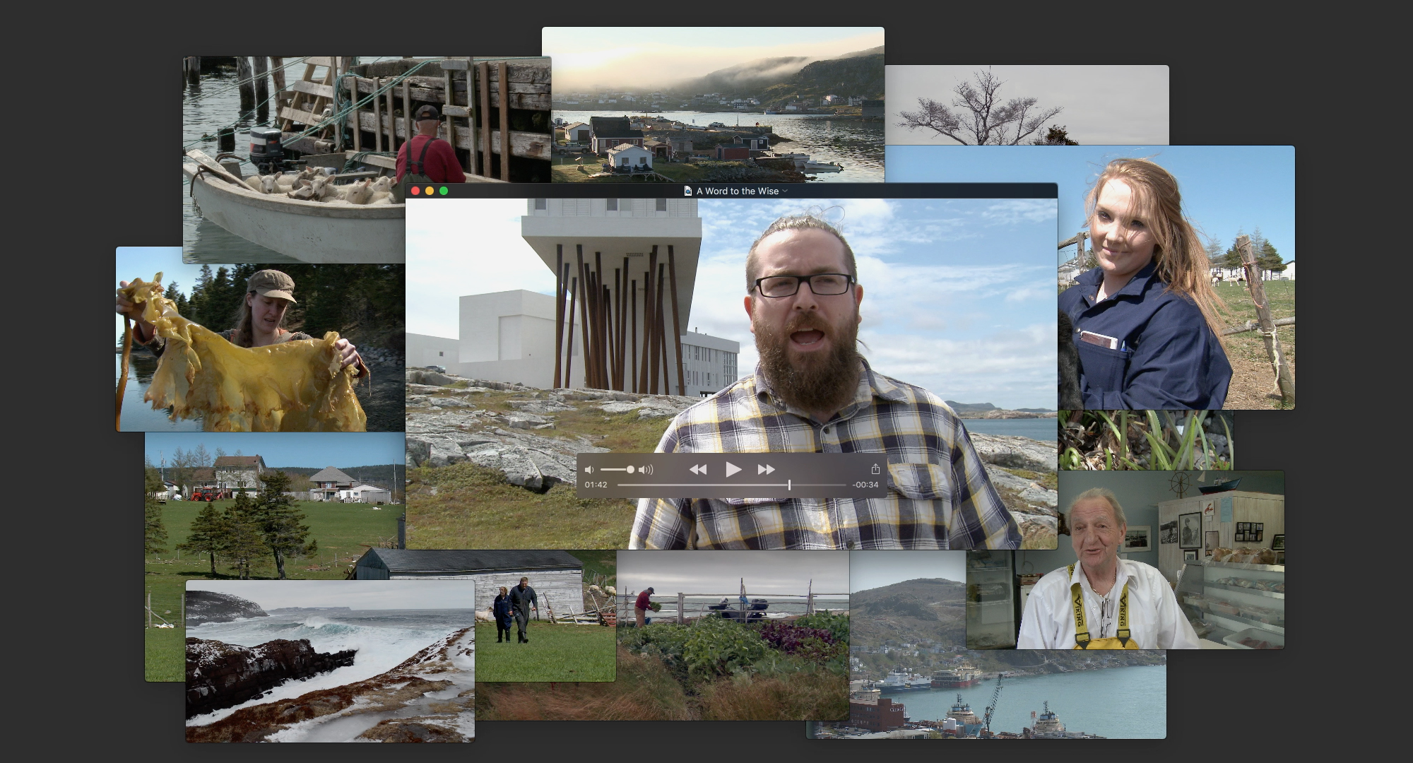
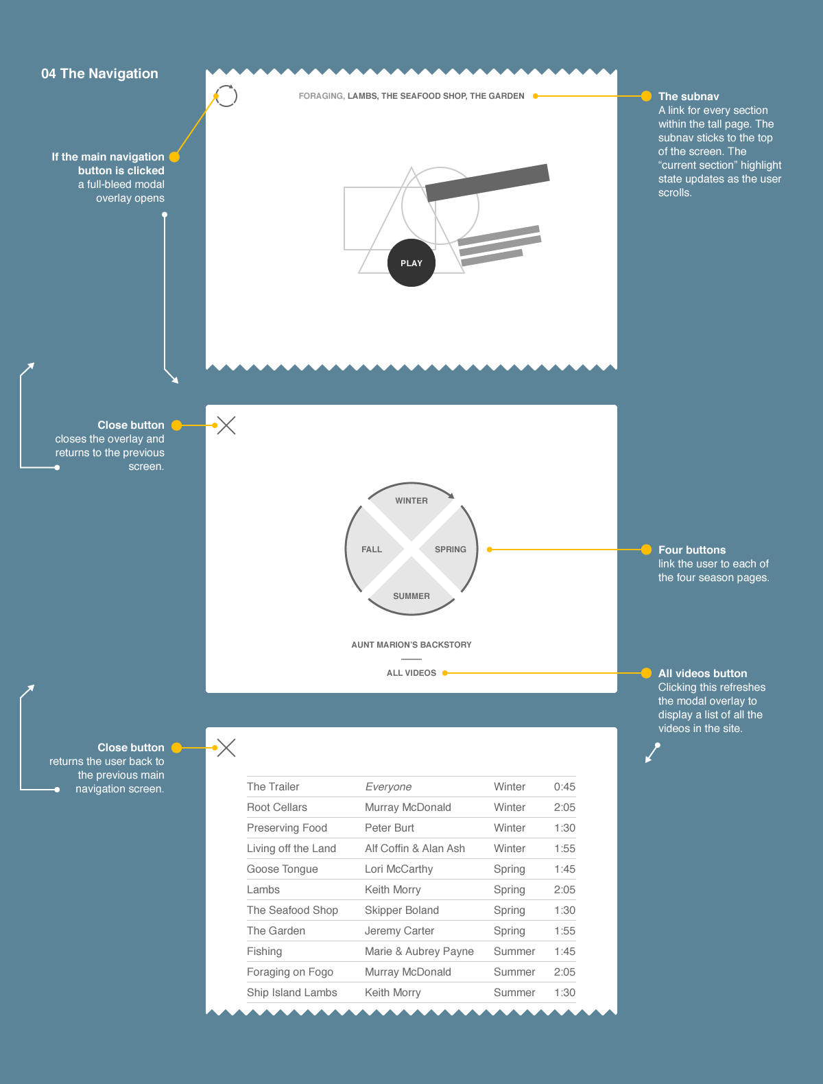
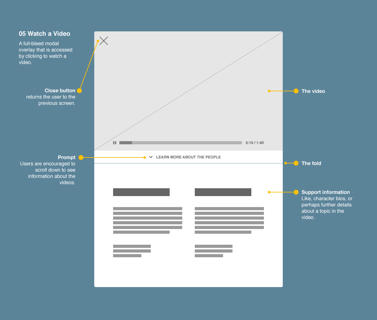
Viewers engage the site through a collection of 14 videos accessed through a scrollable modal, season-to-season vertical transitions, and a navigation overlay that allows users to skip the chronological hand-holding and jump to any season, video, or page. Take a look:
Video — screencast of the HMM interaction, on desktop
A moving window
Season header videos
Short vignette videos mark the beginning of a new season. Masking these moving landscapes with abstract brush strokes helped inject them into the page in a painterly fashion.
Video — compilation of embedded videos (includes some alternate versions)
Of all sizes and shapes
Responsivity
The simple UI and content flow allowed the layout to work easily at any screen size.
Various phone and desktop design comps


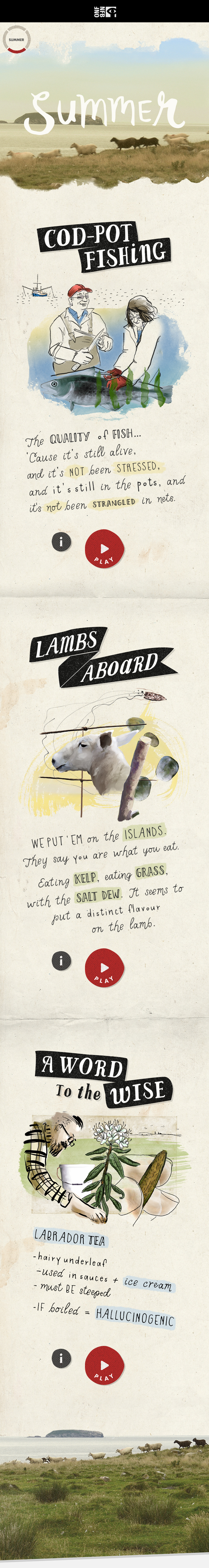
Eating kelp, eating grass
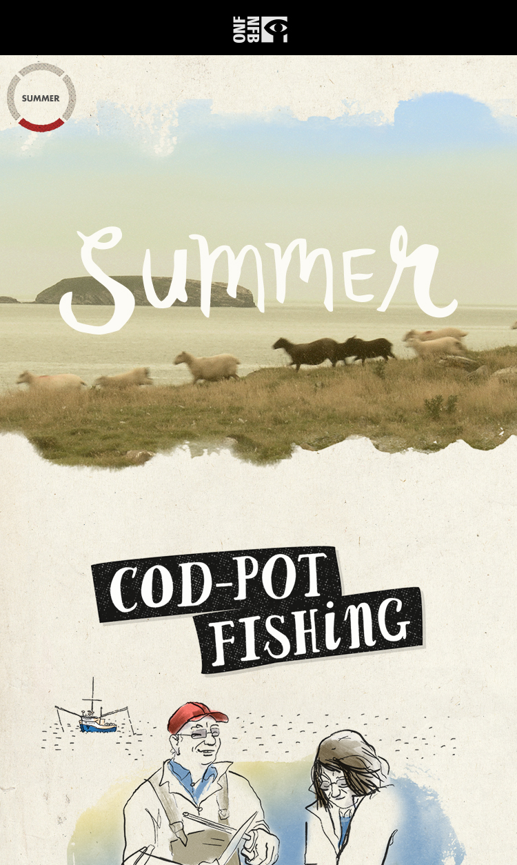
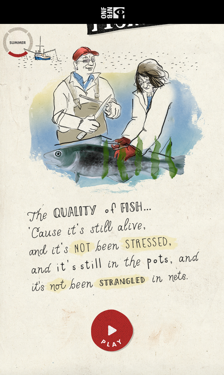
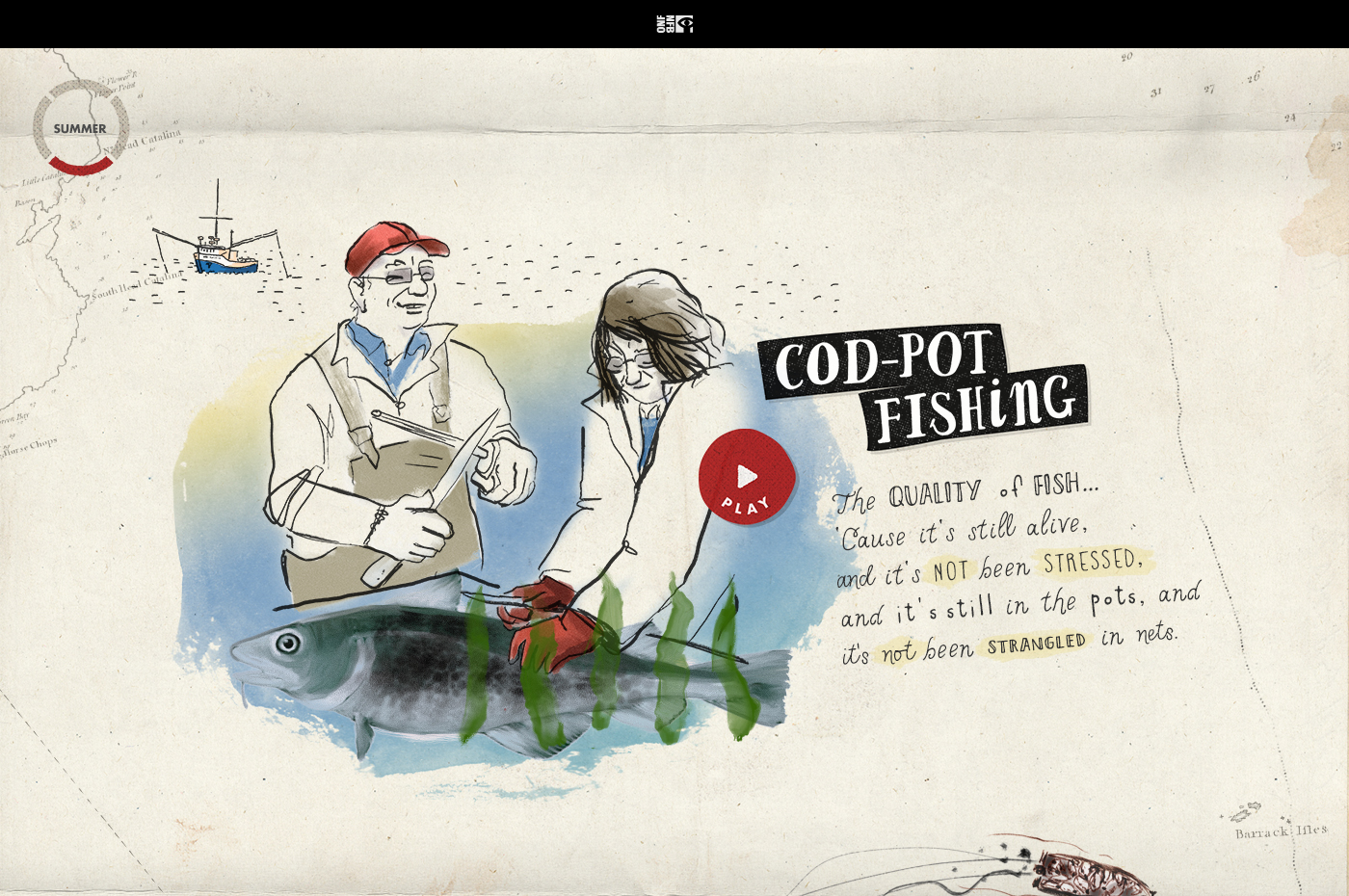
Summer
Each season has its own colour palette and illustrations.

The bright orange colour
Fall and credits
Talking about the olden days
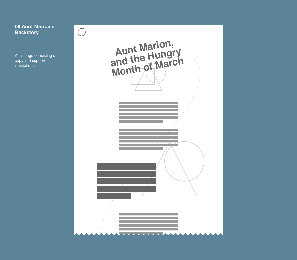
Aunt Marion's backstory
An extra page is devoted to explaining the site’s namesake and “the years when Newfoundland was its own country.”
Staring hunger in the face
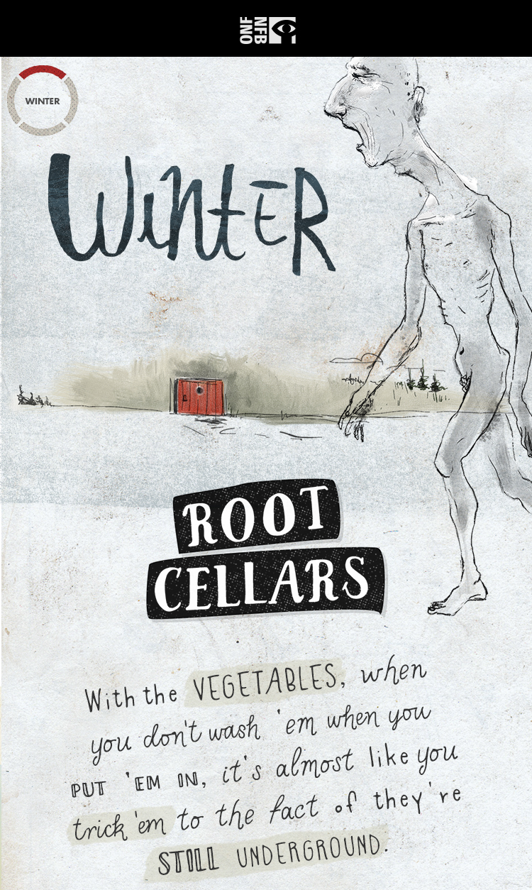
Winter
Phone design comp — winter
'Cause it’s still alive
Summer
Phone design comps — summer
Life meant subsistence
Aunt Marion's backstory
Phone design comp — backstory screen
![]()

Experience Hungry Month of March ↗