Sprout Family Health
Healthcare with heart
Health stress and struggles are things of the past. For moms, dads, and little ones, Sprout is here, at last.
Role
Art direction, design (IA, visual concept, UI, layout, typography, iconography, illustration manipulation), production + motion (Webflow)
Collaborators
Creative direction, branding, and illustrations by Caleb Beyers 🤍 // Writing by Kate Chandler, Caleb Beyers, and Brad Jawl.
Art direction, design (IA, visual concept, UI, layout, typography, iconography, illustration manipulation), production + motion (Webflow)
Collaborators
Creative direction, branding, and illustrations by Caleb Beyers 🤍 // Writing by Kate Chandler, Caleb Beyers, and Brad Jawl.

A storybook beginning
The experience
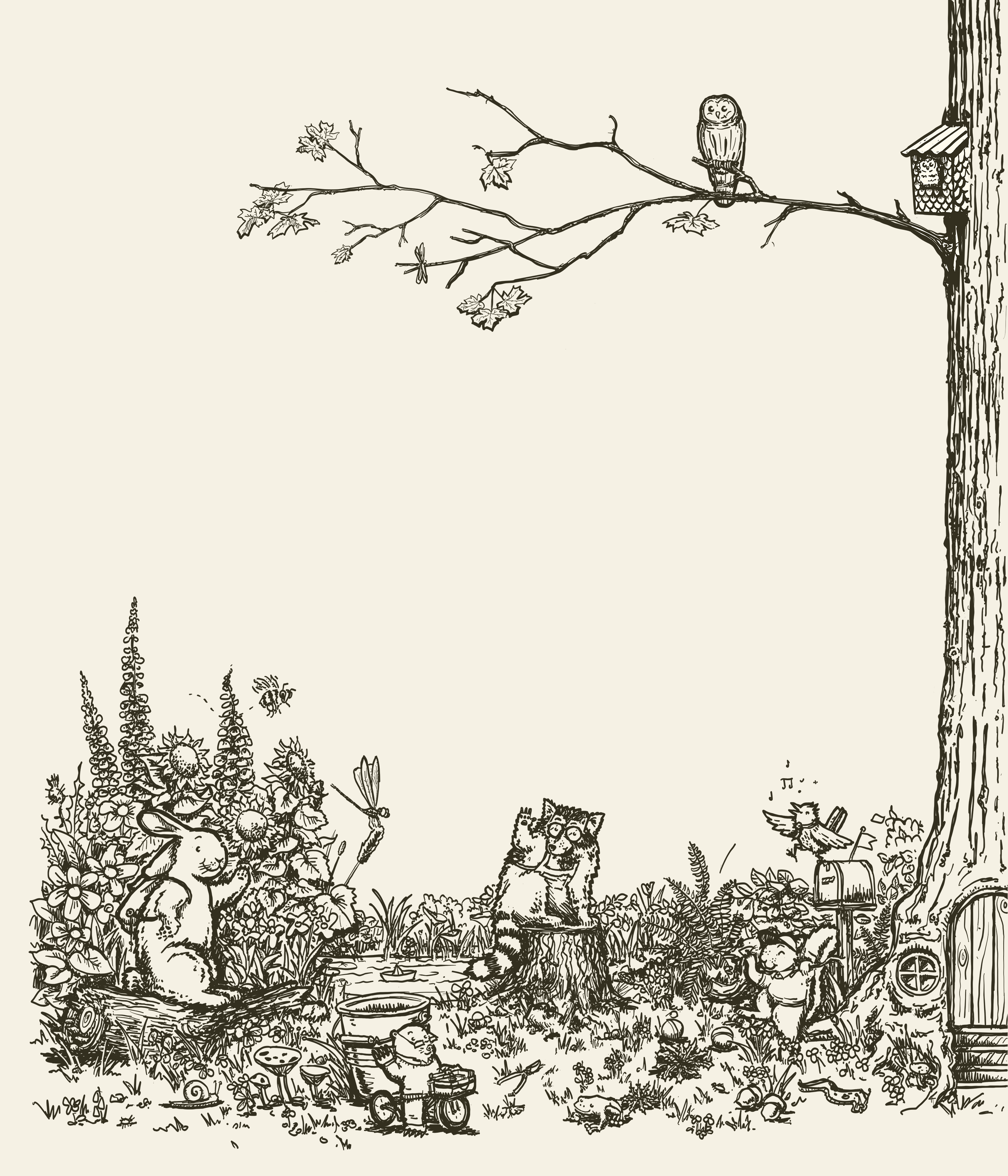
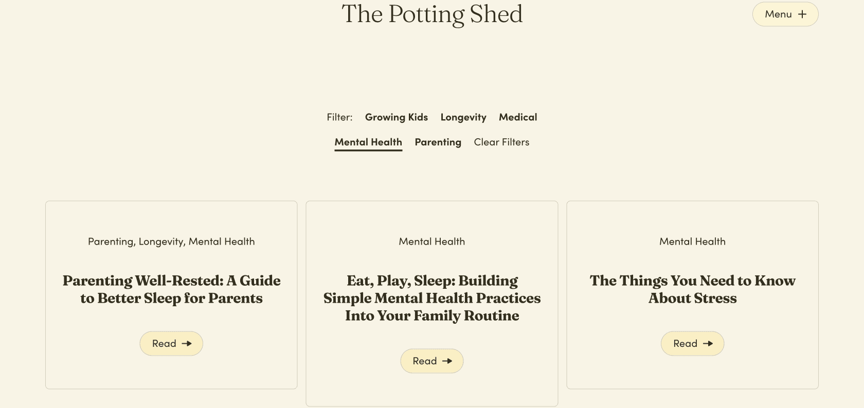
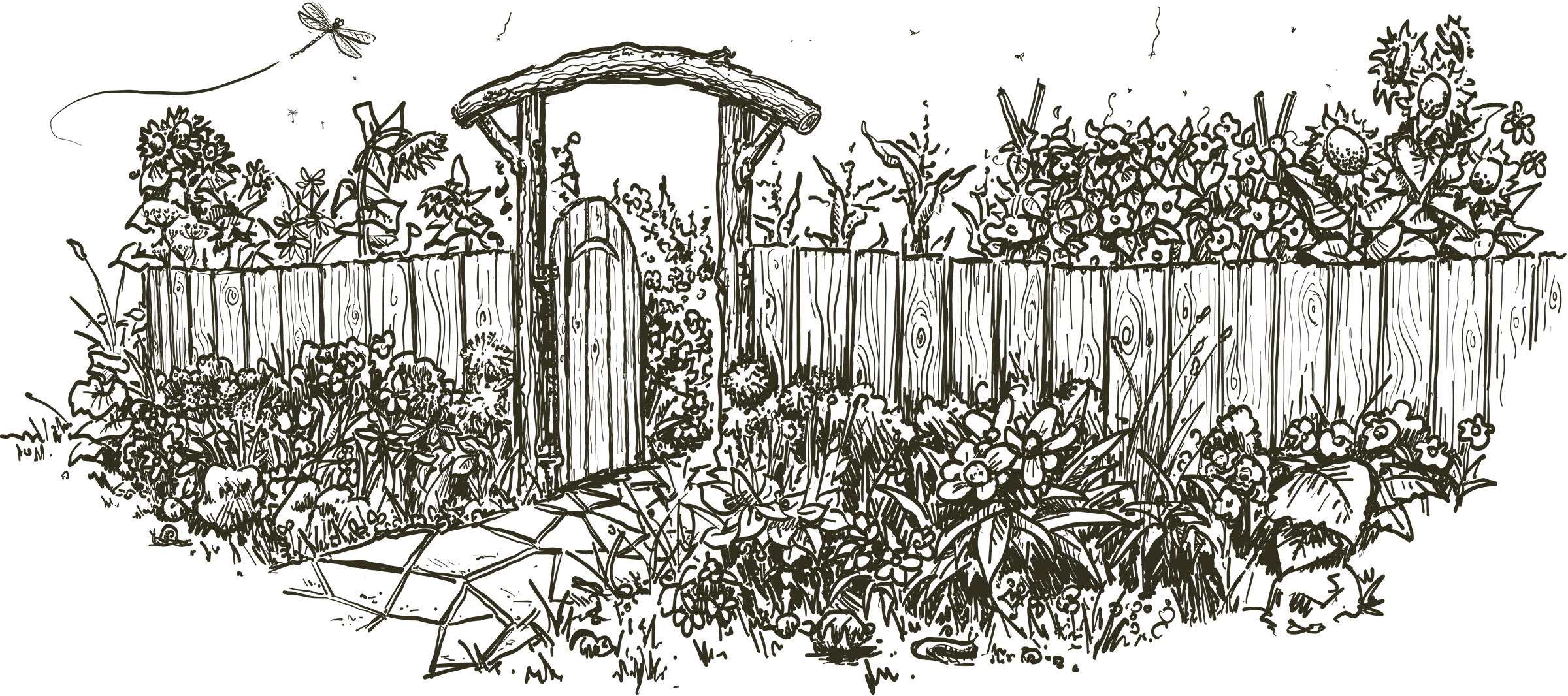
Sprout is a family-focussed healthcare provider that optimizes for illness prevention and longevity. The brand, and this marketing website project, uses the metaphor of a nurturing garden, full of colourful animal characters, to summarize the clinic’s team-based breadth of services.
Video – desktop browser screencast of the Sprout website
From sketches to screens
Design, build, motion
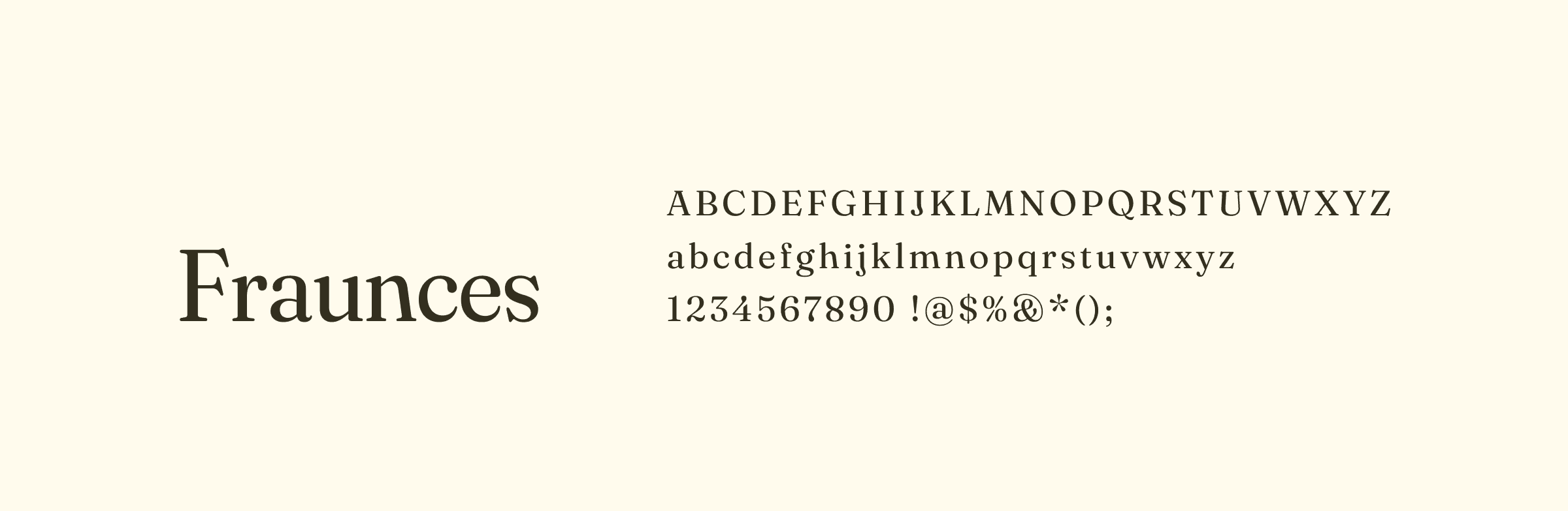
I was brought on board to receive the loose brand concept, flesh out a digital design language, and build a marketing website. In a nutshell, the final visual system consisted of:
- a typeface pairing with a playful, literary feel and long-form capabilities;
- a largely monochrome palette that uses a supportive colour set for moments of surprise;
- a layout and component structure that mirrors the clinic’s thoughtful systematization;
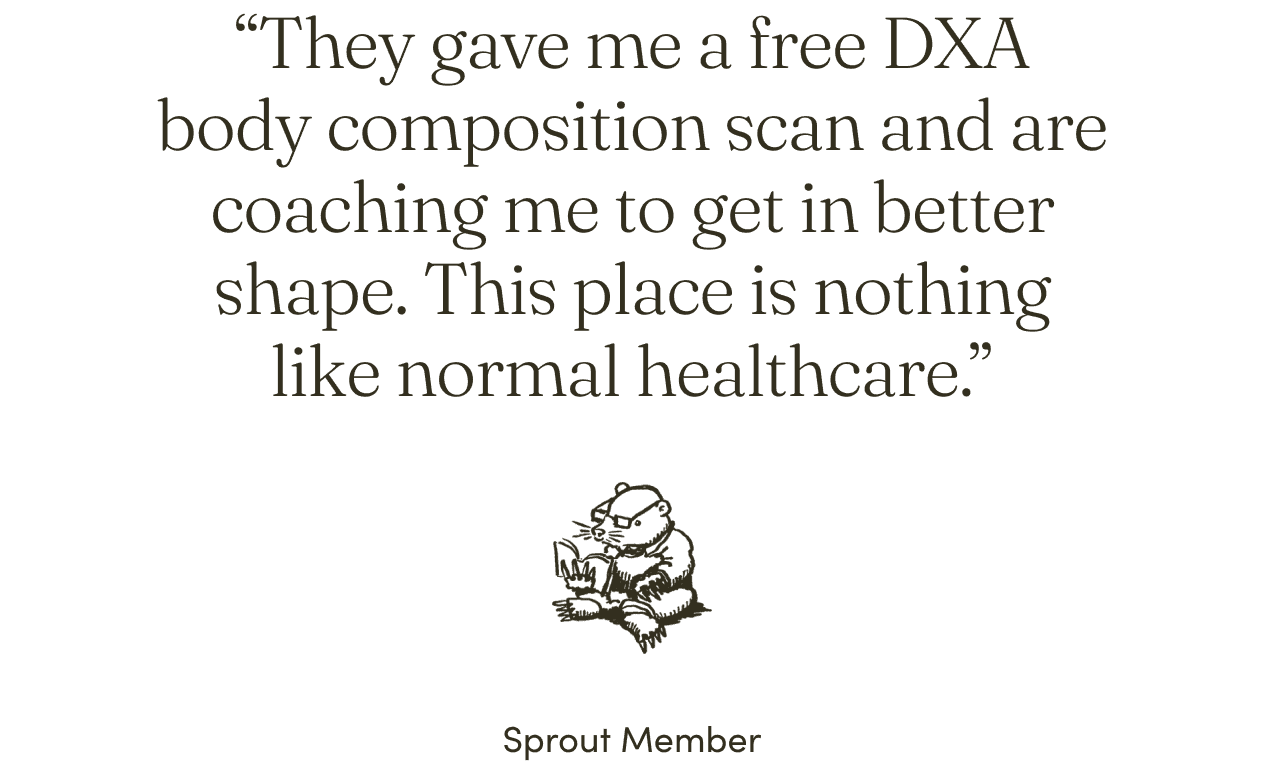
- an overall sense of confidence, mixed with storybook pacing and playfulness, anchored by Caleb Beyers’ heartfelt illustrations (drawn specifically for various moments of motion).
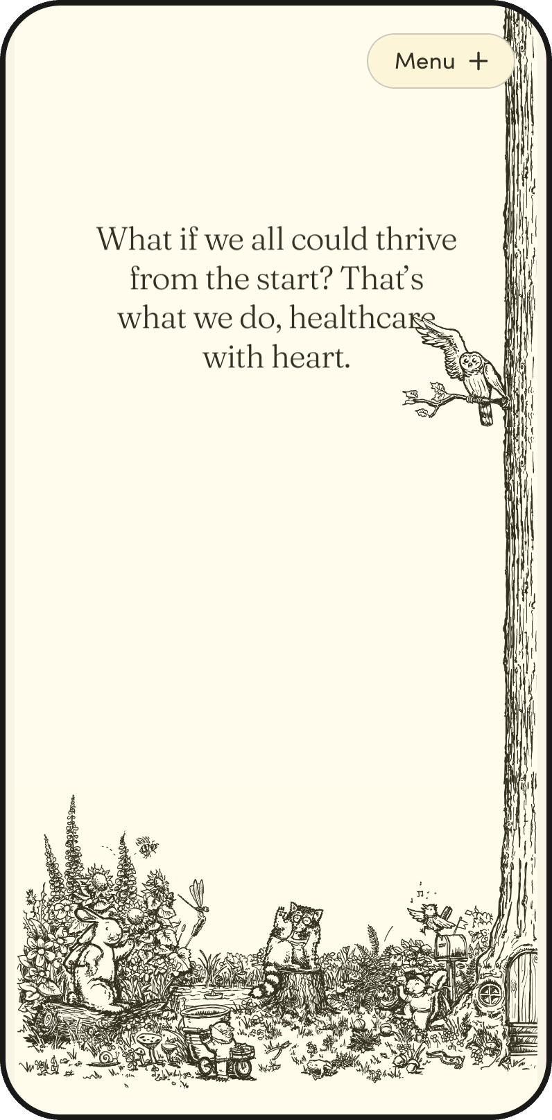
The homepage hero’s tree scroll — desktop

The homepage's character scroll — desktop
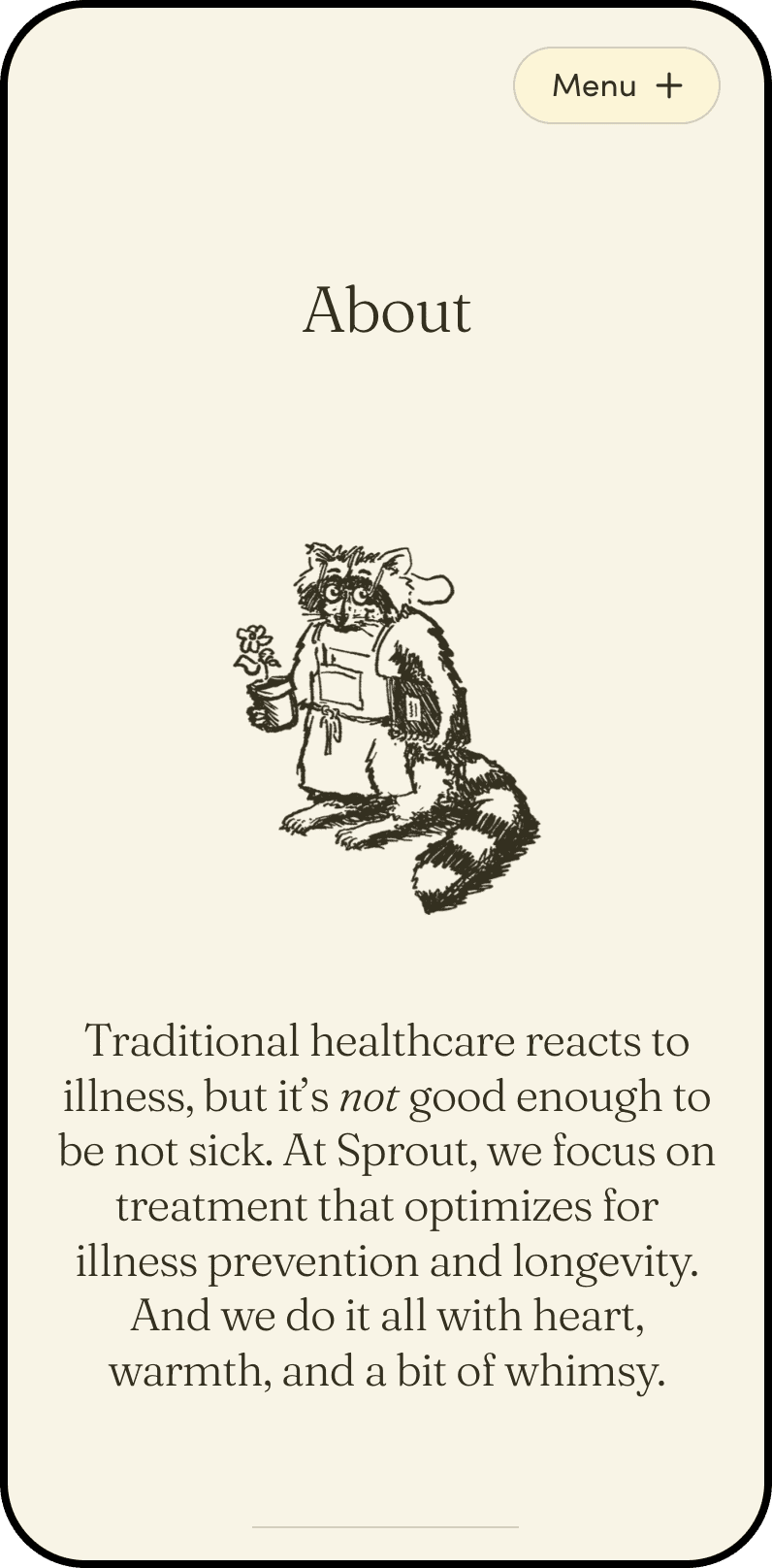


About page’s manifesto — desktop
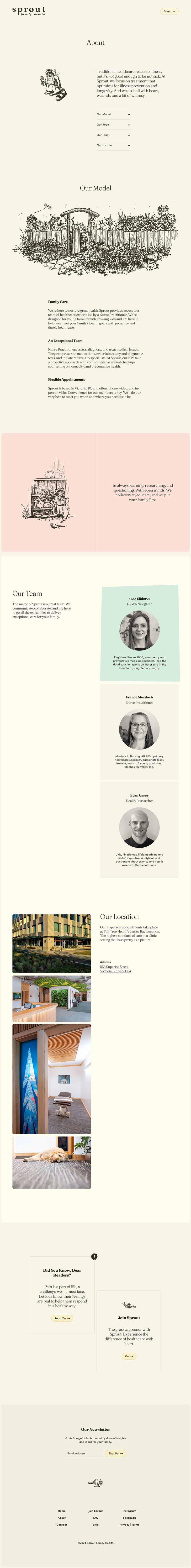
About page’s team section — desktop
![]()
About page’s team section — desktop


Menu overlay — desktop
![]()
![]()


Experience Sprout Family Health ↗