Legacies 150
Oh Canada
A nation is a collection of stories. Where they overlap, they represent a shared experience and an intergenerational legacy. In their uniqueness, they underscore just how varied our individual lives are.
Type
Anthology website
View it
legacies150.nfb.ca
Agency
NFB Interactive
Awards
From Janet with Love: 2nd Prize, Innovative Storytelling, World Press Photo 2018 Digital Storytelling Contest
Press
National Post (1, 2)
Anthology website
View it
legacies150.nfb.ca
Agency
NFB Interactive
Awards
From Janet with Love: 2nd Prize, Innovative Storytelling, World Press Photo 2018 Digital Storytelling Contest
Press
National Post (1, 2)
Role
It varied per story, but: art direction, design (visual concept, screen flow, UI, layout, typography), image curation and manipulation, interaction + animation samples, some production graphics.
Collaborators
Series production (NFB) by Nicholas Klassen, Camille Fillion, Dana Dansereau. For specific stories, see below.
Quel âge as-tu?
The premise
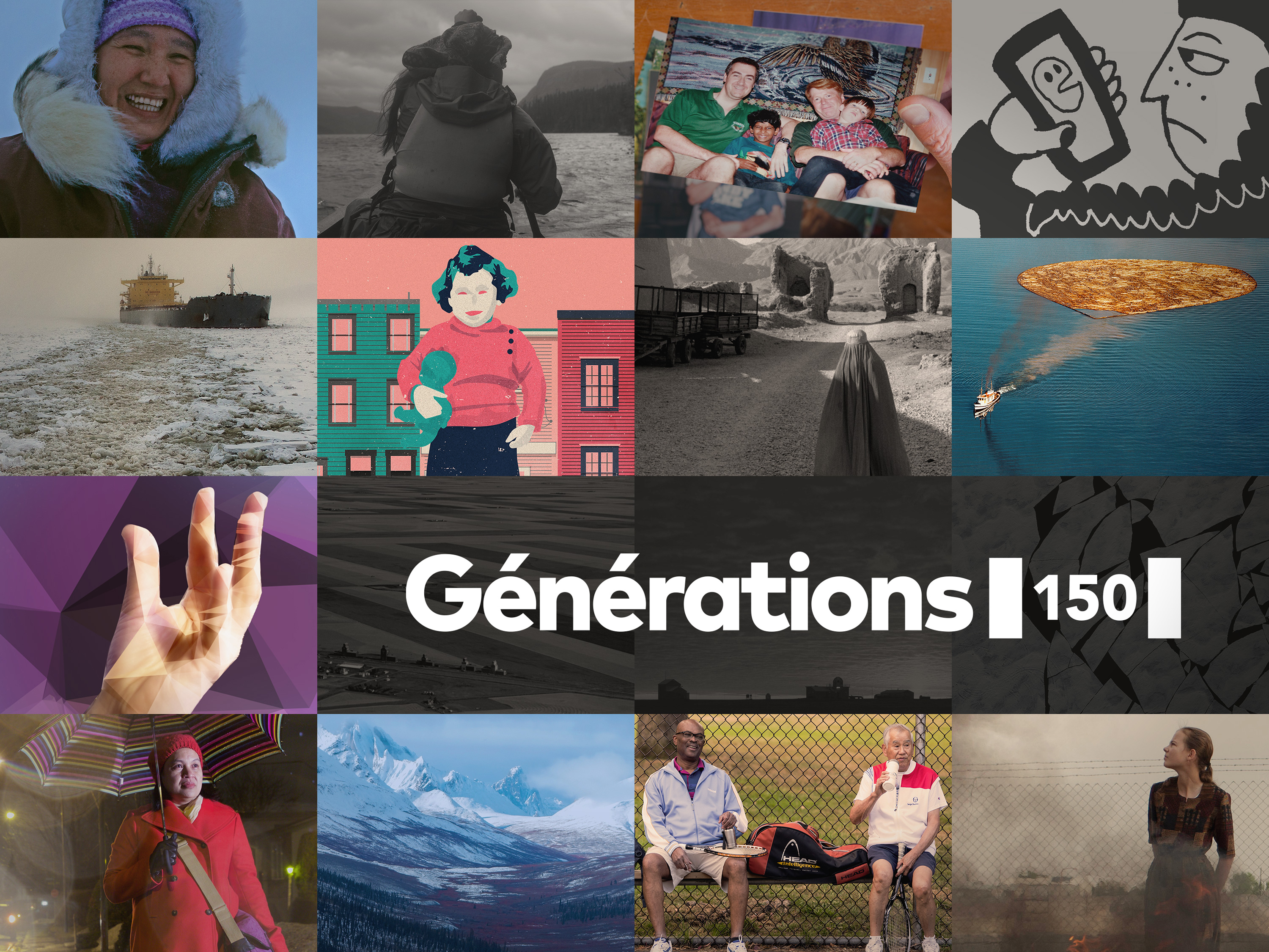
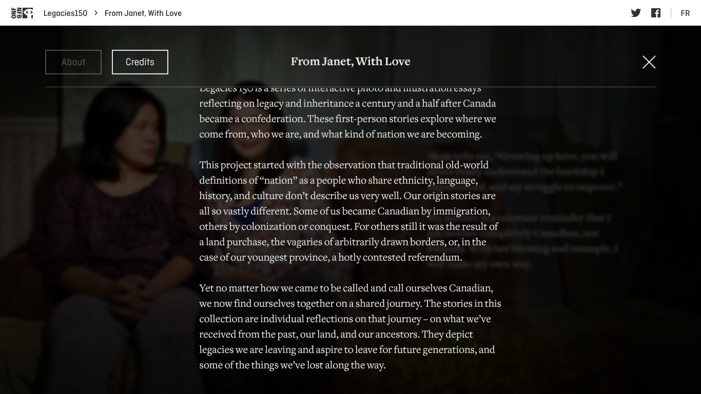
Legacies 150 is a series of interactive photo and illustration essays, released in tandem with Canada’s 150th birthday. These first-person stories explore where we come from, who we are, and what kind of nation we are becoming.
The anthology was an enormous collaboration, spearheaded by the NFB’s network of production studios, and involved writers, filmmakers, illustrators, photographers, musicians, designers and developers scattered across the country.
It was distributed in both English and French, and through media partners Postmedia and La Presse+.

Michelle Van Beusekom, Executive Director, NFB English Studio / Photo from The Cache
The A→B scale
My role
Of the 13 stories that make up Legacies, I was the Interface Designer for four of them, as well as the designer for the anthology’s landing page and the framework elements that wrap around each story.
“Interface designer,” however, requires some explanation. My role on a story ranged from:
A — the more conceptually robust: taking a text and a collection of photos and suggesting a visual language with textures, colours, typography; storyboarding the flow and ensuring there was good pacing and visual variety; art directing supporting illustrations; designing animations; and communicating it all to the devs with design comps, motion samples, and lots of discussions…
to
B — the more visually technical: receiving a concept or design and adapting the layout for a responsive build; injecting some variety and pacing; updating the typography; re-designing or re-building complex design assets for better loading and page rendering; and communicating that solution to the devs with a polished storyboard and much back and forth.

Balls... in the air
Challenges
I’ll get into the specific stories deeper in this case study, but on a project-wide scale the challenges were:
First and foremost, editorial. Support each story with a suitably-flavoured interface, and layout and pace the visual experience.
Working alongside creators with different degrees of control. For instance, the writer and producer of From Janet with Love were very loose with visual direction, while their counterparts on The Gift had designed a fixed-width comp, and my role was essentially to solve the design for a responsive build.
Fluidity. The Legacies stories were all built on a story engine platform that was, at the same time, being developed by the team at gskinner. This made for a fun, iterative challenge. This platform would also serve as a tool for future NFB longform interactive photo essays, and we were putting it through its early paces.
Technical constraints. As part of the discovery process, we’d referenced several elaborate and very custom interactive essays by publications like the New York Times and the Huffpost’s Highline. However, the story engine’s options for layout, positioning, transitions, scrolling, and animations would restrict what was possible visually and interactively on each story. We couldn’t just dream up any kind of motion, for example.
Two languages. Oh Canada! Layouts, and specific components (e.g. title screens), needed to be flexible enough to accommodate French text and assets.
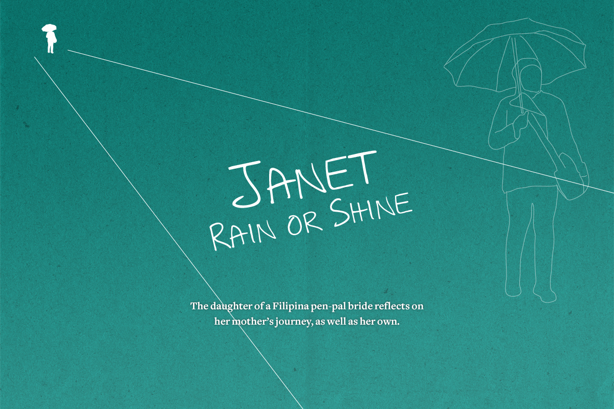
Story no.1
Daring, sacrifice and dreams
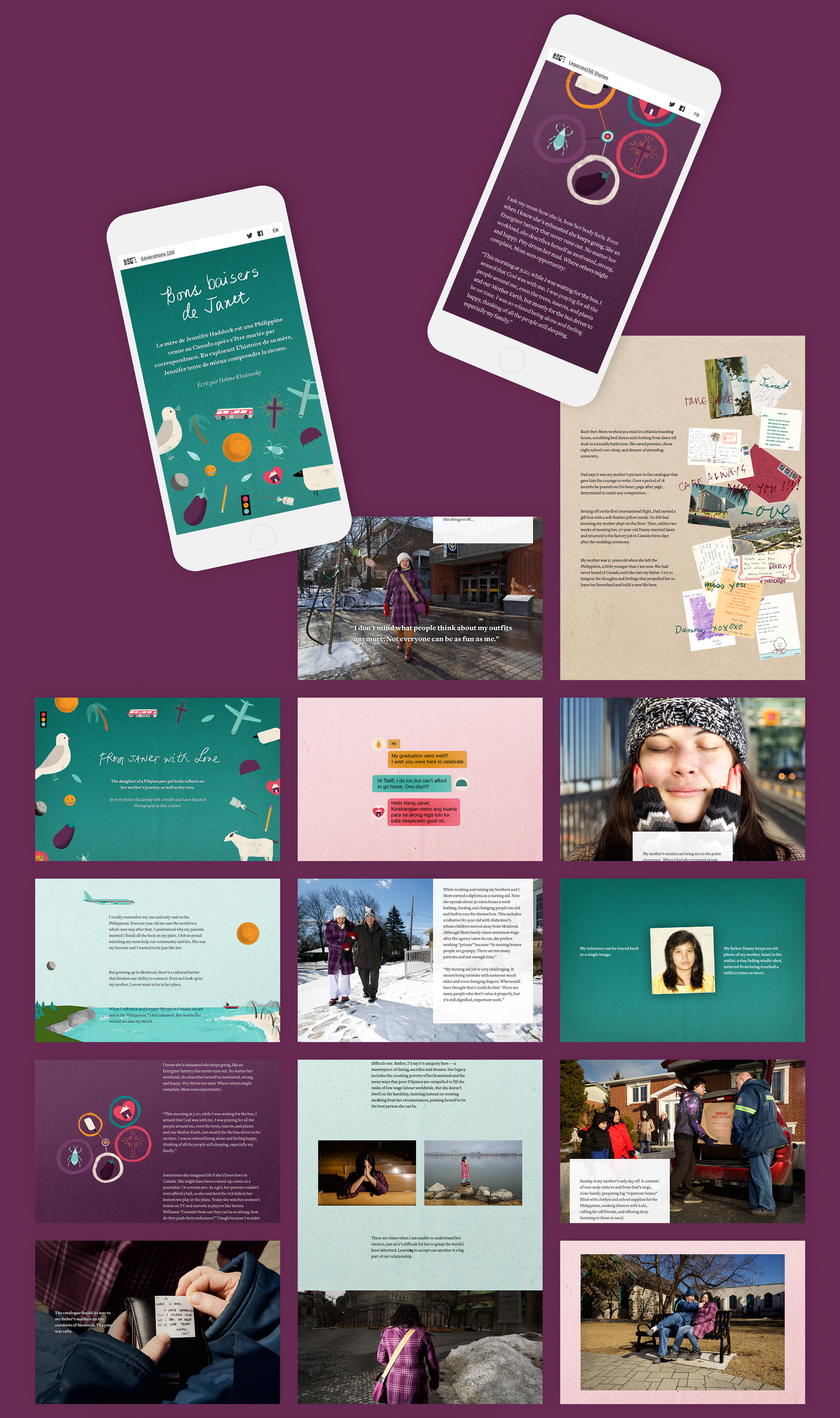
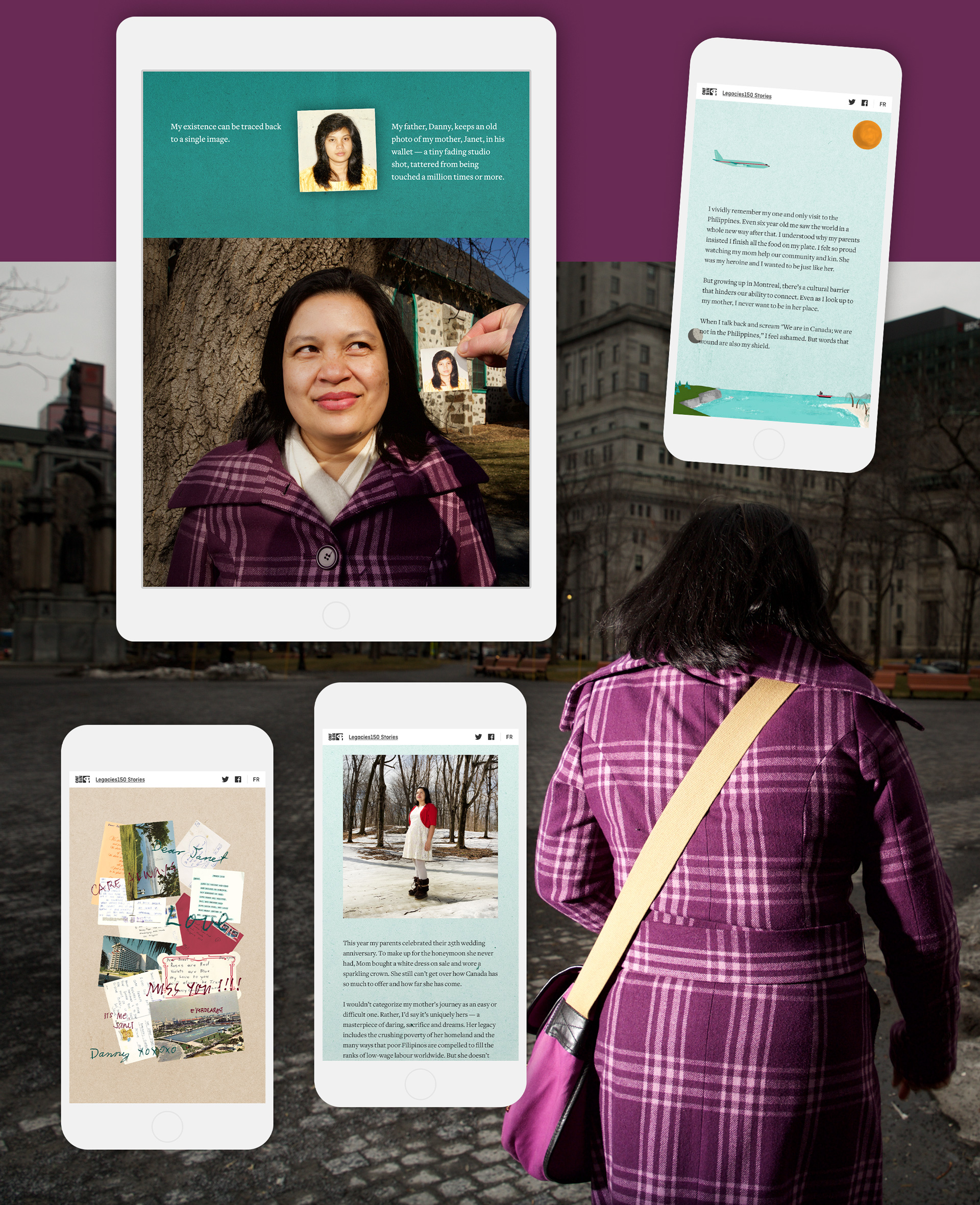
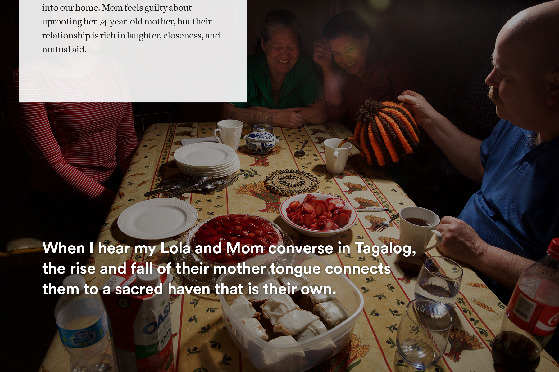
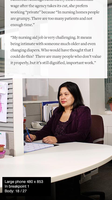
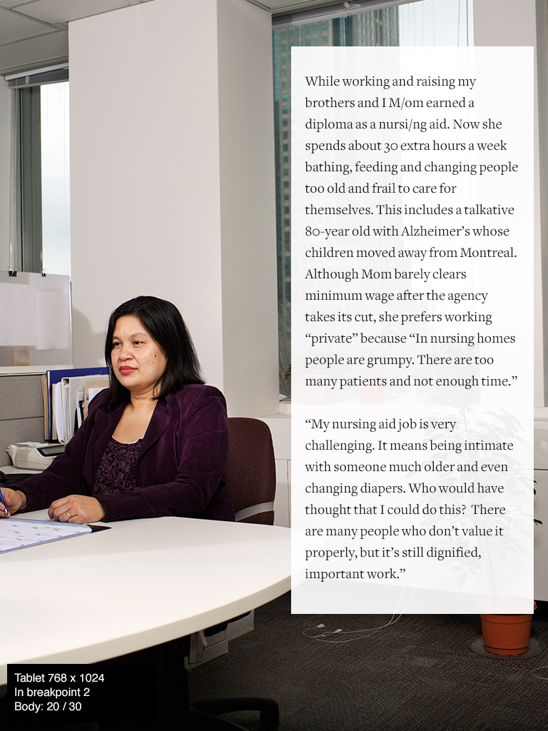
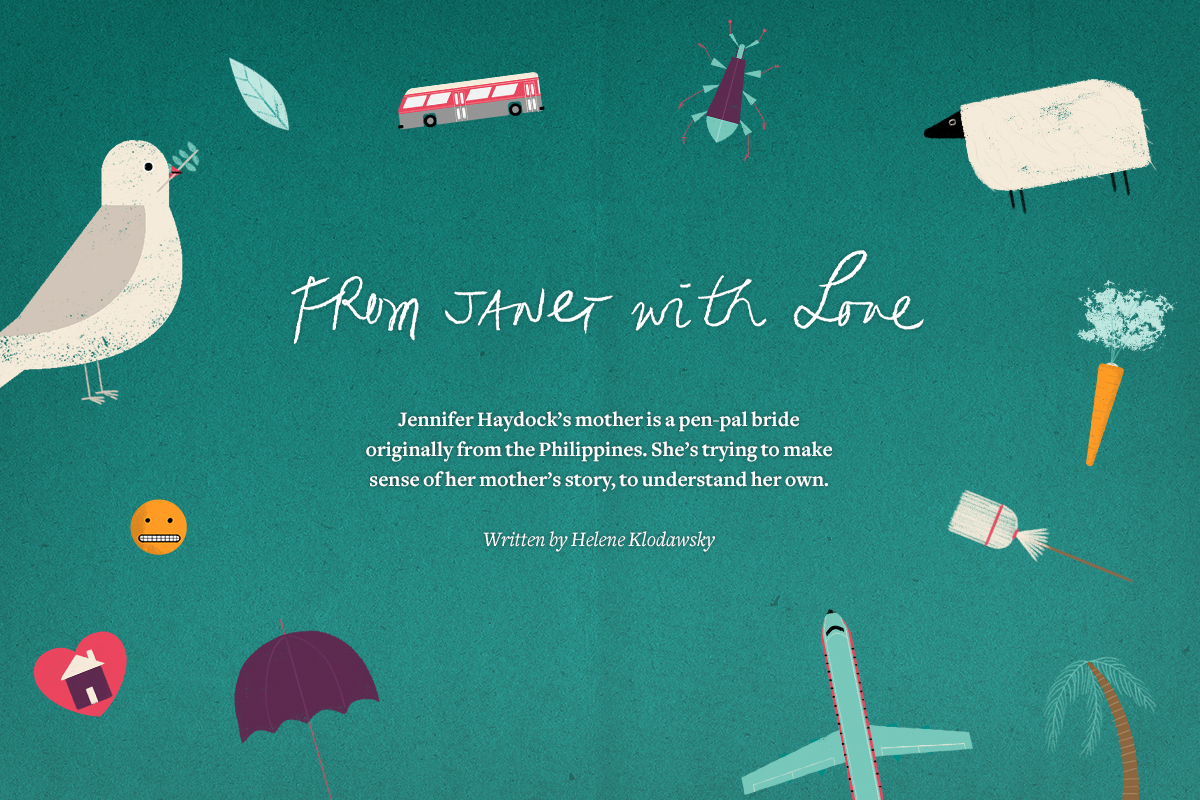
The daughter of a Filipino pen-pal-bride-slash-care-worker-slash-DIY-philanthropist, Jennifer Haydock is trying to make sense of her mother’s story, to understand her own.
Touch it, feel it From Janet with Love ↗
Screencast — From Janet with Love, on desktop
Going deep
My role + the team
Off the top, I was handed a draft of the text, a collection of striking photos, a few hand-written correspondence letters, and the promise of some illustrations.
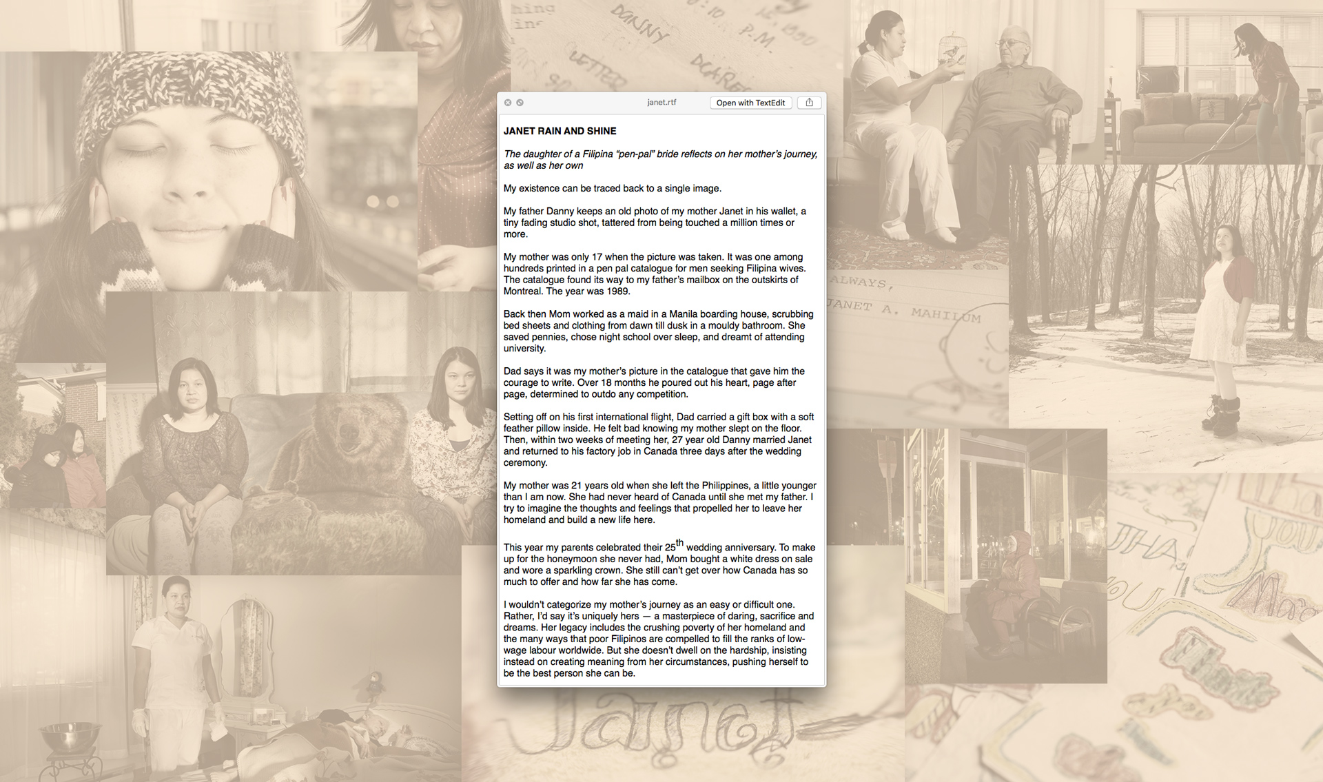
On the A→B scale mentioned above, Janet was an A. The creators were open to all suggestions and collaboration. My role was to craft a style, layout, and full visual flow.
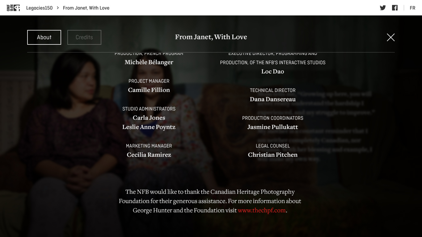
COLLABORATORS
Writer/director: Helene Klodawsky
Producer: Kat Baulu
Photographer: Rita Leistner
Developers: Blair Ludwig and Lanny McNie at gskinner
Illustrator: Fred Casia
Music: Andrew Whiteman
COLLABORATORS
Writer/director: Helene Klodawsky
Producer: Kat Baulu
Photographer: Rita Leistner
Developers: Blair Ludwig and Lanny McNie at gskinner
Illustrator: Fred Casia
Music: Andrew Whiteman
Testing ground
Developing a process
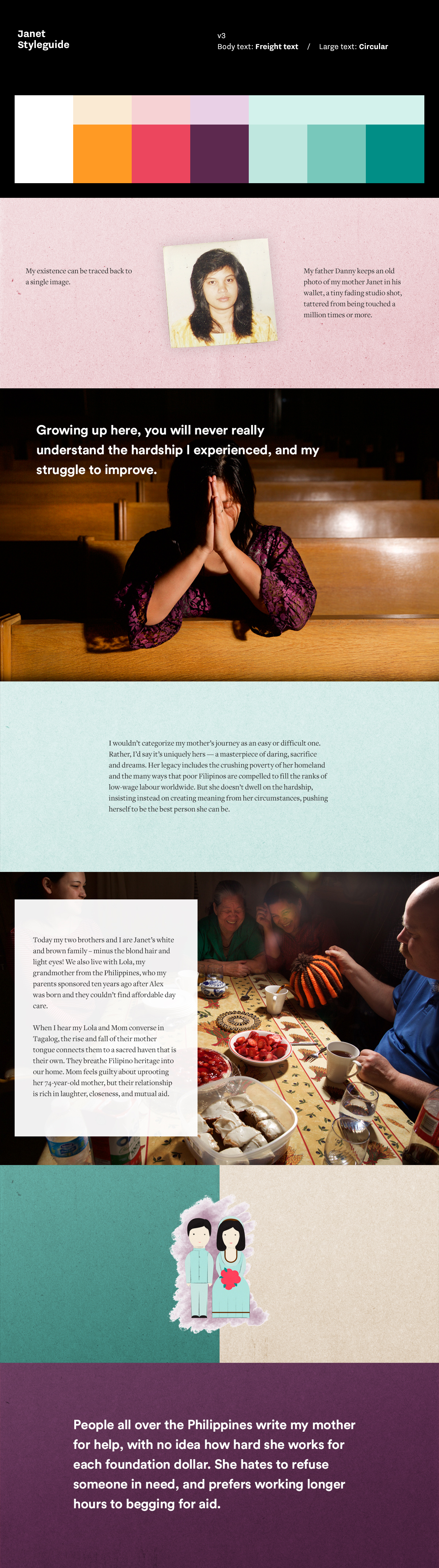
As the first Legacies 150 story that I worked on, Janet would prove to be a testing ground for process, layout, typography, animation, and our comfort with visual complexity and the responsive implications. Like, to what degree would we customize passages for various breakpoints, or not? This story took the longest, and had the most edits. As you’ll see below, we used styleguides, wireframes, rough storyboards, high fidelity storyboards (final comps), motion samples, and continued to refine the design during development.
All of which would influence the way we approached the next stories.
A mid-round Janet styleguide
![]()
Not everyone is as fun as me
Art Direction
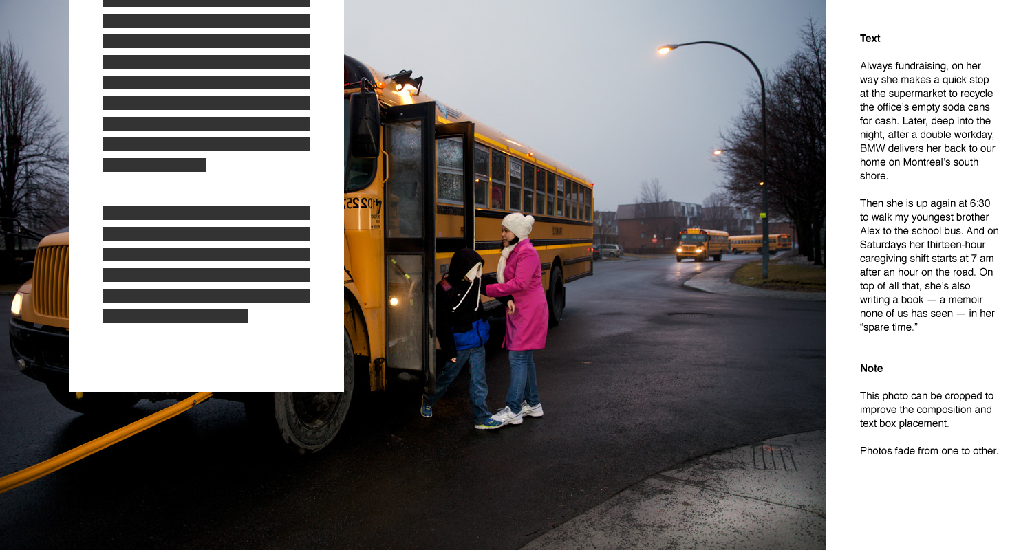
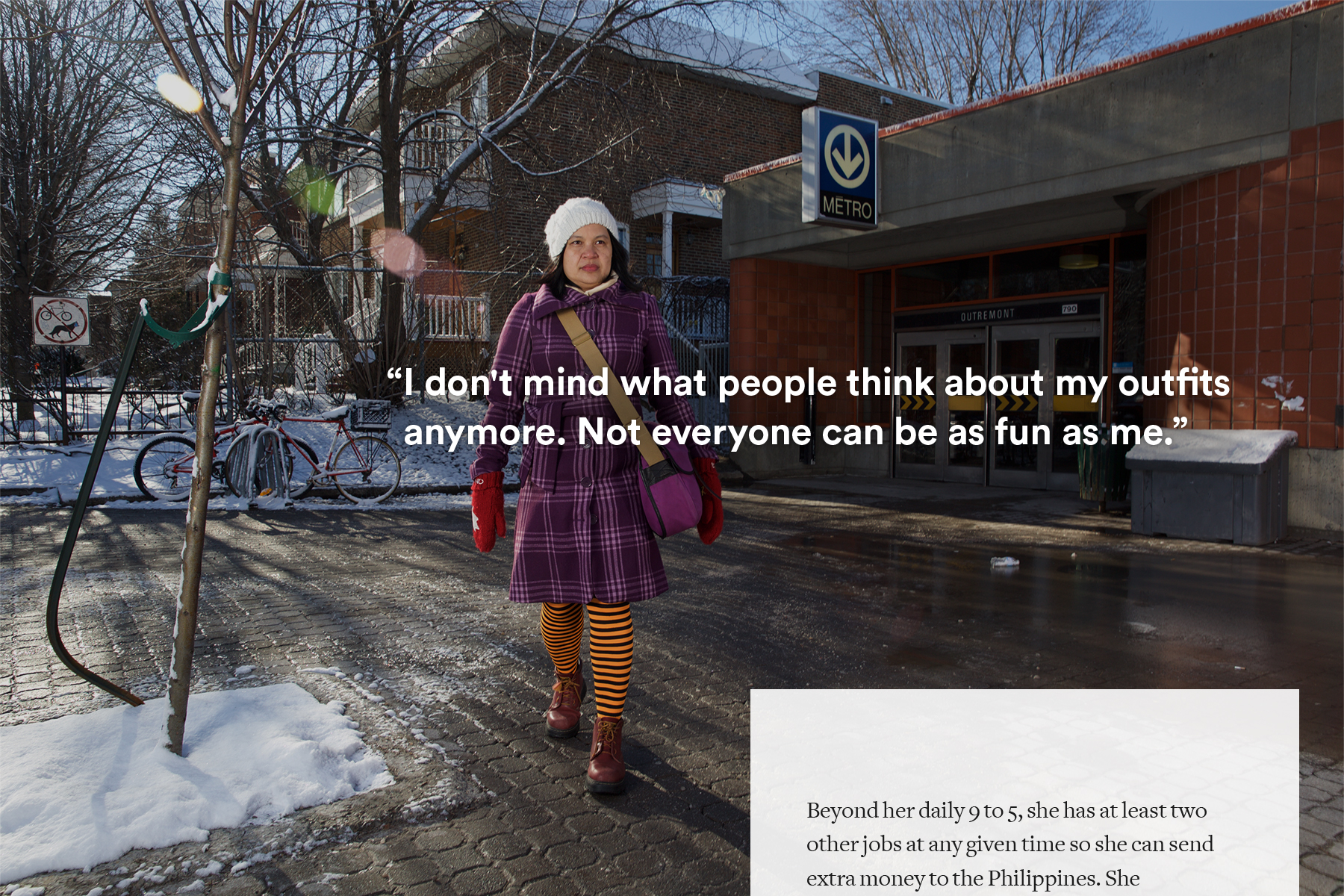
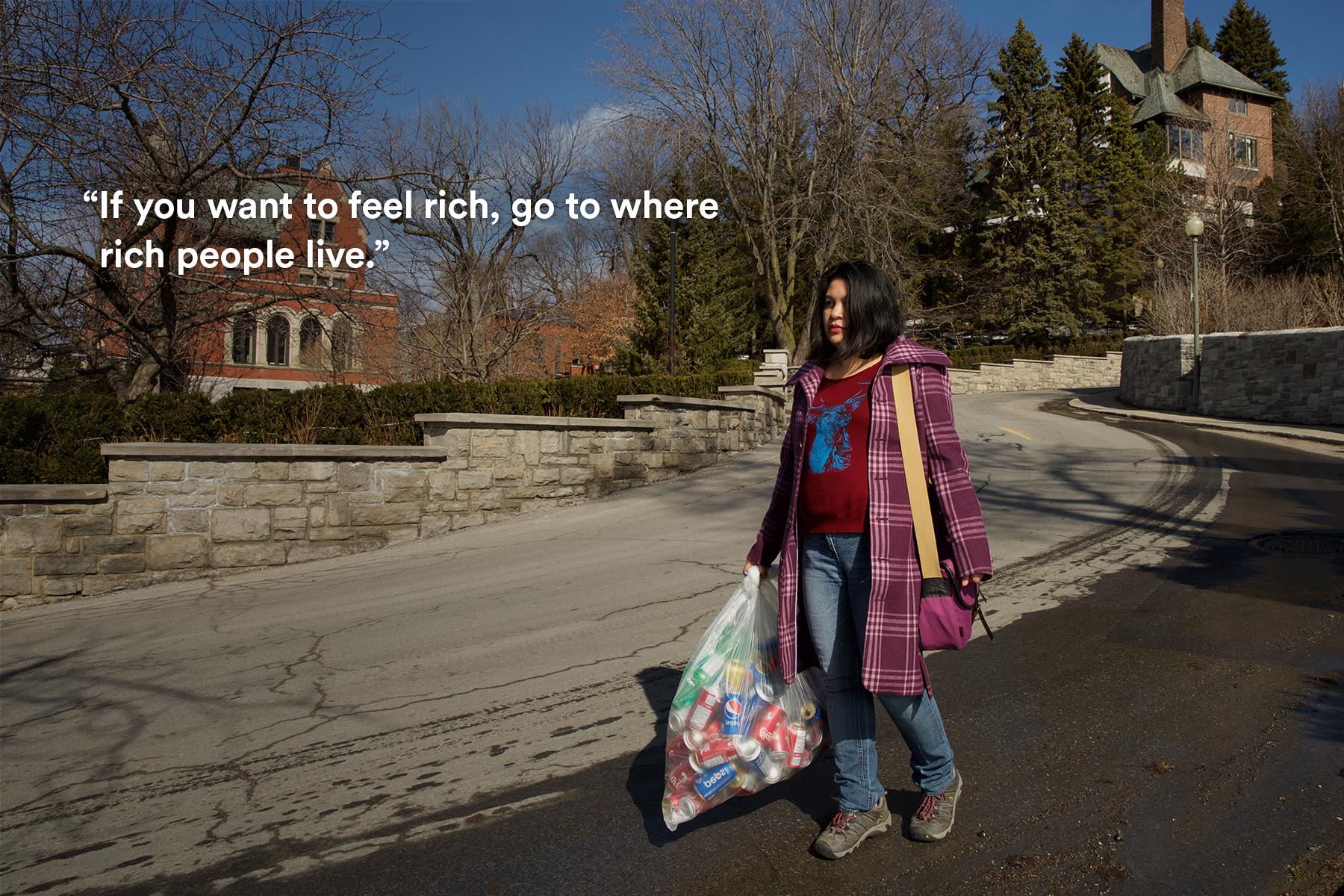
The essay is told through the voice of Jennifer, Janet’s daughter, as she details the genesis of her parents’ relationship, her mom’s arrival in Canada, and the expansive life she has since crafted. The story is uplifting and inspiring, and rich with themes of resilience and selflessness.
I began by reading the text. Many times. It would undergo edits as the project continued, but most of it was there. I also spent some cozy time with the photos, and started to imagine pairing certain passages with certain images.
Style-wise, it was very tempting to pull from two of Janet’s personal items:
- her wardrobe, which is gloriously colourful and on full display in the photography, and
- the textures from her 25-year history of hand-written correspondences.
And so I did.
Storyboarding
Working through cinematic storyboards made sense, as we needed to plan how the visuals would unfold with reference to the text, front to back. I started with paper sketches, and then turned to digital and began integrating the photography.
An early-round digital storyboard for Janet
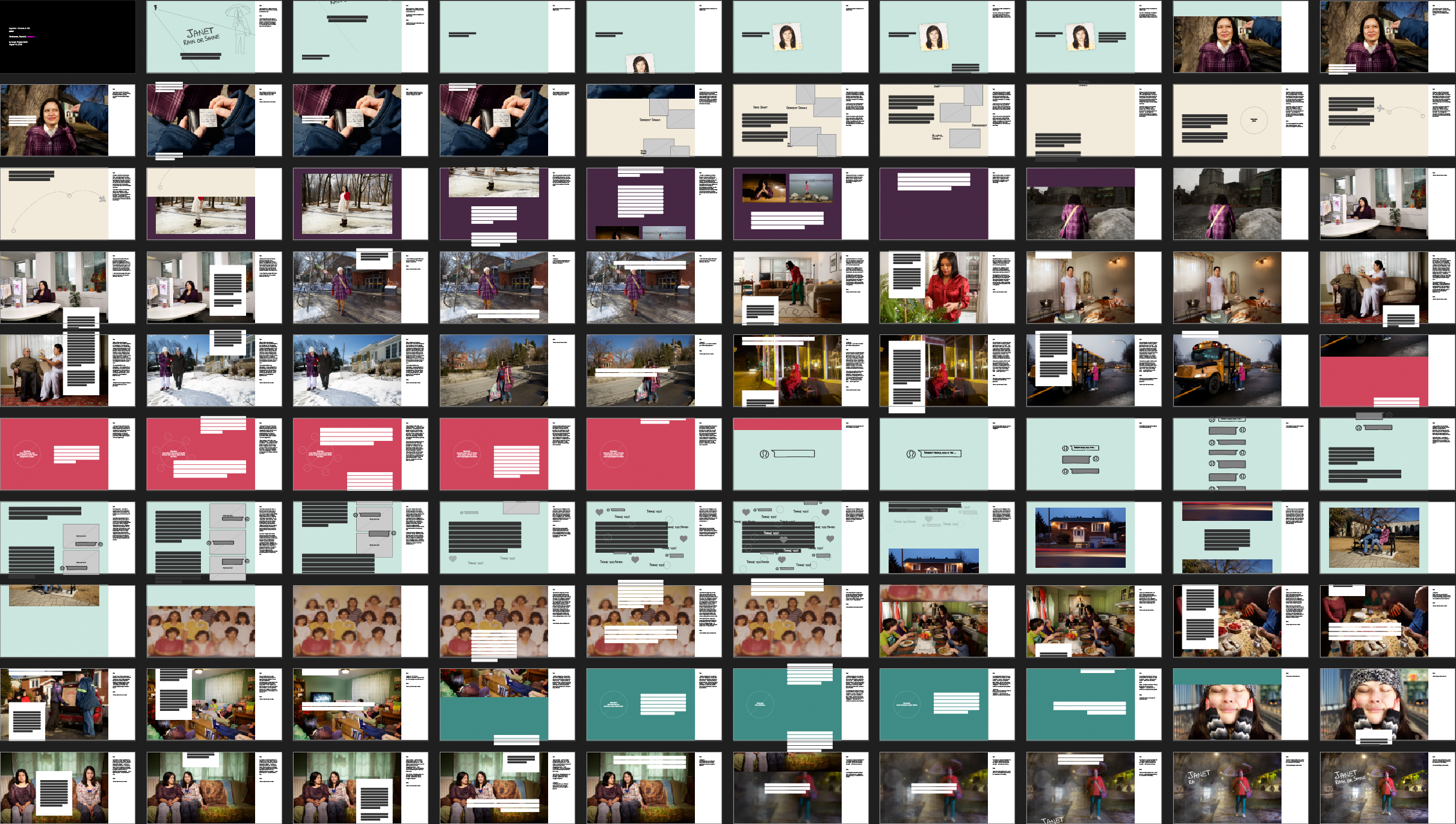
While the text would dictate the order in which the story was told, at this time I was massaging pace, flow, visual variety, colour rhythm, the sectioning of pseudo “chapters” within the story, transitions between passages, photo order, and actual layout design. For instance, where would the text run? And how often would it exist on the screen by itself (on a simple background, with few distractions) or in tandem with photos and illustrations in order to pick up the pace?
Slideshow: select screens from an early-round rough storyboard


At this point, the design of Janet was well underway, and the gskinner developers were weighing in with feedback on the visual plan. We’d established a process that would be repeated on future Legacies 150 stories: start with rough storyboards and move to high-fidelity ones.
Put it in writing
Typography
I wanted a typeface for the body that would be highly readable, work well at various sizes, with a slight touch of personality. And my plan was to use it across each of the four Legacies stories that I worked on, so it needed to have a balance of literary / modern / traditional to nicely accompany diverse subjects.
Freight Text at various Legacies 150 font sizes

After some research and testing, I suggested Joshua Darden’s Freight Text for its balance of precision and handmade-ness, its nod towards a bookish Clarendon feel (like those lovely ball terminals) and its options and variations. The NFB agreed, and went on to use the typeface across all but one Legacies story.
Type pairing
My initial aim was to find a typeface to pair with Freight, something to help punctuate large-format quotes, and compliment the story’s visuals and themes. In the end, we would greatly trim down the number of large-format text blurbs, and stick to a single typeface.
Slideshow — Freight Text and Circular paired on Janet
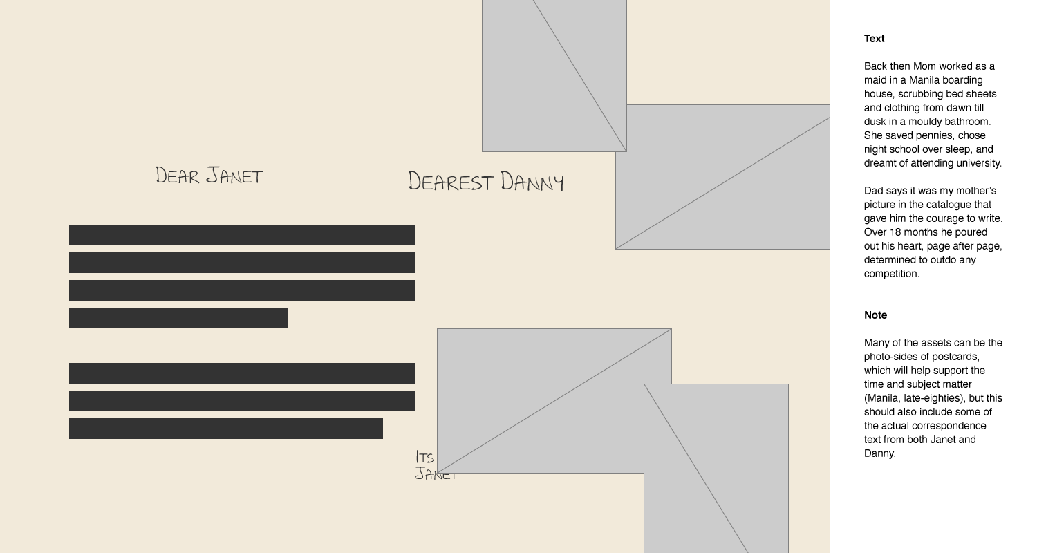
Text + breakpoints
Part of the storyboarding challenge was coming up with layouts, positioning, sequences and animations that could adapt to the story platform’s four different breakpoints without too much reconfiguration. For instance, the text-on-imagery reading experience (font-size, measure, backplates) needed to be carefully considered.
Breakpoints, font size + measure — some screens from layout tests


These are a few of my...
Illustrations
With a screen flow and visual plan, we were able to give some specific direction to illustrator Fred Casia, and he began showing us sample drawings, using some of Janet’s favourite things as subject matter.

We quickly settled on a style, for both the drawings and animation boils. We weren’t just asking Fred for a collection of illustrations we could sprinkle in the background of various screens. Instead, either based on my rough storyboards or collaborative discussions, we scripted a plan for each sequence, including interaction. Some of the animations would run as a sequence of stills drawn by Fred, and some would be animated with code based on scroll and time values.
Video — a selection of animated illustrations from Janet
Picture paints a thousand words
Final comps
As Fred refined the illustrations, I continued to massage the storyboards until they were high-fidelity comps. The 100-board sequence provided a tonne of information as to positioning, pacing, transitions, and scroll / drag influence.

Our cover story
The title screen
Title screens, across all Legacies 150 stories, would prove to be crucial elements, and Janet was no exception.
In order to channel the intimacy of her story, and as a nod to her history of letter writing, we asked Janet herself to provide us with handwriting samples to use in the title screen.
Various title screen concepts (rough and final) for Janet


Upon review
The build + edits
The team at gskinner had begun building Janet within their story platform while the designs were in progress, and build reviews led to much editing. While my comps suggested pacing and transitions, much of the timing needed to be fine-tuned using the real browser-based product.
If anything, we were trying to cram too much content into the storyboards, and once we were scrolling and swiping through the essay, it became easier to commit to removing some photos and reducing the word count.
And of course, the build also informed the design, and some layouts and sequences needed to be reworked, like the title screen…
A little too much
Title screen transition
The animation sequences in Janet required many build iterations to get right, and it was usually a case of refining positioning and speed for different breakpoints. Perhaps the trickiest was the opening title sequence.
I had drafted some motion samples that depicted the transition from the title screen (scattered with Fred’s drawings), to the first sentence of the text, by showing how Janet’s iconography fuels her core—her endless supply of energy.
Video — motion samples of possible title screen transitions
However, in the end, due to responsive complexity and a ticking clock, we simplified the sequence (and built a parallax staggered removal of Janet’s objects).
Experience From Janet with Love ↗
Story no.2
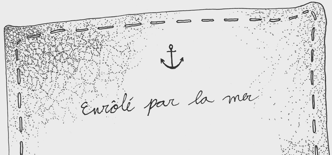
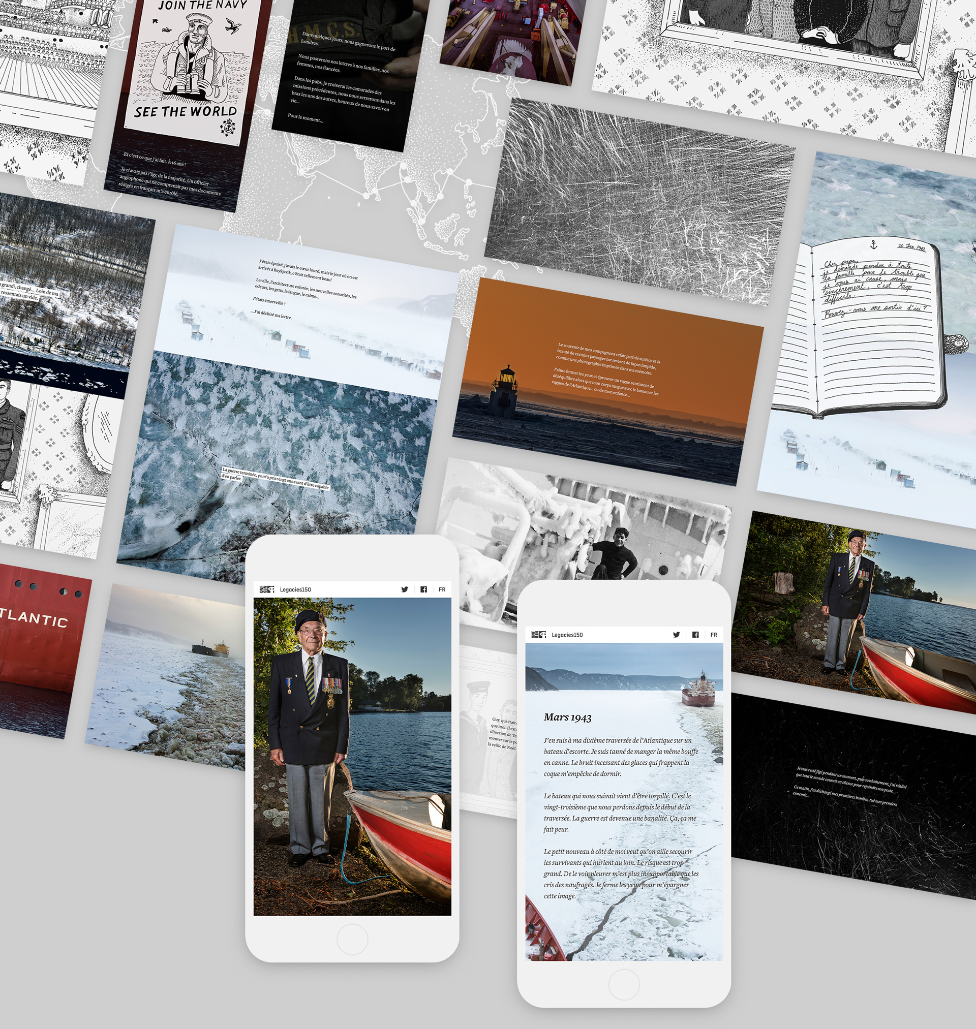
Recruited by Water
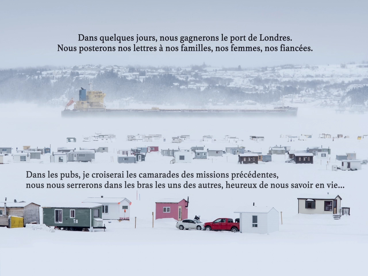
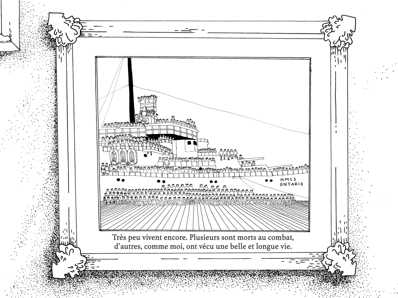
For centuries, sailors have watched over our shores — like René Bertrand, who joined the navy at the age of 16 during World War II.
View it live Recruited by Water ↗

Video screencast — Recruited by Water, tablet breakpoint
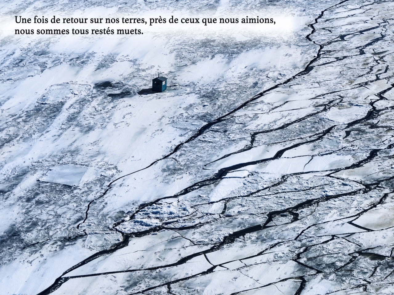
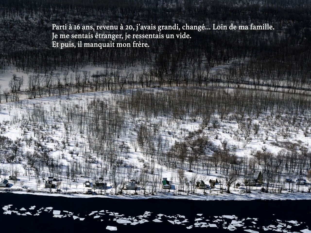
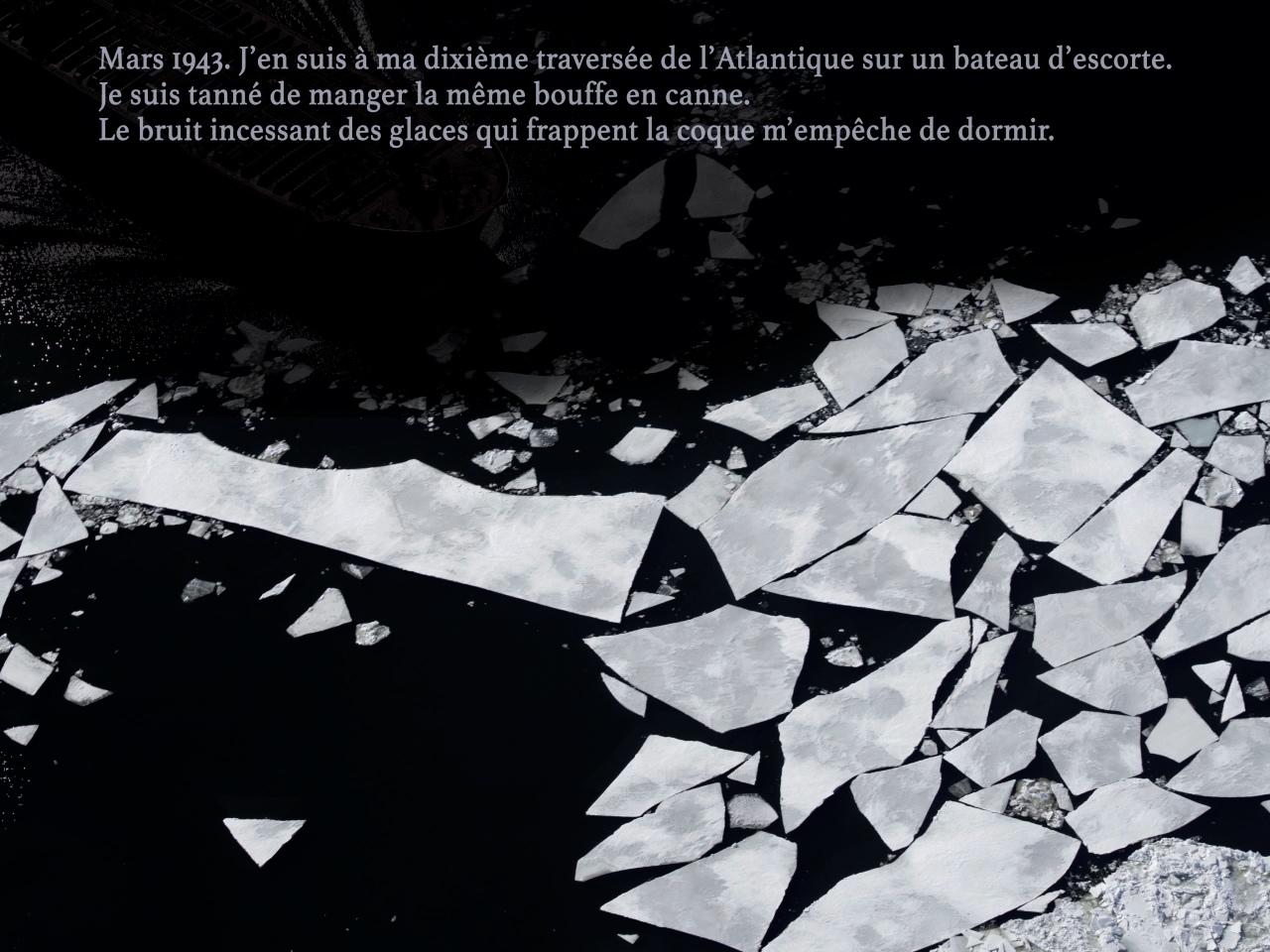
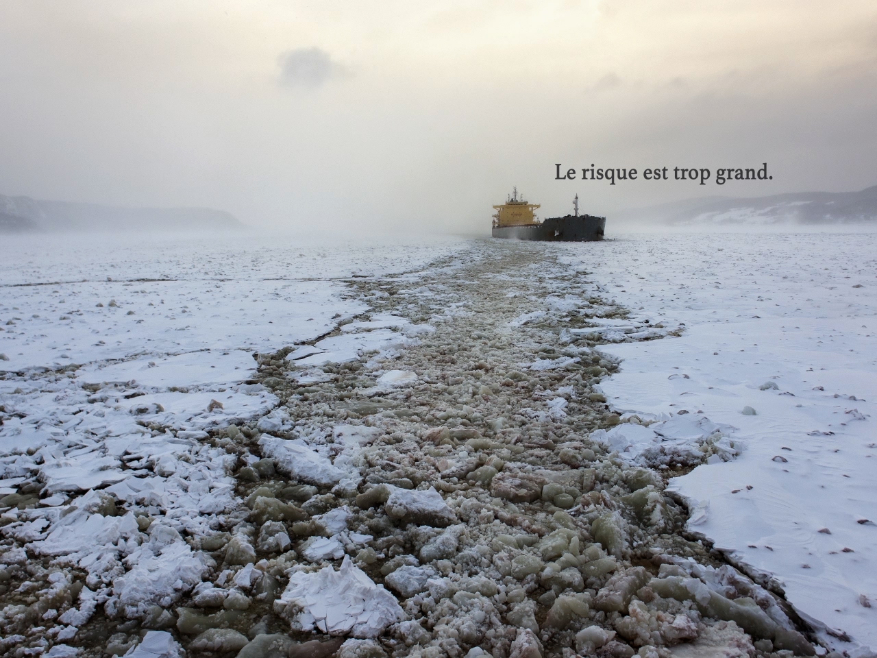
None of us said a word
The story + its visuals
Recruited by Water is a touching blend of emotions and visuals, telling a restrained and heart-wrenching story from a WWII veteran coping with memories.
Sarah Taylor’s illustrations are jarringly innocent, but for the most part the imagery is of contemporary photos from a Canadian Coast Guard mission. It’s a metaphor for seafaring adventure, for the cold, for closing up, and it was a risk that the creators pushed for. And it works. Get to the 1-minute mark of the screencast, when the soundtrack deepens, and tell me it doesn’t.

Executing a concept
My role + the team
On the A→B scale mentioned above, Recruited was closer to a B. The story creators Marc and Yannick had done a tremendous amount of groundwork pairing the text with photography, and sequencing the visuals along with near-final illustrations into a seven-minute concept video.
COLLABORATORS
Concept design, photography: Yannick Grandmont
Producer: Marc Bertrand
Writer: Sophie Dupuis
Illustrator: Sarah Taylor
Developers: gskinner, Martin Leroux
Music: Olivier Alary
Concept design, photography: Yannick Grandmont
Producer: Marc Bertrand
Writer: Sophie Dupuis
Illustrator: Sarah Taylor
Developers: gskinner, Martin Leroux
Music: Olivier Alary
Slideshow — stills from the creators’ concept video
![]()
![]()
![]()
![]()
![]()
![]()
![]()
![]()


Challenges
So, much of the process that I had been responsible for on Janet — the story flow planning, the order of photography, the illustration and animation ideation — had been already done.
However, this presented its own set of challenges. Because the concept video ran like a robust slideshow, with specific short-burst sentences appearing on top of specific photos,
- it made for a very long read;
- it didn’t feel like a contemporary browser experience;
- there were all kinds of responsive layout sadfaces 😞;
- the creators, because of the detailed work they’d put into crafting their concept video, were very committed to sticking with the established pairing of text and imagery, and I pushed against this at times. They had a vision!
For the web
Responsive solutions
Again, as on Janet, I iterated with storyboards through layout, typography, sectioning, pacing and transitions, the last set of boards working as final comps.
In adapting the creators’ visual concept for a web experience, I worked to:
- embrace the vertical scroll more, as a means to present text and also as a direction for some of the imagery. In other words, less of a fade-in/fade-out slideshow;
- remove some photos, to speed up the story and reduce redundant visuals;
- develop more of a conscious rhythm between the light and dark chapters of the story;
- suggest different transitions from chapter to chapter, to add some visual segmenting;
- experiment with the reveal and animation of the illustrations.
Video — excerpts of an early, and final, Recruited storyboard sequence
Experience Recruited by Water ↗
Story no.3
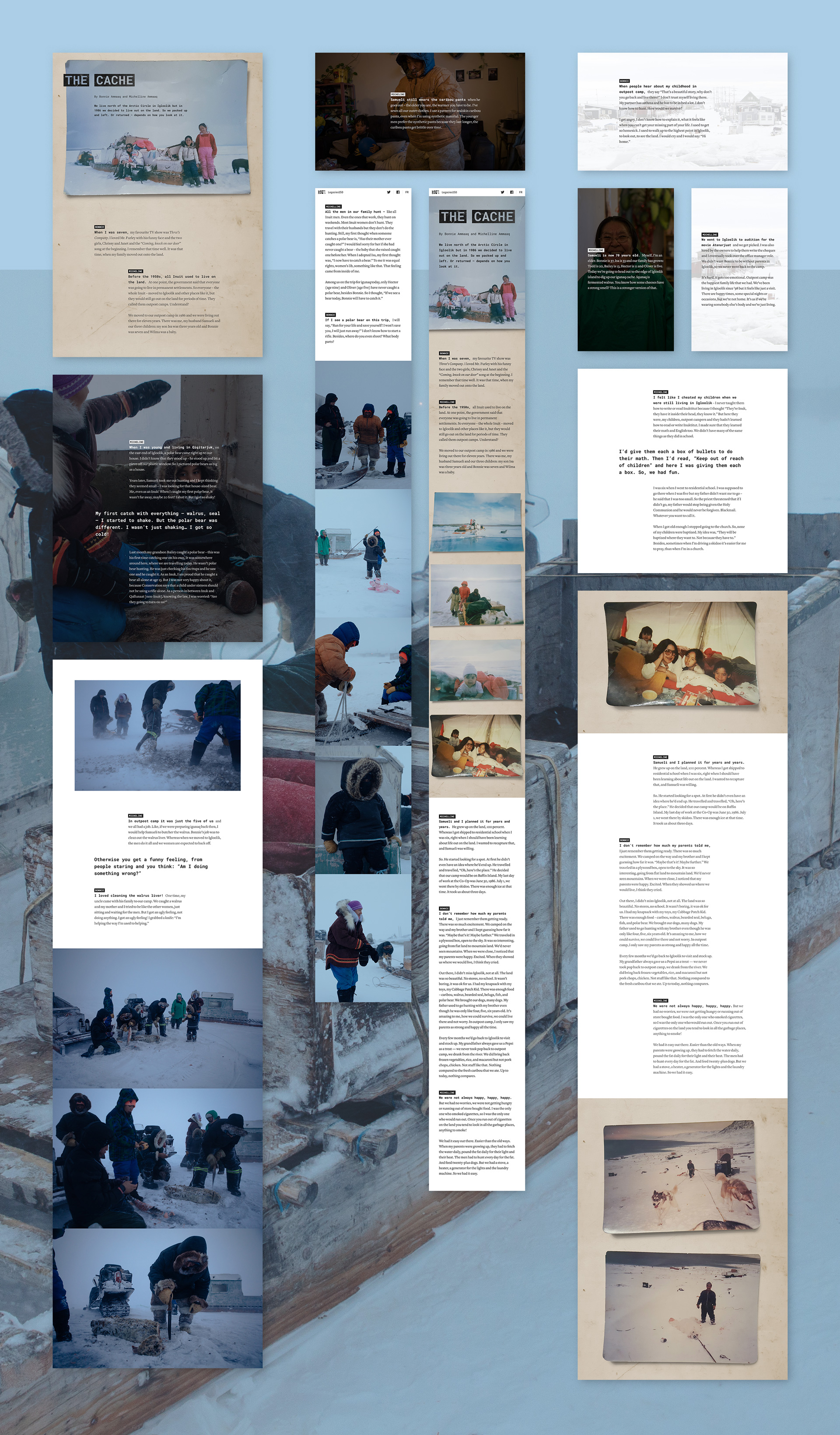
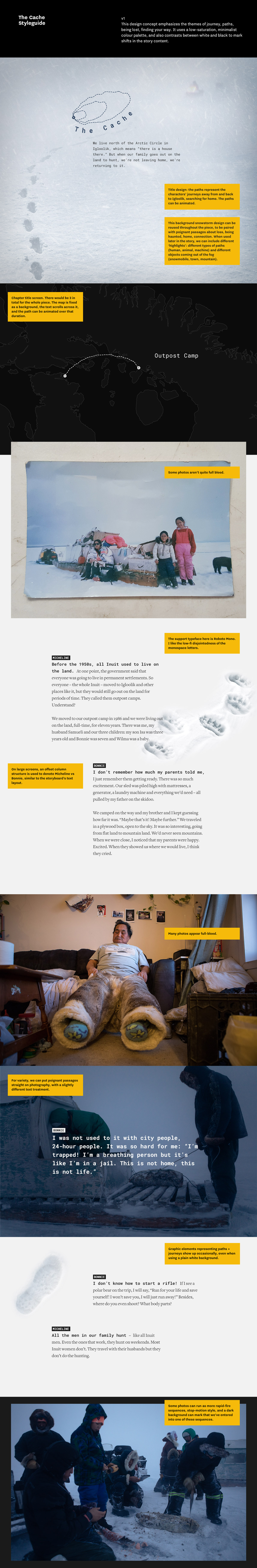
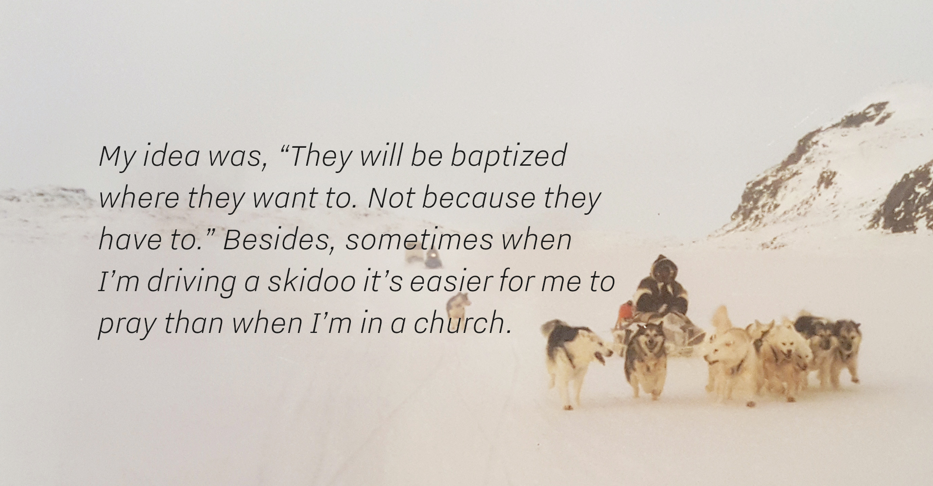
Bonnie and Michelline Ammaaq live north of the Arctic Circle in Igloolik, but in 1986 they decided to live out on the land. So they packed up and left. Or returned – depends on how you look at it.
View it in real life, for realz The Cache ↗
Video screencast — The Cache, desktop breakpoint
Keep it simple
My role + challenges
On the A→B scale, The Cache was an A. Creator and writer Alicia Smith, with whom I’d worked before on Seances, was up for collaborating on all aspects of the creative, and there was much to figure out. My tasks were styling, typography, layout, screen flow, transitions, text movement, scroll interactivity, and video integration. Alicia and I worked together on the photo curation and order.
However, we had some scope restrictions. At the time, the development of Janet was running long, as were some other Legacies stories I was not involved with. The series producers asked for a design and animation plan that was comparatively easier to build. There would be no complex transitions or illustrations. Luckily, Alicia wanted an aesthetic that was simple, clean and minimal (much like the story’s setting!), and these two desires fit together nicely.
However, we had some scope restrictions. At the time, the development of Janet was running long, as were some other Legacies stories I was not involved with. The series producers asked for a design and animation plan that was comparatively easier to build. There would be no complex transitions or illustrations. Luckily, Alicia wanted an aesthetic that was simple, clean and minimal (much like the story’s setting!), and these two desires fit together nicely.
COLLABORATORS
Producer + Story Editor: Alicia Smith
Photographer: Jonathan Frantz
Developers: gskinner, Denman Digital
Sound Designer: Christine Fellows
Producer + Story Editor: Alicia Smith
Photographer: Jonathan Frantz
Developers: gskinner, Denman Digital
Sound Designer: Christine Fellows
An early-round Cache design concept, with notes. Title screen and map elements would later change, but much of the final style is there.
![]()
Puzzle pieces
Assets + styleguide
The Cache is the story of a family, told through the voices of its two female leads. As a young child, Bonnie and parents and siblings lived off the land, in the vast interior of Baffin Island. Today, they live in Igloolik, but remain deeply connected to the land, and Bonnie wonders whether she’ll be able to pass that same sense of connection on to her children.
As I joined this story, we had:
- a working text that was divided into three parts;
- contemporary photography shot by Jonathan Frantz, mainly of the Ammaaq family at home in Igloolik and en route to digging up their cache of igunaq (fermented walrus);
- a bunch of old prints of the family living on the land in the 1980s, that Alicia had recently photographed lying on the surface of a weathered Coleman cooler;
- and later, Alicia would uncover a video, a wideshot of the town of Igloolik, that we could use.
With some styleguide work, I established a fairly stark and straightforward visual plan. The Cache is the least textured of the four Legacies stories I worked on, and the photography is by far the dominant visual. The text, presented in an interview format, is unique to the Legacies collection, and we offset the voices of Michelline and Bonnie in two distinct columns (at least for desktop and tablet). Finally, we used the Coleman cooler as a background texture for some early passages.
Movement + freedom
Scroll metaphors
The story is flush with themes of movement, freedom and entrapment, and even within our limited animation and interaction scope, we wanted to channel these with subtle touches.
In parts 1 and 3, which depict the family’s experience living on the land in the 80s, and going on a day trip for the walrus cache in the present day, respectively, the movement is dominated by a traditional vertical scroll. For Part 2, in which Bonnie and Michelline touch on their anger and the emotional toll of living in town, the experience is stunted and claustrophobic: text blocks barely move and photos cross-fade.
Video — scroll movements in the 3 parts of The Cache
Experience The Cache ↗

Story no.4
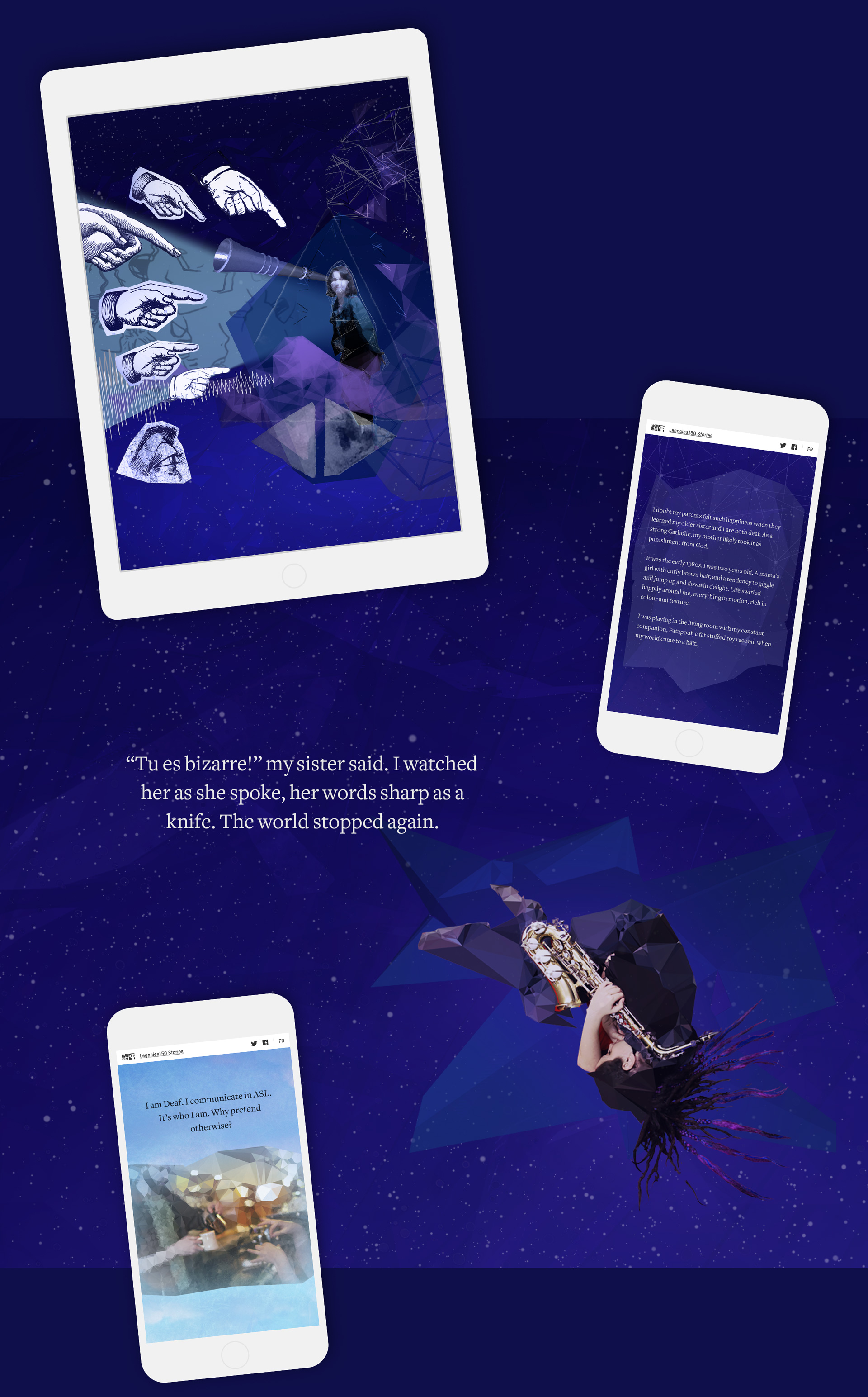
As the Deaf mother of a Deaf son, Chantal Deguire explains that the absence of hearing isn’t a problem that needs fixing.
View it live The Gift ↗
I finally felt recognized
The story
This essay tells of Chantal’s struggles growing up as a Deaf child, and how it led her to an approach that will power her son through a very different experience: where others see disability, she sees the Deaf culture and way of life as a gift she has passed on.
The visuals are a kaleidoscope collage of abstract geometry and bursts of colour, and depict her journey from darkness and loneliness to community and light.
Video screencast — The Gift, phone breakpoint
Portion of the original Gift layout by the story's creators
![]()

My own game was about to start
My role + challenges
On the A→B scale, The Gift was a B and more of a technical job. When I came on board the story, a version of the layout design was largely finished, as was the creation of 13 animated sequences that the producers referred to as vignettes (simpler animations) and tableaux (more complex). However, the layout and assets were very tied to a fixed-width desktop breakpoint, and the plan was to simply scroll it all as a massive vertical stack.
In a nutshell, my role on this project was to optimize the design and assets for a smart responsive experience, to add some pacing to the delivery of the content, and include some visual depth on scroll.
COLLABORATORS
Written by: Andrea Curtis
Illustrator: Pyramid Attack Inc
Photographer: Jason Thériault
Producer: Dominic Desjardins
Developers: gSkinner
Sound Designer: Adam White
Specifics
More precisely, here are some of the key tasks I performed to push The Gift to a state ready for development:
- as usual, I storyboarded the complete visual experience, to ensure we had a good story flow;
- designed a title screen that dissolves as the reader enters the story;
- varied the rhythm of the reading experience by separating key passages and giving them a distinct motion and/or size;
- for pacing and flow, I added overlap between elements as they enter and leave the screen;
- for added depth, I created rules for parallax, and re-built assets for proper layering and to optimize them for progressive loading.
Experience The Gift ↗

Wrap it up
Landing page + framework
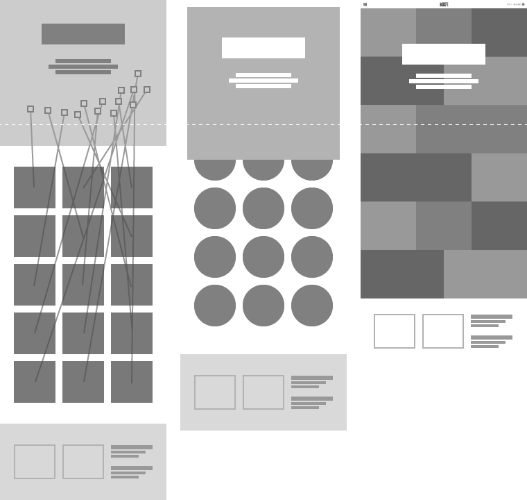
The final challenge on Legacies was to design a landing page for the anthology, as well as various support screens and wrapper components, and they all needed to jive with the NFB’s branding and design language.
Do it, live it Legacies 150 landing page ↗
We iterated through various elaborate “welcome” experiences, but in the end chose to go with a quick and simple offset grid. The point being: get to the stories a.s.a.p.
Final landing page comp — desktop breakpoint
![]()

Unused landing page concepts
![]()
LANDING PAGE + FRAMEWORK COLLABORATORS
Developers: Patrick Matte, gskinner
Series producer: Nicholas Klassen
Project manager: Camille Fillion
Technical director: Dana Dansereau
Developers: Patrick Matte, gskinner
Series producer: Nicholas Klassen
Project manager: Camille Fillion
Technical director: Dana Dansereau
Custom iconography for Legacies UI
![]()
Various support screens and components


Experience Legacies 150 ↗
—fin—